Category Archives: Dodgy statistics

More nonsense about vaping

A paper was published in PLoS One a few days ago by Soneji et al that made the bold claim that “e-cigarette use currently represents more population-level harm than benefit”.

That claim, for reasons we’ll come to shortly, is not remotely supported by the evidence. But this leaves me with rather mixed feelings. On the one hand, I am disappointed that such a massively flawed paper can make it through peer review. It is a useful reminder that just because a paper is published in a peer reviewed journal does not mean that it is necessarily even approximately believable.

But on the other hand, the paper was largely ignored by the British media. I find that rather encouraging. We have seen flawed studies about e-cigarettes cheerfully picked up by the media before (here’s one example, but there are plenty of others), who don’t seem too bothered about whether the research is any good or not, just that it makes a good story. Perhaps the media are starting to learn that parroting press releases, when those press releases are a load of nonsense, is not such a great idea after all.

Sure, the paper made it into two of our most dreadful and unreliable newspapers, but as far as I can tell, the story was not picked up at all by the BBC or any of the broadsheet newspapers. And that’s a good thing.

So what was wrong with the paper then?

It’s important to understand that the paper did not collect any new data. There was no survey or clinical trial or review of health records or anything like that. It was purely a mathematical modelling study based on previously published data.

Soneji et al attempted to model the benefits and harms of e-cigarettes at the population level by considering what proportion of smokers are helped to quit by e-cigarettes, thus experiencing a health benefit, and what proportion of never-smokers are encouraged to start smoking by e-cigarettes, thus experiencing harm.

Of course a mathematical model is only as good as the assumptions that go into it. The big problem with this model is that there is no evidence that e-cigarettes encourage anyone to start smoking.

Now, there have been studies that show that young people who use e-cigarettes are more likely to start smoking that young people who don’t use e-cigarettes. Soneji et al used a meta-analysis of those studies to obtain the necessary estimates of just how much more likely that was.

But there is a big problem here. The assumption in Soneji et al’s modelling paper is that the observed association between e-cigarette use and subsequent smoking initiation is causal. In other words, they assume that those people who use e-cigarettes and then go on to start smoking have started smoking because they used e-cigarettes.

A moment’s thought shows that there are other perfectly plausible explanations rather than a causal relationship. Surely it is more likely that there is confounding by personality type here. The sort of person who uses e-cigarettes is probably the type of person who is more likely to start smoking. If e-cigarettes were not available, those people who first used e-cigarettes and then subsequently started smoking would probably have started smoking anyway.

But this is to some extent guesswork. While Soneji et al can most definitely not prove that the association between e-cigarette use and subsequent smoking is causal, no-one can prove it isn’t causal from those association studies, even if another explanation is more plausible.

We can, however, look at other data to help understand what is going on. Given that e-cigarettes are now far more available than they were a few years ago, if e-cigarettes were really causing people who wouldn’t otherwise have smoked to start smoking, then you would expect to see population-level rates of smoking start to increase.

In fact, according to data from the Office for National Statistics, the opposite is happening. According to the ONS data, “Since 2010, smoking has become less common across all age groups in the UK, with the most pronounced decrease observed among those aged 18 to 24 years”.

Now, of course we can’t say that that decrease in smoking prevalence is because of e-cigarettes, but it does seem to argue strongly against the hypothesis that e-cigarettes are encouraging young people to start smoking on a grand scale.

And if you believe Soneji et al’s claims, people would be starting smoking on a grand scale. Prof Peter Hajek, quoted by the Science Media Centre, has calculated what Soneji et al’s claims would mean if they were true in the UK:

“This new ‘finding’ is based on the bizarre assumption that for every one smoker who uses e-cigs to quit, 80 non-smokers will try e-cigs and take up smoking. It flies in the face of available evidence but it is also mathematically impossible. In the UK alone, 1.5 million smokers have quit smoking with the help of e-cigarettes. The ‘modelling’ in this paper assumes that we also have 120 million young people who became smokers.”

I think we can all see that having 120 million young people who are smokers among the UK population doesn’t make a whole lot of sense. Why could the peer-reviewers of the paper not see that?

Do 41% of middle aged adults really walk for less than 10 minutes each month?

I was a little surprised when I heard the news on the radio this morning and heard that a new study had been published allegedly showing that millions of middle aged adults are so inactive that they don’t even walk for 10 minutes each month. The story has been widely covered in the media, for example here, here, and here.

The specific claim is that 41% of adults aged 40 to 60 in England, or about 6 million people, do not walk for 10 minutes in one go at a brisk pace at least once a month, based on a survey by Public Health England (PHE). I tracked down the source of this claim to this report on the PHE website.

I found that hard to believe. Walking for just 10 minutes a month is a pretty low bar. Can it really be true that 41% of middle aged adults don’t even manage that much?

Well, if it is, which I seriously doubt, then the statistic is at best highly misleading. The same survey tells us that less than 20% of the same sample of adults were physically inactive, where physical activity is defined as “participating in less than 30 minutes of moderate intensity physical activity per week”. Here is the table from the report about physical activity:

So we have about 6 million people doing less than 10 minutes of walking per month, but only 3 million people doing less than 30 minutes of moderate intensity physical activity per week. So somehow, there must be 3 million people who are doing at least 30 minutes of physical activity per week while simultaneously walking for less than 10 minutes per month.

I suppose that’s possible. Maybe those people cycle a lot, or perhaps drive to the gym and have a good old workout and then drive home again. But it seems unlikely.

And even if it’s true, the headline figure that 41% of middle aged adults are doing so little exercise that they don’t even manage 10 minutes of walking a month is grossly misleading. Because in fact over 80% of middle aged adults are exercising for at least 30 minutes per week.

I notice that the report on the PHE website doesn’t link to the precise questions asked in the survey. I am always sceptical of any survey results that aren’t accompanied by a detailed description of the survey methods, including specifying the precise questions asked, and this example only serves to remind me of the importance of maintaining that scepticism.

The news coverage focuses on the “41% walk for less than 10 minutes per month” figure and not on the far less alarming figure that less than 20% exercise for less than 30 minutes per week. The 41% figure is also presented first on the PHE website, and I’m guessing, given the similarity of stories in the media, that that was the figure they emphasised in their press release.

I find it disappointing that a body like PHE is prioritising newsworthiness over honest science.

The Trials Tracker and post-truth politics

The All Trials campaign was founded in 2013 with the stated aim of ensuring that all clinical trials are disclosed in the public domain. This is, of course, an entirely worthy aim. There is no doubt that sponsors of clinical trials have an ethical responsibility to make sure that the results of their trials are made public.

However, as I have written before, I am not impressed by the way the All Trials campaign misuses statistics in pursuit of its aims. Specifically, the statistic they keep promoting, “about half of all clinical trials are unpublished”, is simply not evidence based. Most recent studies show that the extent of trials that are undisclosed is more like 20% than 50%.

The latest initiative by the All Trials campaign is the Trials Tracker. This is an automated tool that looks at all trials registered on clinicaltrials.gov since 2006 and determines, using an automated algorithm, which of them have been disclosed. They found 45% were undisclosed (27% of industry sponsored-trials and 54% of non-industry trials). So, surely this is evidence to support the All Trials claim that about half of trials are undisclosed, right?

Wrong.

In fact it looks like the true figure for undisclosed trials is not 45%, but at most 21%. Let me explain.

The problem is that an automated algorithm is not very good at determining whether trials are disclosed or not. The algorithm can tell if results have been posted on clinicaltrials.gov, and also searches PubMed for publications with a matching clinicaltrials.gov ID number. You can probably see the flaw in this already. There are many ways that results could be disclosed that would not be picked up by that algorithm.

Many pharmaceutical companies make results of clinical trials available on their own websites. The algorithm would not pick that up. Also, although journal publications of clinical trials should ideally make sure they are indexed by the clinicaltrials.gov ID number, in practice that system is imperfect. So the automated algorithm misses many journal articles that aren’t indexed correctly with their ID number.

So how bad is the algorithm?

The sponsor with the greatest number of unreported trials, according to the algorithm, is Sanofi. I started by downloading the raw data, picked the first 10 trials sponsored by Sanofi that were supposedly “undisclosed”, and tried searching for results manually.

As an aside, the Trials Tracker team get 7/10 for transparency. They make their raw data available for download, which is great, but they don’t disclose their metadata (descriptions of what each variable in the dataset represents), so it was rather hard work figuring out how to use the data. But I think I figured it out in the end, as after trying a few combinations of interpretations I was able to replicate their published results exactly.

Anyway, of those 10 “undisclosed” trials by Sanofi, 8 of them were reported on Sanofi’s own website, and one of the remaining 2 was published in a journal. So in fact only 1 of the 10 was actually undisclosed. I posted this information in a comment on the journal article in which the Trials Tracker is described, and it prompted another reader, Tamas Ferenci, to investigate the Sanofi trials more systematically. He found that 227 of the 285 Sanofi trials (80%) listed as undisclosed by Trials Tracker were in fact published on Sanofi’s website. He then went on to look at “undisclosed” trials sponsored by AstraZeneca, and found that 38 of the 68 supposedly undisclosed trials (56%) were actually published on AstraZeneca’s website. Ferenci’s search only looked at company websites, so it’s possible that more of the trials were reported in journal articles.

The above analyses only looked at a couple of sponsors, and we don’t know if they are representative. So to investigate more systematically the extent to which the Trials Tracker algorithm underestimates disclosure, I searched for results manually for 100 trials: a random selection of 50 industry trials and a random selection of 50 non-industry trials.

I found that 54% (95% confidence interval 40-68%) of industry trials and 52% (95% CI 38-66%) of non-industry trials that had been classified as undisclosed by Trials Tracker were available in the public domain. This might be an underestimate, as my search was not especially thorough. I searched Google, Google Scholar, and PubMed, and if I couldn’t find any results in a few minutes then I gave up. A more systematic search might have found more articles.

If you’d like to check the results yourself, my findings are in a csv file here. This follows the same structure as the original dataset (I’d love to be able to give you the metadata for that, but as mentioned above, I can’t), but with the addition of 3 variables at the end. “Disclosed” specifies whether the trial was disclosed, and if so, how (journal, company website, etc). It’s possible that trials were disclosed in more than one place, but once I’d found a trial in one place I stopped searching. “Link” is a link to the results if available, and “Comment” is any other information that struck me as relevant, such as whether a trial was terminated prematurely or was of a product which has since been discontinued.

Putting these figures together with the Trials Tracker main results, this suggests that only 12% of industry trials and 26% of non-industry trials are undisclosed, or 21% overall (34% of the trials were sponsored by industry). And given the rough and ready nature of my search strategy, this is probably an upper bound for the proportion of undisclosed trials. A far cry from “about half”, and in fact broadly consistent with the recent studies showing that about 80% of trials are disclosed. It’s also worth noting that industry are clearly doing better at disclosure than academia. Much of the narrative that the All Trials campaign has encouraged is of the form “evil secretive Big Pharma deliberately withholding their results”. The data don’t seem to support this. It seems far more likely that trials are undisclosed simply because triallists lack the resources to write them up for publication. Research in industry is generally better funded than research in academia, and my guess is that the better funding explains why industry do better at disclosing their results. I and some colleagues have previously suggested that one way to increase trial disclosure rates would be to ensure that funders of research ringfence a part of their budget specifically for the costs of publication.

There are some interesting features of the 23 out of the 50 industry-sponsored trials that really did seem to be undisclosed. 9 of them were not trials of a drug intervention. Of the 14 undisclosed drug trials, 4 were of products that had been discontinued and a further 3 had sample sizes less than 12 subjects, so none of those 7 studies are likely to be relevant to clinical practice. It seems that undisclosed industry-sponsored drug trials of relevance to clinical practice are very rare indeed.

The Trials Tracker team would no doubt respond by saying that the trials missed by their algorithm have been badly indexed, which is bad in itself. And they would be right about that. Trial sponsors should update clinicaltrials.gov with their results. They should also make sure that the clinicaltrials.gov ID number is included in the publication (although in several cases of published trials that were missed by the algorithm, the ID number was in fact included in the abstract of the paper, so this seems to be a fault of Medline indexing rather than any fault of the triallists).

However, the claim made by the Trials Tracker is not that trials are badly indexed. If they stuck to making only that claim, then the Trials Tracker would be a perfectly worthy and admirable project. But the problem is they go beyond that, and claim something which their data simply do not show. Their claim is that the trials are undisclosed. This is just wrong. It is another example of what seems to be all the rage these days, namely “post-truth politics”. It is no different from when the Brexit campaign said “We spend £350 million a week on the EU and could spend it on the NHS instead” or when Donald Trump said, well, pretty much every time his lips moved really.

Welcome to the post-truth world.


Made up statistics on sugar tax

I woke up this morning to the sound of Radio 4 telling me that Cancer Research UK had done an analysis showing that a 20% tax on sugary drinks could reduce the number of obese people in the UK by 3.7 million by 2025. (That could be the start of the world’s worst ever blues song, but it isn’t.)

My first thought was that was rather surprising, as I wasn’t aware of any evidence on how sugar taxes impact on obesity. So I went hunting for the report with interest.

Bizarrely, Cancer Research UK didn’t link to the full report from their press release (once you’ve read the rest of this post, you may conclude that perhaps they were too embarrassed to let anyone see it), but I tracked it down here. Well, I’m not sure even that is the full report. It says it’s a “technical summary”, but the word “summary” makes me wonder if it is still not the full report. But that’s all that seems to be made publicly available.

There are a number of problems with this report. Christopher Snowdon has blogged about some of them here, but I want to focus on the extent to which the model is based on untested assumptions.

It turns out that the conclusions were indeed not based on any empirical data about how a sugar tax would impact on obesity, but on  a modelling study. This study made various assumptions about various things, principally the following:

  1. The price elasticity of demand for sugary drinks (ie the extent to which an increase in price reduces consumption)
  2. The extent to which a reduction in sugary drink consumption would reduce total calorie intake
  3. The effect of total calorie intake on body mass

The authors get 0/10 for transparent reporting for the first of those, as they don’t actually say what price elasticity they used. That’s pretty basic stuff, and not to report it is somewhat akin to reporting the results of a clinical trial of a new drug and not saying what dose of the drug you used.

However, the report does give a reference for their price elasticity data, namely this paper. I must say I don’t find the methods of that paper easy to follow. It’s not at all clear to me whether the price elasticities they calculated were actually based on empirical data or themselves the results of a modelling exercise. But the data that are used in that paper come from the period 2008 to 2010, when the UK was in the depths of  recession, and when it might be hypothesised that price elasticities were greater than in more economically buoyant times. They don’t give a single figure for price elasticity, but a range of 0.8 to 0.9. In other words, a 20% increase in the price of sugary drinks would be expected to lead to a 16-18% decrease in the quantity that consumers buy. At least in the depths of the worst recession since the 1930s.

That figure for price elasticity is a crucial input to the model, and if it is wrong, then the answers of the model will be wrong.

The next input is the extent to which a reduction in sugary drink consumption reduces total calorie intake.  Here, an assumption is made that total calorie intake is reduced by 60% of the amount of calories not consumed in sugary drinks. Or in other words, that if you forego the calories of a sugary drink, you only make up 40% of those from elsewhere.

Where does that 60% figure come from? Well, they give a reference to this paper. And how did that paper arrive at the 60% figure? Well, they in turn give a reference to this paper. And where did that get it from? As far as I can tell, it didn’t, though I note it reports the results of a clinical study in people trying to lose weight by dieting. Even if that 60% figure is based on actual data from that study, rather than just plucked out of thin air, I very much doubt that data on calorie substitution taken from people trying to lose weight would be applicable to the general population.

What about the third assumption, the weight loss effects of reduced calorie intake? We are told that reducing energy intake by 100 KJ per day results in 1 kg body weight loss. The citation given for that information is this study, which is another modelling study. Are none of the assumptions in this study based on actual empirical data?

A really basic part of making predictions by mathematical modelling is to use sensitivity analyses. The model is based on various assumptions, and sensitivity analyses answer the questions of what happens if those assumptions were wrong. Typically, the inputs to the model are varied over plausible ranges, and then you can see how the results are affected.

Unfortunately, no sensitivity analysis was done. This, folks, is real amateur hour stuff. The reason for the lack of sensitivity analysis is given in the report as follows:

“it was beyond the scope of this project to include an extensive sensitivity analysis. The microsimulation model is complex involving many thousands of calculations; therefore sensitivity analysis would require many thousands of consecutive runs using super computers to undertake this within a realistic time scale.”

That has to be one of the lamest excuses for shoddy methods I’ve seen in a long time. This is 2016. You don’t have to run the analysis on your ZX Spectrum.

So this result is based on a bunch of heroic assumptions which have little basis in reality, and the sensitivity of the model to those assumptions were not tested. Forgive me if I’m not convinced.


The dishonesty of the All Trials campaign

The All Trials campaign is very fond of quoting the statistic that only half of all clinical trials have ever been published. That statistic is not based on good evidence, as I have explained at some length previously.

Now, if they are just sending the odd tweet or writing the odd blogpost with dodgy statistics, that is perhaps not the most important thing in the whole world, as the wonderful XKCD pointed out some time ago:

Wrong on the internet

But when they are using dodgy statistics for fundraising purposes, that is an entirely different matter. On their USA fundraising page, they prominently quote the evidence-free statistic about half of clinical trials not having been published.

Giving people misleading information when you are trying to get money from them is a serious matter. I am not a lawyer, but my understanding is that the definition of fraud is not dissimilar to that.

The All Trials fundraising page allows comments to be posted, so I posted a comment questioning their “half of all clinical trials unpublished” statistic. Here is a screenshot of the comments section of the page after I posted my comment,  in case you want to see what I wrote:Screenshot from 2016-02-02 18:16:32

Now, if the All Trials campaign genuinely believed their “half of all trials unpublished” statistic to be correct, they could have engaged with my comment. They could have explained why they thought they were right and I was wrong. Perhaps they thought there was an important piece of evidence that I had overlooked. Perhaps they thought there was a logical flaw in my arguments.

But no, they didn’t engage. They just deleted the comment within hours of my posting it. That is the stuff of homeopaths and anti-vaccinationists. It is not the way that those committed to transparency and honesty in science behave.

I am struggling to think of any reasonable explanation for this behaviour other than that they know their “half of all clinical trials unpublished” statistic to be on shaky ground and simply do not wish anyone to draw attention to it. That, in my book, is dishonest.

This is such a shame. The stated aim of the All Trials campaign is entirely honourable. They say that their aim is for all clinical trials to be published. This is undoubtedly important. All reasonable people would agree that to do a clinical trial and keep the results secret is unethical. I do not see why they need to spoil the campaign by using exactly the sort of intellectual dishonesty themselves that they are campaigning against.

New alcohol guidelines

It has probably not escaped your attention that the Department of Health published new guidelines for alcohol consumption on Friday. These guidelines recommend lower limits than the previous guidelines, namely no more than 14 units per week. The figure is the same for men and women.

There are many odd things about these guidelines. But before I get into that, I was rightly picked up on a previous blogpost for not being clear about my own competing interests, so I’ll get those out of the way first, as I think it’s important.

I do not work either for the alcohol industry or in public health, so professionally speaking, I have no dog in this fight. However, at a personal level, I do like a glass of wine or two with my dinner, which I have pretty much every day. So my own drinking habits fall within the recommended limits of the previous guidelines (no more than 4 units per day for men), but under the new guidelines I would be classified as an excessive drinker. Do bear that in mind when reading this blogpost. I have tried to be as impartial as possible, but we are of course all subject to biases in the way we assess evidence, and I cannot claim that my assessment is completely unaffected by being classified as a heavy drinker under the new guidelines.

So, how were the new guidelines developed? This was a mixture of empirical evidence, mathematical modelling, and the judgement of the guidelines group. They were reasonably explicit about this process, and admit that the guidelines are “both pragmatic and evidence based”, so they get good marks for being transparent about their overall thinking.

However, it was not always easy to figure out what evidence was used, so they get considerably less good marks for being transparent about the precise evidence that led to the guidelines. It’s mostly available if you look hard enough, but the opacity of the referencing is disappointing. Very few statements in the guidelines document are explicitly referenced. But as far as I can tell, most of the evidence comes from two other documents, “A summary of the evidence of the health and social impacts of alcohol consumption” (see the document “Appendix 3 CMO Alcohol Guidelines Summary of evidence.pdf” within the zip file that you can download here) ,and the report of the Sheffield modelling group.

The specific way in which “14 units per week” was derived was as follows. The guidelines team investigated what level of alcohol consumption would be associated with no more than an “acceptable risk”, which is fair enough. Two definitions of “acceptable risk” were used, based on recent work in developing alcohol guidelines in Canada and Australia. The Canadian definition of acceptable risk was a relative risk of alcohol-related mortality of 1, in other words, the point at which the overall risk associated with drinking, taking account of both beneficial and harmful effects, was the same as the risk for a non-drinker. The Australian definition of acceptable risk was that the proportion of deaths in the population attributable to alcohol, assuming that everyone in the population drinks at the recommended limit, is 1%. In practice, both methods gave similar results, so choosing between them is not important.

To calculate the the levels of alcohol that would correspond to those risks, a mathematical model was used which incorporated empirical data on 43 diseases which are known to be associated with alcohol consumption. Risks for each were considered, and the total mortality attributable to alcohol was calculated from those risks (although the precise mathematical calculations used were not described in sufficient detail for my liking).

These results are summarised in the following table (table 1 in both the guidelines document and the Sheffield report). Results are presented separately for men and women, and also separately depending on how many days each week are drinking days. The more drinking days you have per week for the same weekly total, the less you have on any given day. So weekly limits are higher if you drink 7 days per week than if you drink 1 day per week, because of the harm involved with binge drinking if you have your entire weekly allowance on just one day.

Table 1

Assuming that drinking is spread out over a few days a week, these figures are roughly in the region of 14, so that is where the guideline figure comes from. The same figure is now being used for men and women.

Something you may have noticed about the table above is that it implies the safe drinking limits are lower for men than for women. You may think that’s a bit odd. I think that’s a bit odd too.

Nonetheless, the rationale is explained in the report. We are told (see paragraph 46 of the guidelines document) that the risks of immediate harm from alcohol consumption, usually associated with binge-drinking in a single session, “are greater for men than for women, in part because of men’s underlying risk taking behaviours”. That sounds reasonably plausible, although no supporting evidence is offered for the statement.

To be honest, I find this result surprising. According to table 6 on page 35 of the Sheffield modelling report, deaths from the chronic effects of alcohol (eg cancer) are about twice as common as deaths from the acute affects of alcohol (eg getting drunk and falling under a bus). We also know that women are more susceptible than men to the longer term effect of alcohol. And yet it appears that the acute effects dominate this analysis.

Unfortunately, although the Sheffield report is reasonably good at explaining the inputs to the mathematical model, specific details of how the model works are not presented. So it is impossible to know why the results come out in this surprising way and whether it is reasonable.

There are some other problems with the model.

I think the most important one is that the relationship between alcohol consumption and risk was often assumed to be linear. This strikes me as a really bad assumption, perhaps best illustrated with the following graph (figure 11 on page 45 of the Sheffield report).

Figure 11

This shows how the risk of hospital admission for acute alcohol-related causes increases as a function of peak day consumption, ie the amount of alcohol drunk in a single day.

A few moments’ thought suggest that this is not remotely realistic.

The risk is expressed as a relative risk, in other words how many times more likely you are to be admitted to hospital for an alcohol-related cause than you are on a day when you drink no alcohol at all. Presumably they consider that there is a non-zero risk when you don’t drink at all, or a relative risk would make no sense. Perhaps that might be something like being injured in a road traffic crash where you were perfectly sober but the other driver was drunk.

But it’s probably safe to say that the risk of being hospitalised for an alcohol-related cause when you have not consumed any alcohol is low. The report does not make it clear what baseline risk they are using, but let’s assume conservatively that the daily risk is 1 in 100, or 1%. That means that you would expect to be admitted to hospital for an alcohol-related cause about 3 times a year if you don’t drink at all. I haven’t been admitted to hospital 3 times in the last year (or even once, in fact) for an alcohol related cause, and I’ve even drunk alcohol on most of those days. I doubt my experience of lack of hospitalisation is unusual. So I think it’s probably safe to assume that 1% is a substantial overestimate of the true baseline risk.

Now let’s look at the top right of the graph. That suggests that my relative risk of being admitted to hospital for an alcohol-related cause would be 6 times higher if I drink 50 units in a day. In other words, that my risk would be 6%. And remember that that is probably a massive overestimate.

Now, 50 units of alcohol is roughly equivalent to a bottle and a half of vodka. I don’t know about you, but I’m pretty sure that if I drank a bottle and a half of vodka in a single session then my chances of being hospitalised – if I survived that long – would be close to 100%.

So I don’t think that a linear function is realistic. I don’t have any data on the actual risk, but I would expect it to look something more like this:

Alcohol graph

Here we see that the risk is negligible at low levels of alcohol consumption, then increases rapidly once you get into the range of serious binge drinking, and approaches 100% as you consume amounts of alcohol unlikely to be compatible with life. The precise form of that graph is something I have just guessed at, but I’m pretty sure it’s a more reasonable guess than a linear function.

A mathematical model is only as good as the data used as inputs to the model and the assumptions used in the modelling. Although the data used are reasonably clearly described and come mostly from systematic reviews of the literature, the way in which the data are modelled is not sufficiently clear, and also makes some highly questionable assumptions. Although some rudimentary sensitivity analyses were done, no sensitivity analyses were done using risk functions other than linear ones.

So I am not at all sure I consider the results of the mathematical modelling trustworthy. Especially when it comes up with the counter-intuitive result that women can safely drink more than men, which contradicts most of the empirical research in this area.

But perhaps more importantly, I am also puzzled why it was felt necessary to go through a complex modelling process in the first place.

It seems to me that the important question here is how does your risk of premature death depend on your alcohol consumption. That, at any rate, is what was modelled.

But there is no need to model it: we actually have empirical data. A systematic review of 34 prospective studies by Di Castelnuovo et al published in 2006 looked at the relationship between alcohol consumption and mortality. This is what it found (the lines on either side of the male and female lines are 99% confidence intervals).

Systematic review

This shows that the level of alcohol consumption associated with no increased mortality risk compared with non-drinkers is about 25 g/day for women and 40 g/day for men. A standard UK unit is 8 g of alcohol, so that converts to about 22 units per week for women and 35 units per week for men: not entirely dissimilar to the previous guidelines.

Some attempt is made to explain why the data on all cause mortality have not been used, but I do not find them convincing (see page 7 of the summary of evidence).

One problem we are told is that “most of the physiological mechanisms that have been suggested to explain the protective effect of moderate drinking only apply for cohorts with overall low levels of consumption and patterns of regular drinking that do not vary”. That seems a bizarre criticism. The data show that there is a protective effect only at relatively low levels of consumption, and that once consumption increases, so does the risk. So of course the protective effect only applies at low levels of consumption. As for the “patterns of regular drinking”, the summary makes the point that binge drinking is harmful. Well, we know that. The guidelines already warn of the dangers of binge drinking. It seems odd therefore, to also reject the findings for people who split their weekly consumption evenly over the week and avoid binge drinking, as this is exactly what the guidelines say you should do.

I do not understand why studies which apply to people who follow safe drinking guidelines are deemed to be unsuitable for informing safe drinking guidelines. That makes no sense to me.

The summary also mentions the “sick quitter hypothesis” as a reason to mistrust the epidemiological data. The sick quitter hypothesis suggests that the benefits of moderate drinking compared with no drinking may have been overestimated in epidemiological studies, as non-drinkers may include recovering alcoholics and other people who have given up alcohol for health reasons, and therefore include an unusually unhealthy population.

The hypothesis seems reasonable, but it is not exactly a new revelation to epidemiologists, and has been thoroughly investigated. The systematic review by Di Castelnuovo reported a sensitivity analysis including only studies which excluded former drinkers from their no-consumption category. That found a lower beneficial effect on mortality than in the main analysis, but the protective effect was still unambiguously present. The point at which drinkers had the same risk as non-drinkers in that analysis was about 26 units per week (this is an overall figure: separate figures for men and women were not presented in the sensitivity analysis).

A systematic review specifically of cardiovascular mortality by Ronksley et al published in 2011 also ran a sensitivity analysis where only lifelong non-drinkers were used as the reference category, and found it made little difference to the results.

So although the “sick quitter hypothesis” sounds like a legitimate concern, in fact it has been investigated and is not a reason to distrust the results of the epidemiological analyses.

So all in all, I really do not follow the logic of embarking on a complex modelling exercise instead of using readily available empirical data. Granted, the systematic review by Di Castelnuovo et al is 10 years old now, but surely a more appropriate response to that would have been to commission an updated systematic review rather than ignore the systematic review evidence on mortality altogether and go down a different and problematic route.

Does any of this matter? After all, the guidelines are not compulsory. If my own reading of the evidence tells me I can quite safely drink 2 glasses of wine with my dinner most nights, I am completely free to do so.

Well, I think this does matter. If the government are going to publish guidelines on healthy behaviours, I think it is important that they be as accurate and evidence-based as possible. Otherwise the whole system of public health guidelines will fall into disrepute, and then it is far less likely that even sensible guidelines will be followed.

What is particularly concerning here is the confused messages the guidelines give about whether moderate drinking has benefits. From my reading of the literature, it certainly seems likely that there is a health benefit at low levels of consumption. That, at any rate, is the obvious conclusion from Di Castelnuovo et al’s systematic review.

And yet the guidelines are very unclear about this. While even the Sheffield model used to support the guidelines shows decreased risks at low levels of alcohol consumption (and those decreased risks would extend to substantially higher drinking levels if you base your judgement on the systematic review evidence), the guidelines themselves say that such decreased risks do not exist.

The guideline itself says “The risk of developing a range of diseases (including, for example, cancers of the mouth, throat, and breast) increases with any amount you drink on a regular basis”. That is true, but it ignore the fact that it is not true for other diseases. To mention only the harms of alcohol and ignore the benefits in the guidelines seems a dishonest way to present data. Surely the net effect is what is important.

Paragraph 30 of the guidelines document says “there is no level of drinking that can be recommended as completely safe long term”, which is also an odd thing to say when moderate levels of drinking have a lower risk than not drinking at all.

There is no doubt that the evidence on alcohol and health outcomes is complex. For obvious reasons, there have been no long-term randomised controlled trials, so we have to rely on epidemiological research with all its limitations. So I do not pretend for a moment that developing guidelines on what is a safe amount of alcohol to drink is easy.

But despite that, I think the developers of these guidelines could have done better.

Dangerous nonsense about vaping

If you thought you already had a good contender for “most dangerous, irresponsible, and ill-informed piece of health journalism of 2015”, then I’m sorry to tell you that it has been beaten into second place at the last minute.

With less than 36 hours left of 2015, I am confident that this article by Sarah Knapton in the Telegraph will win the title.

The article is titled “E-cigarettes are no safer than smoking tobacco, scientists warn”. The first paragraph is

“Vaping is no safer that [sic] smoking, scientists have warned after finding that e-cigarette vapour damages DNA in ways that could lead to cancer.”

There are such crushing levels of stupid in this article it’s hard to know where to start. But perhaps I’ll start by pointing out that a detailed review of the evidence on vaping by Public Health England, published earlier this year, concluded that e-cigarettes are about 95% less harmful than smoking.

If you dig into the detail of that review, you find that most of the residual 5% is the harm of nicotine addiction. It’s debatable whether that can really be called a harm, given that most people who vape are already addicted to nicotine as a result of years of smoking cigarettes.

But either way, the evidence shows that vaping, while it may not be 100% safe (though let’s remember that nothing is 100% safe: even teddy bears kill people), is considerably safer than smoking. This should not be a surprise. We have a pretty good understanding of what the toxic components of cigarette smoke are that cause all the damage, and most of those are either absent from e-cigarette vapour or present at much lower concentrations.

So the question of whether vaping is 100% safe is not the most relevant thing here. The question is whether it is safer than smoking. Nicotine addiction is hard to beat, and if a smoker finds it impossible to stop using nicotine, but can switch from smoking to vaping, then that is a good thing for that person’s health.

Now, nothing is ever set in stone in science. If new evidence comes along, we should always be prepared to revise our beliefs.

But obviously to go from a conclusion that vaping is 95% safer than smoking to concluding they are both equally harmful would require some pretty robust evidence, wouldn’t it?

So let’s look at the evidence Knapton uses as proof that all the previous estimates were wrong and vaping is in fact as harmful as smoking.

The paper it was based on is this one, published in the journal Oral Oncology.  (Many thanks to @CaeruleanSea for finding the link for me, which had defeated me after Knapton gave the wrong journal name in her article.)

The first thing to notice about this is that it is all lab based, using cell cultures, and so tells us little about what might actually happen in real humans. But the real kicker is that if we are going to compare vaping and smoking and conclude that they are as harmful as each other, then the cell cultures should have been exposed to equivalent amounts of e-cigarette vapour and cigarette smoke.

The paper describes how solutions were made by drawing either the vapour or smoke through cell media. We are then told that the cells were treated with the vaping medium every 3 days for up to 8 weeks. So presumably the cigarette medium was also applied every 3 days, right?

Well, no. Not exactly. This is what the paper says:

“Because of the high toxicity of cigarette smoke extract, cigarette-treated samples of each cell line could only be treated for 24 h.”

Yes, that’s right. The cigarette smoke was applied at a much lower intensity, because otherwise it killed the cells altogether. So how can you possibly conclude that vaping is no worse than smoking, when smoking is so harmful it kills the cells altogether and makes it impossible to do the experiment?

And yet despite that, the cigarettes still had a larger effect than the vaping. It is also odd that the results for cigarettes are not presented at all for some of the assays. I wonder if that’s because it had killed the cells and made the assays impossible? As primarily a clinical researcher, I’m not an expert in lab science, but not showing the results of your positive control seems odd to me.

But the paper still shows that the e-cigarette extract was harming cells, so that’s still a worry, right?

Well, there is the question of dose. It’s hard for me to know from the paper how realistic the doses were, as this is not my area of expertise, but the press release accompanying this paper (which may well be the only thing that Knapton actually read before writing her article) tells us the following:

“In this particular study, it was similar to someone smoking continuously for hours on end, so it’s a higher amount than would normally be delivered,”

Well, most things probably damage cells in culture if used at a high enough dose, so I don’t think this study really tells us much. All it tells us is that cigarettes do far more damage to cell cultures than e-cigarette vapour does. Because, and I can’t emphasise this point enough, THEY COULDN’T DO THE STUDY WITH EQUIVALENT DOSES OF CIGARETTE SMOKE BECAUSE IT KILLED ALL THE CELLS.

A charitable explanation of how Knapton could write such nonsense might be that she simply took the press release on trust (to be clear, the press release also makes the claim that vaping is as dangerous as smoking) and didn’t have time to check it. But leaving aside the question of whether a journalist on a major national newspaper should be regurgitating press releases without any kind of fact checking, I note that many people (myself included) have been pointing out to Knapton on Twitter that there are flaws in the article, and her response has been not to engage with such criticism, but to insist she is right and to block anyone who disagrees: the Twitter equivalent of the “la la la I’m not listening” argument.

It seems hard to come up with any explanation other than that Knapton likes to write a sensational headline and simply doesn’t care whether it’s true, or, more importantly, what harm the article may do.

And make no mistake: articles like this do have the potential to cause harm. It is perfectly clear that, whether or not vaping is completely safe, it is vastly safer than smoking. It would be a really bad outcome if smokers who were planning to switch to vaping read Knapton’s article and thought “oh, well if vaping is just as bad as smoking, maybe I won’t bother”. Maybe some of those smokers will then go on to die a horrible death of lung cancer, which could have been avoided had they switched to vaping.

Is Knapton really so ignorant that she doesn’t realise that is a possible consequence of her article, or does she not care?

And in case you doubt that anyone would really be foolish enough to believe such nonsense, I’m afraid there is evidence that people do believe it. According to a survey by Action on Smoking and Health (ASH), the proportion of people who believe that vaping is as harmful or more harmful than smoking increased from 14% in 2014 to 22% in 2015. And in the USA, the figures may be even worse: this study found 38% of respondents thought e-cigarettes were as harmful or more harmful than smoking. (Thanks again to @CaeruleanSea for finding the links to the surveys.)

I’ll leave the last word to Deborah Arnott, Chief Executive of ASH:

“The number of ex-smokers who are staying off tobacco by using electronic cigarettes is growing, showing just what value they can have. But the number of people who wrongly believe that vaping is as harmful as smoking is worrying. The growth of this false perception risks discouraging many smokers from using electronic cigarettes to quit and keep them smoking instead which would be bad for their health and the health of those around them.”

STAT investigation on failure to report research results

A news story by the American health news website STAT has appeared in my Twitter feed many times over the last few days.

The story claims to show that “prestigious medical research institutions have flagrantly violated a federal law requiring public reporting of study results, depriving patients and doctors of complete data to gauge the safety and benefits of treatments”. They looked at whether results of clinical trials that should have been posted on the clinicaltrials.gov website actually were posted, and found that many of them were not. It’s all scary stuff, and once again, shows that those evil scientists are hiding the results of their clinical trials.

Or are they?

To be honest, it’s hard to know what to make of this one. The problem is that the “research” on which the story is based has not been published in a peer reviewed journal. It seems that the only place the “research” has been reported is on the website itself. This is a significant problem, as the research is simply not reported in enough detail to know whether the methods it used were reliable enough to allow us to trust its conclusions. Maybe it was a fantastically thorough and entirely valid piece of research, or maybe it was dreadful. Without the sort of detail we would expect to see in a peer-reviewed research paper, it is impossible to know.

For example, the rather brief “methods section” of the article tells us that they filtered the data to exclude trials which were not required to report results, but they give no detail about how. So how do we know whether their dataset really contained only trials subject to mandatory reporting?

They also tell us that they excluded trials for which the deadline had not yet arrived, but again, they don’t tell us how. That’s actually quite important. If a trial has not yet reported results, then it’s hard to be sure when the trial finished. The clinicaltrials.gov website uses both actual and estimated dates of trial completion, and also has two different definitions of trial completion. We don’t know which definition was used, and if estimated dates were used, we don’t know if those estimates were accurate. In my experience, estimates of the end date of a clinical trial are frequently inaccurate.

Some really basic statistical details are missing. We are told that the results include “average” times by which results were late, but not whether they are mean or medians. With skewed data such as time to report something, the difference is important.

It appears that the researchers did not determine whether results had been published in peer-reviewed journals. So the claim that results are being hidden may be totally wrong. Even if a trial was not posted on clinicaltrials.gov, it’s hard to support a claim that the results are hidden if they’ve been published in a medical journal.

It is hardly surprising there are important details missing. Publishing “research” on a news website rather than in a peer reviewed journal is not how you do science. A wise man once said “If you have a serious new claim to make, it should go through scientific publication and peer review before you present it to the media“. Only a fool would describe the STAT story as “excellent“.

One of the findings of the STAT story was that academic institutions were worse than pharmaceutical companies at reporting their trials. Although it’s hard to be sure if that result is trustworthy, for all the reasons I describe above, it is at least consistent with more than one other piece of research (and I’m not aware of any research that has found the opposite).

There is a popular narrative that says clinical trial results are hidden because of evil conspiracies. However, no-one ever has yet given a satisfactory explanation of how hiding their clinical trial results furthers academics’ evil plans for global domination.

A far more likely explanation is that posting results is a time consuming and faffy business, which may often be overlooked in the face of competing priorities. That doesn’t excuse it, of course, but it does help to understand why results posting on clinicaltrials.gov is not as good as it should be, particularly from academic researchers, who are usually less well resourced than their colleagues in the pharmaceutical industry.

If the claims of the STAT article are true and researchers are indeed falling below the standards we expect in terms of clinical trial disclosure, then I suggest that rather than getting indignant and seeking to apportion blame, the sensible approach would be to figure out how to fix things.

I and some colleagues published a paper about 3 years ago in which we suggest how to do exactly that. I hope that our suggestions may help to solve the problem of inadequate clinical trial disclosure.

Zombie statistics on half of all clinical trials unpublished

You know what zombies are, right? No matter how often you kill them, they just keep coming back. So it is with zombie statistics. No matter how often they are debunked, people will keep repeating them as if they were a fact.

zombies

Picture credit: Scott Beale / Laughing Squid

As all fans of a particular horror movie genre know, the only way you can kill a zombie is to shoot it in the head. This blog post is my attempt at a headshot for the zombie statistic “only half of all clinical trials have ever been published”.

That statistic has been enthusiastically promoted by the All Trials campaign. The campaign itself is fighting for a thoroughly good cause. Their aim is to ensure that the results of all clinical trials are disclosed in the public domain. Seriously, who wouldn’t want to see that happen? Medical science, or indeed any science, can only progress if we know what previous research has shown.

But sadly, All Trials are not being very evidence-based in their use of statistics. They have recently written yet another article promoting the “only half of all clinical trials are published” zombie statistic, which I’m afraid is misleading in a number of ways.

The article begins: “We’re sometimes asked if it’s still true that around half of clinical trials have never reported results. Yes, it is.” Or at least that’s how it starts today. The article has been silently edited since it first appeared, with no explanation of why. That’s a bit odd for an organisation that claims to be dedicated to transparency.

The article continues “Some people point towards recent studies that found a higher rate of publication than that.” Well, yes. There are indeed many studies showing much higher rates of publication for recent trials, and I’ll show you some of those studies shortly. It’s good that All Trials acknowledge the recent increase in publication rates.

“But these studies look at clinical trials conducted very recently, often on the newest drugs, and therefore represent a tiny fraction of all the clinical trials that have ever been conducted”, the All Trials campaign would have us believe.

It’s worth looking at that claim in some detail.

Actually, the studies showing higher rates of publication are not necessary conducted very recently. It’s true that some of the highest rates come from the most recent studies, as there has been a general trend to greater disclosure for some time, which still seems to be continuing. But rates have been increasing for a while now (certainly since long before the All Trials campaign was even thought of, in case you are tempted to believe the spin that recent increases in disclosure rates are a direct result of the campaign), so it would be wrong to think that rates of publication substantially higher than 50% have only been seen in the last couple of years. For example, Bourgeois et al’s 2010 study, which found 80% of trials were disclosed in the public domain, included mostly trials conducted over 10 years ago.

It’s a big mistake to think that trials in the last 10 years have a negligible effect on the totality of trials. The number of clinical trials being done has increased massively over time, so more recent trials are actually quite a large proportion of all trials that have ever been done. And certainly a large proportion of all trials that are still relevant. How much do you think this 1965 clinical trial of carbenoxolone sodium is going to inform treatment of gastric ulcers today in the era of proton pump inhibitors, for example?

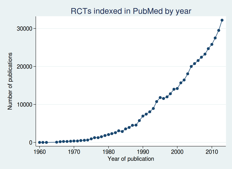
If we look at the number of randomised controlled trials indexed in PubMed over time, we see a massive increase over the last couple of decades:

Graph

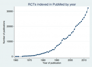
In fact over half of all those trials have been published since 2005. I wouldn’t say over half is a “tiny fraction”, would you?

“Ah”, I hear you cry, “but what if more recent trials are more likely to be published? Maybe it only looks like more trials have been done recently.”

Yes, fair point. It is true that in the last century, a significant proportion of trials were unpublished. Maybe it was even about half, although it’s hard to know for sure, as there is no good estimate of the overall proportion, despite what All Trials would have you believe (and we’ll look at their claims in more detail shortly).

But even if we make the rather extreme assumption that up to 2000 only half of all trials were published, then the rate increased evenly up to 2005 from which point 100% of trials were published, then the date after which half of all trials were done only shifts back as far as 2001.

So the contribution of recent trials matters. In fact even the All Trials team themselves tacitly acknowledge this, if you look at the last sentence of their article:

“Only when all of this recent research is gathered together with all other relevant research and assessed in another systematic review will we know if this new data changes the estimate that around half of clinical trials have ever reported results.”

In other words, at the moment, we don’t know whether it’s still true that only around half of clinical trials have ever reported results. So why did they start by boldly stating that it is true?

The fact is that no study has ever estimated the overall proportion of trials that have been published. All Trials claim that their figure of 50% comes from a 2010 meta-analysis by Song et al. This is a strange claim, as Song et al do not report a figure for the proportion of trials published. Go on. Read their article. See if you can find anything saying “only 50% of trials are published”. I couldn’t. So it’s bizarre that All Trials claim that this paper is the primary support for their claim.

The paper does, however, report publication rates in several studies of completeness of publication, and although no attempt is made to combine them into an overall estimate, some of the figures are in the rough ballpark of 50%. Maybe All Trials considered that close enough to support a nice soundbite.

But the important thing to remember about the Song et al study is that although it was published in 2010, it is based on much older data. Most of the trials it looks at were from the 1990s, and many were from the 1980s. The most recent study included in the review only included trials done up to 2003. I think we can all agree that publication rates in the last century were way too low, but what has happened since then?

Recent evidence

Several recent studies have looked at completeness of publication, and have shown disclosure rates far higher than 50%.

One important thing to remember is that researchers today have the option of posting their results on websites such as clinicaltrials.gov, which were not available to researchers in the 1990s. So publication in peer reviewed journals is not the only way for clinical trial results to get into the public domain. Any analysis that ignores results postings on websites is going to greatly underestimate real disclosure rates. Some trials are posted on websites and not published in journals, while others are published in journals but not posted on websites. To look at the total proportion of trials with results disclosed in the public domain, you have to look at both.

There may be a perception among some that posting results on a website is somehow “second best”, and only publication in a peer-reviewed journal really counts as disclosure. However, the evidence says otherwise. Riveros et al published an interesting study in 2013, in which they looked at completeness of reporting in journal publications and on clinicaltrials.gov. They found that postings on clinicaltrials.gov were generally more complete than journal articles, particularly in the extent to which they reported adverse events. So perhaps it might even be reasonable to consider journal articles second best.

But nonetheless, I think we can reasonably consider a trial to be disclosed in the public domain whether it is published in a journal or posted on a website.

So what do the recent studies show?

Bourgeois et al (2010) looked at disclosure for 546 trials that had been registered on clinicaltrials.gov. They found that 80% of them had been disclosed (66% in journals, and a further 14% on websites). The results varied according to the funder: industry-sponsored trials were disclosed 88% of the time, and government funded trials 55% of the time, with other trials somewhere in between.

Ross et al (2012) studied 635 trials that had been funded by the NIH, and found 68% had been published in journals. They didn’t look at results posting on websites, so the real disclosure rate may have been higher than that. And bear in mind that government funded trials were the least likely to be published in Bourgeois et al’s study, so Ross et al’s results are probably an underestimate of the overall proportion of studies that were being disclosed in the period they studied.

Rawal and Deane published 2 studies, one in 2014 and one in 2015. Their 2014 study included 807 trials, of which 89% were disclosed, and their 2015 study included 340 trials, of which 92% were disclosed. However, both studies included only trials done by the pharmaceutical industry, which had the highest rates of disclosure in Bourgeois et al’s study, so we can’t necessarily assume that trials from non-industry sponsors are being disclosed at such a high rate.

Taken together, these trials show that the claim that only 50% of trials are published is really not tenable for trials done in the last decade or so. And remember that trials done in the last decade or so make up about half the trials that have ever been done.

Flaws in All Trials’s evidence

But perhaps you’re still not convinced? After all, All Trials include on their page a long list of quite recent references, which they say support their claim that only half of all trials are unpublished.

Well, just having a long list of references doesn’t necessarily mean that you are right. If it did, then we would have to conclude that homeopathy is an effective treatment, as this page from the Society of Homeopaths has an even longer reference list. The important thing is whether the papers cited actually back up your claim.

So let’s take a look at the papers that All Trials cite. I’m afraid this section is a bit long and technical, which is unavoidable if we want to look at the papers in enough detail to properly assess the claims being made. Feel free to skip to the conclusions of this post if long and technical looks at the evidence aren’t your bag.

We’ve already looked at All Trials’s primary reference, the Song et al systematic review. This does show low rates of publication for trials in the last century, but what do the more recent studies show?

Ross et al, 2009, which found that 46% of trials on ClinicalTrials.gov, the world’s largest clinical trials register, had reported results.

For a start, this trial is now rather old, and only included trials up to 2005, so it doesn’t tell us about what’s been happening in the last decade. It is also likely to be a serious underestimate of the publication rate even then, for 3 reasons. First, the literature search for publication only used Medline. Many journals are not indexed in Medline, so just because a study can’t be found with a Medline search does not mean it’s not been published. Pretty much the first thing you learn at medical literature searching school is that searching Medline alone is not sufficient if you want to be systematic, and it is important to search other databases such as Embase as well. Second, and perhaps most importantly, it only considers publications in journals, and does not look at results postings on websites. Third, although they only considered completed trials, 46% of the trials they studied did not report an end date, so it is quite possible that those trials had finished only recently and were still being written up for publication.

Prayle et al, 2012, which found 22% of clinical trials had reported summary results on ClinicalTrials.gov within one year of the trial’s completion, despite this being a legal requirement of the US’s Food and Drug Administration Amendments Act 2007.

This was a study purely of results postings, so tells us nothing about the proportion of trials published in journals. Also, the FDA have criticised the methods of the study on several grounds.

Jones et al, 2013, which found 71% of large randomised clinical trials (those with 500 participants or more) registered on ClinicalTrials.gov had published results. The missing 29% of trials had approximately 250,000 trial participants.

71% is substantially higher than 50%, so it seems odd to use this as evidence to support the 50% figure. Also, 71% is only those trials published in peer-reviewed journals. The figure is 77% if you include results postings on websites. Plus the study sample included some active trials and some terminated trials, so is likely to be an underestimate for completed trials.

Schmucker et al, 2014, which found that 53% of clinical trials are published in journals. This study analysed 39 previous studies representing more than 20,000 trials.

This is quite a complex study. It was a meta-analysis, divided into 2 parts: cohorts of studies approved by ethics committees, and cohorts of studies registered in trial registries. The first part included predominantly old trials from the 1980s and 1990s.

The second part included more recent trials, but things start to unravel if you look at some of the studies more carefully. The first problem is that they only count publications in journals, and do not look at results postings on websites. Where the studies reported both publications and results postings, only the publications were considered, and results postings were ignored.

As with any meta-analysis, the results are only as good as the individual trials. I didn’t look in detail at all the trials included, but I did look at some of the ones with surprisingly low rates of disclosure. The largest study was Huser et al 2013, which found only a 28% rate of disclosure. But this is very misleading. It was only the percentage of trials that had a link to a publication in the clinicaltrials.gov record. Although sponsors should come back and update the clinicaltrials.gov record when they have published the results in a journal to provide a link to the article, in practice many don’t. So only to look at records with such a link is going to be a massive underestimate of the true publication rate (and that’s before we remember that results postings on the clinicaltrials.gov website weren’t counted). It is likely that manually searching for the articles would have found many more trials published.

Another study with a low publication rate included in the meta-analysis was Gopal et al 2012. The headline publication rate was 30%, out of a sample size of of 818. However, all 818 of those had had results posted on clinicaltrials.gov, so in fact the total disclosure rate was 100%, although of course that is meaningless as that was determined by their study design rather than a finding of the study.

The other study with a surprisingly low proportion of disclosed trials was Shamilyan et al 2012, which found only a 23% publication rate. This was only a small study (N=112), but apart from that the main flaw was that it only searched Medline, and used what sounds like a rather optimistic search strategy, using titles and ID numbers, with no manual search. So as far as I can tell from this, if a paper is published without indexing the clinicaltrials.gov ID number (and unfortunately many papers don’t) and didn’t use exactly the same verbatim title for the publication as the clinicaltrials.gov record, then publications wouldn’t have been found.

I haven’t checked all the papers, but if these 3 are anything to go by, there are some serious methodological problems behind Schumcker et al’s results.

Munch et al, 2014, which found 46% of all trials on treatments for pain had published results.

This was a study of 391 trials, of which only 181 had published results, which is indeed 46%. But those 391 trials included some trials that were still ongoing. I don’t think it’s reasonable to expect that a trial should be published before it is completed, do you? If you use the 270 completed trials as the denominator, then the publication rate increases to 67%. And even then, there was no minimum follow-up time specified in the paper. It is possible that some of those trials had only completed shortly before Munch et al searched for the results and were still being written up. It is simply not possible to complete a clinical study one day and publish the results the next day.

Anderson et al, 2015, which found that 13% of 13,000 clinical trials conducted between January 2008 and August 2012 had reported results within 12 months of the end of the trial. By 5 years after the end of the trial, approximately 80% of industry-funded trials and between 42% and 45% of trials funded by government or academic institutions had reported results.

I wonder if they have given the right reference here, as I can’t match up the numbers for 5 years after the end of the trial to anything in the paper. But the Anderson et al 2015 study that they cite did not look at publication rates, only at postings on clinicaltrials.gov. It tells us absolutely nothing about total disclosure rates.

Chang et al, 2015, which found that 49% of clinical trials for high-risk medical devices in heart disease were published in a journal.

The flaws in this study are very similar to those in Ross et al 2009: the literature search only used Medline, and results posting on websites was ignored.

Conclusions

When you look at the evidence in detail, it is clear that the claim that half of all clinical trials are unpublished is not supported. The impression one gets from reading the All Trials blog post is that they have decided that “half of all trials are unpublished” is a great soundbite, and then they try desperately to find evidence that looks like it might back it up if it is spun in a certain way and limitations in the research are ignored. And of course research showing higher rates of disclosure is also ignored.

This is not how to do science. You do not start with an answer and then try to look for a justification for it, while ignoring all disconfirming evidence. You start with a question and then look for the answer in as unbiased a way as possible.

It is disappointing to see an organisation nominally dedicated to accuracy in the scientific literature misusing statistics in this way.

And it is all so unnecessary. There are many claims that All Trials could make in support of their cause without having to torture the data like this. They could (and indeed do) point out that the historic low rate of reporting is still a problem, as many of the trials done in the last century are still relevant to today’s practice, and so it would be great if they could be retrospectively disclosed. If that was where their argument stopped, I would have no problem with it, but to claim that those historic low rates of reporting apply to the totality of clinical trials today is simply not supported by evidence.

All Trials could also point out that the rates of disclosure today are less than 100%, which is not good enough. That would also be a statement no reasonable person could argue with. They could even highlight the difficulty in finding research: many of the studies above do not show low rates of reporting, but they do show that reports of clinical trials can be hard to find. That is definitely a problem, and if All Trials want to suggest a way to fix it, that would be a thoroughly good thing.

There is no doubt that All Trials is fighting for a worthy cause. We should not be satisfied until 100% of clinical trials are disclosed, and we are not there yet. But to claim we are still in a position where only half of clinical trials are disclosed, despite all the evidence that rates of disclosure today are more typically in the region of 80-90%, is nothing short of dishonest.

I don’t care how good your cause is, there is never an excuse for using dodgy statistics as part of your campaigning.


Is smoking plunging children into poverty?

If we feel it necessary to characterise ourselves as being “pro” or “anti” certain things, I would unambiguously say that I am anti-smoking. Smoking is a vile habit. I don’t like being around people who are smoking. And as a medical statistician, I am very well aware of the immense harm that smoking does to the health of smokers and those unfortunate enough to be exposed to their smoke.

So it comes as a slight surprise to me that I find myself writing what might be seen as a pro-smoking blogpost for the second time in just a few weeks.

But this blogpost is not intended to be pro-smoking: it is merely anti the misuse of statistics by some people in the anti-smoking lobby. Just because you are campaigning against a bad thing does not give you a free pass to throw all notions of scientific rigour and social responsibility to the four winds.

An article appeared yesterday on the Daily Mail website with the headline:

“Smoking not only kills, it plunges children into POVERTY because parents ‘prioritise cigarettes over food'”

and a similar, though slightly less extreme, version appeared in the Independent:

“Smoking parents plunging nearly half a million children into poverty, says new research”

According to the Daily Mail, parents are failing to feed their children because they are spending money on cigarettes instead of food. The Independent is not quite so explicit in claiming that, but it’s certainly implied.

Regular readers of this blog will no doubt already have guessed that those articles are based on some research which may have been vaguely related to smoking and poverty, but which absolutely did not show that any children were going hungry because of their parents’ smoking habits. And they would be right.

The research behind these stories is this paper by Belvin et al. There are a number of problems with it, and particularly with the way their findings have been represented in the media.

The idea of children being “plunged into poverty” came from looking at the number of families with at least one smoker who were just above the poverty line. Poverty in this case is defined as a household income less than 60% of the median household income (taking into account family size). If the amount families above the poverty line spent on cigarettes took their remaining income after deducting their cigarette expenditure below the poverty line, then they were regarded as being taken into poverty by smoking.

Now, for a start, Belvin et al did not actually measure how much any family just above the poverty line spent on smoking. They made a whole bunch of estimates and extrapolations from surveys that were done for different purposes. So that’s one problem for a start.

Another problem is that absolutely nowhere did Belvin et al look at expenditure on food. There is no evidence whatsoever from their study that any family left their children hungry, and certainly not that smoking was the cause. Claiming that parents were prioritising smoking over food is not even remotely supported by the study, as it’s just not something that was measured at all.

Perhaps the most pernicious problem is the assumption that poverty was specifically caused by smoking. I expect many families with an income above 60% of the median spend some of their money on something other than feeding their children. Perhaps some spend their money on beer. Perhaps others spend money on mobile phone contracts. Or maybe on going to the cinema. Or economics textbooks. Or pretty much anything else you can think of that is not strictly essential. Any of those things could equally be regarded as “plunging children into poverty” if deducting it from expenditure left you below median income.

So why single out smoking?

I have a big problem with this. I said earlier that I thought smoking was a vile habit. But there is a big difference between believing smoking is a vile habit and believing smokers are vile people. They are not. They are human beings. To try to pin the blame on them for their children’s poverty (especially in the absence of any evidence that their children are actually going hungry) is troubling. I am not comfortable with demonising minority groups. It wouldn’t be OK if the group in question were, say, Muslims, and it’s not OK when the group is smokers.

There are many and complex causes of poverty. But blaming the poor is really not the response of a civilised society.

The way this story was reported in the Daily Mail is, not surprisingly, atrocious. But it’s not entirely their fault. The research was filtered through Nottingham University’s press office before it got to the mainstream media, and I’m afraid to say that Nottingham University are just as guilty here. Their press release states

“The reserch [sic] suggests that parents are likely to forgo basic household and food necessities in order to fund their smoking addiction.”

No, the research absolutely does not suggest that, because the researchers didn’t measure it. In fact I think Nottingham University are far more guilty than the Daily Mail. An academic institution really ought to know better than to misrepresent the findings of their research in this socially irresponsible way.