Category Archives: Public health

Wet Bulb Temperatures, Part 2

I wrote recently about wet bulb temperatures (WBTs), and why we should be worried if they get too high. In that post, I mentioned that I had excluded data from before 1990, as I was concerned about the data quality. For the rest of that post, I assumed that the quality control of the HadISD dataset that the Met Office does would be adequate and that the episodes of extreme WBTs that I found in the dataset were real.

I’ve been thinking about that some more, and I think I probably need to be a bit more careful about data quality. Although the Met Office’s quality control procedures are very thorough, the observations that I’ve been looking at are by definition outliers. So even if 99.99% of the observations in the dataset are genuine (and I don’t know if that’s the right figure), the extreme observations I was interested in are far more likely to be in that remaining 0.01% than some randomly selected observation.

I’ve had some discussions about this with Dr Kate Willett from the Met Office, who has been supremely helpful and has given me some great ideas about how to look in more detail at the data quality. I’m very grateful to Dr Willett for her support, and much of the deep dive into data quality in the rest of this blog post uses her ideas. Any errors in my interpretation of the data below are mine.

So, for today I’d like to look at some of the extreme WBT episodes I found and look in more detail about whether they appear to be genuine or some artefact of faulty instruments or similar.

I gave a list of extreme WBT episodes in my last post, and I’m going to use a slightly different one here, though several of the episodes are common to both lists. Today I’m looking at all episodes where the WBT was recorded as being at least 35°C for at least 4 h, and I’m including all data at any time in the dataset (last time I excluded any observations before 1990). This gives us the following list of 26 episodes:

Weather stationDate of observationHours WBT ≥ 35Max WBT
723870-03160, DESERT ROCK AIRPORT, Nye County, Nevada, United States (36.621, -116.028)08 May 1979638.8
13 May 1980439
24 May 1980536.7
25 May 19801238.6
29 May 1980539.4
19 Apr 1981639
20 Apr 19811139.8
21 Apr 1981438.8
20 May 1981939.8
09 May 1982439.1
944490-99999, LAVERTON AERO, Shire Of Laverton, Western Australia, 6440, Australia (-28.617, 122.417)22 Jan 1995636.2
952050-99999, DERBY AERO, Shire Of Derby-West Kimberley, Western Australia, Australia (-17.367, 123.667)03 Feb 2001436.8
404160-99999, KING ABDULAZIZ AB, Dammam Governorate, Eastern Province, Saudi Arabia (26.265, 50.152)08 Jul 2003536.5
417150-99999, SHAHBAZ AB, Jacobabad District, Larkana Division, Sindh, 79000, Pakistan (28.284, 68.45)06 Jun 2005637.4
954820-99999, BIRDSVILLE, Diamantina Shire, Queensland, Australia (-25.898, 139.348)30 Dec 2006436.6
952050-99999, DERBY AERO, Shire Of Derby-West Kimberley, Western Australia, Australia (-17.367, 123.667)16 Apr 2009436.5
941310-99999, TINDAL, Town of Katherine, Northern Territory, 0850, Australia (-14.521, 132.378)04 Nov 2011436.5
06 Nov 2011536.9
942170-99999, ARGYLE AERODROME, Shire Of Wyndham-East Kimberley, Western Australia, Australia (-16.633, 128.45)13 Jan 2013636.9
946590-99999, WOOMERA, Pastoral Unincorporated Area, South Australia, Australia (-31.144, 136.817)11 Mar 2013636.6
943120-99999, PORT HEDLAND INTL, Town Of Port Hedland, Western Australia, Australia (-20.378, 118.626)24 Mar 2013436.9
952050-99999, DERBY AERO, Shire Of Derby-West Kimberley, Western Australia, Australia (-17.367, 123.667)29 Sep 2013435.8
760400-99999, EJIDO NUEVO LEON BC., Municipio de Mexicali, Baja California, Mexico (32.4, -115.183)23 Jul 2018638.4
948170-99999, COONAWARRA, Wattle Range Council, South Australia, Australia (-37.3, 140.817)10 Jan 2021436.5
760400-99999, EJIDO NUEVO LEON BC., Municipio de Mexicali, Baja California, Mexico (32.4, -115.183)21 Jul 2021637.5
16 Aug 2021637.2
(The “Weather station” details are the ID number of the weather station and its name as recorded in the HadISD dataset, followed by the address of its region, and finally the latitude and longitude coordinates.)

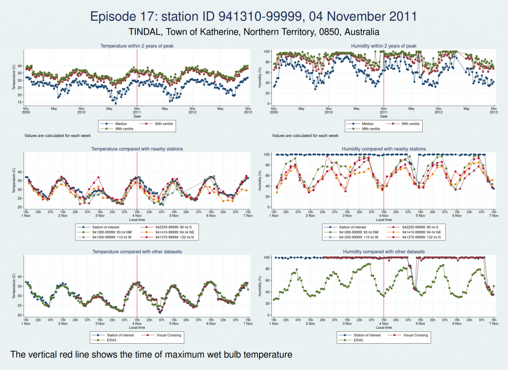
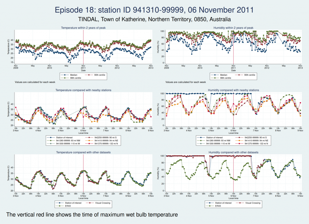
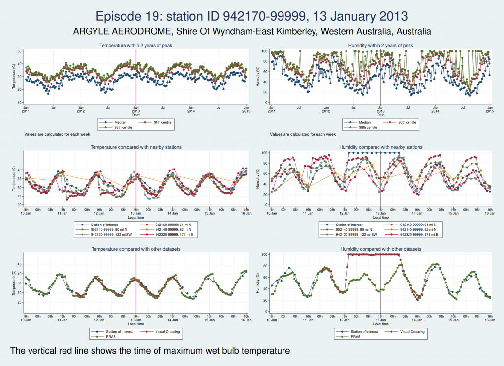
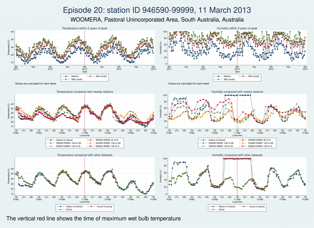
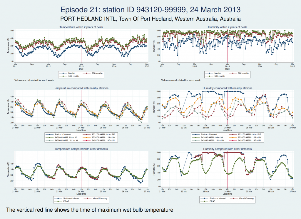
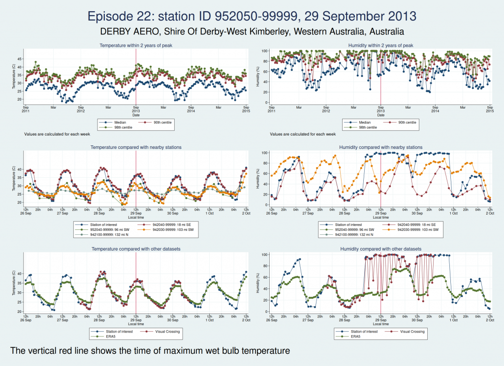
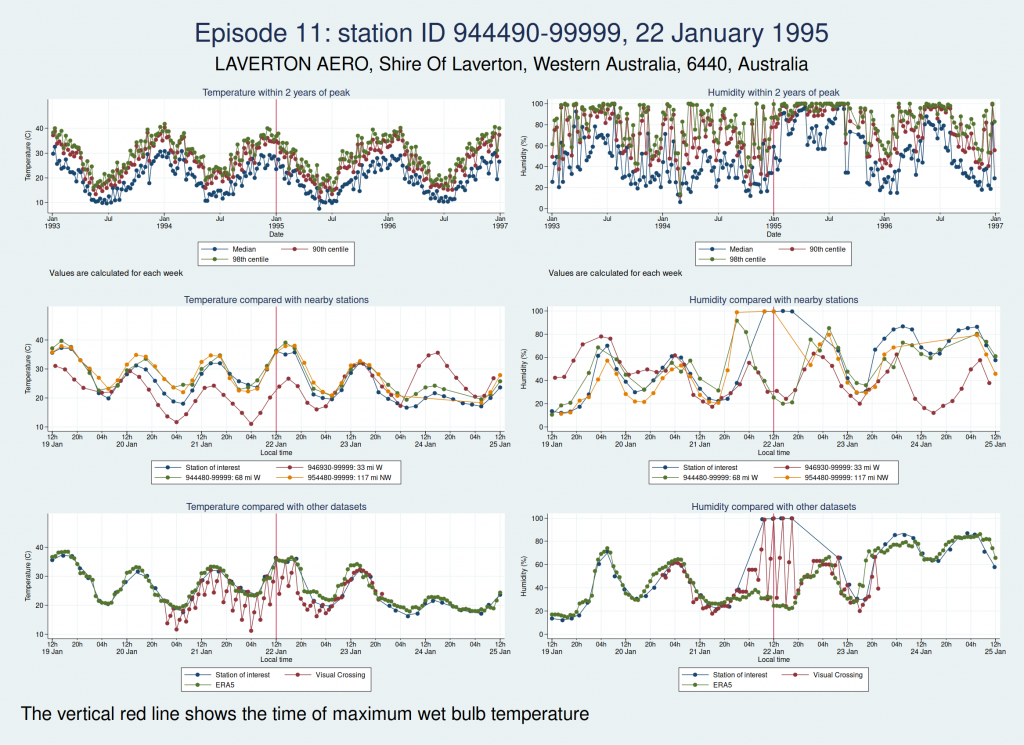
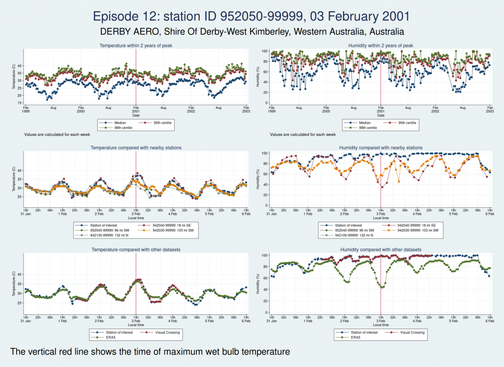
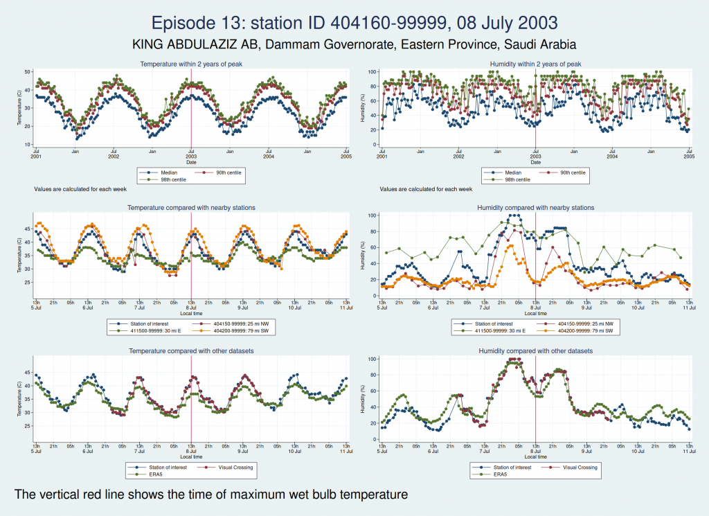
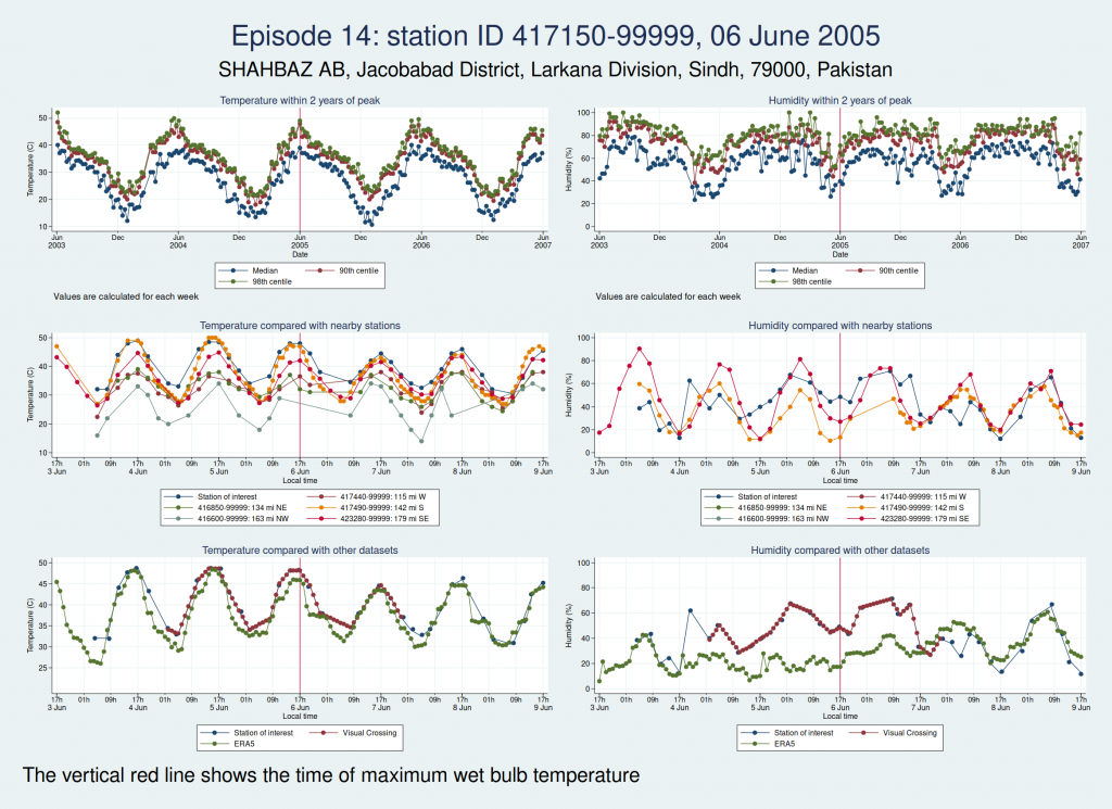
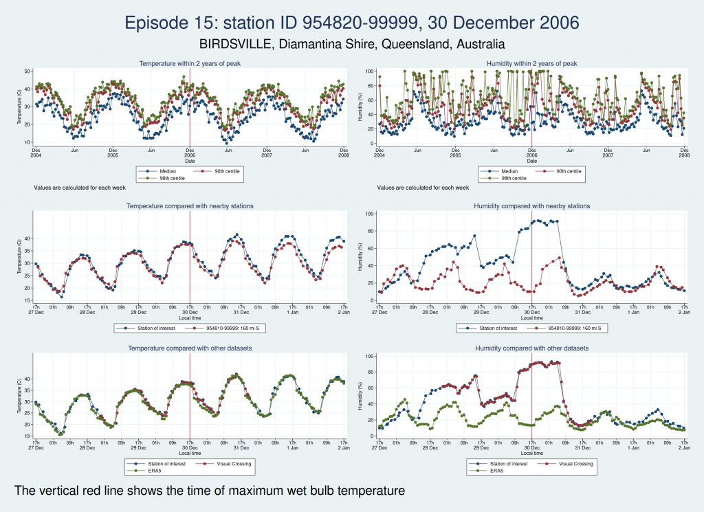
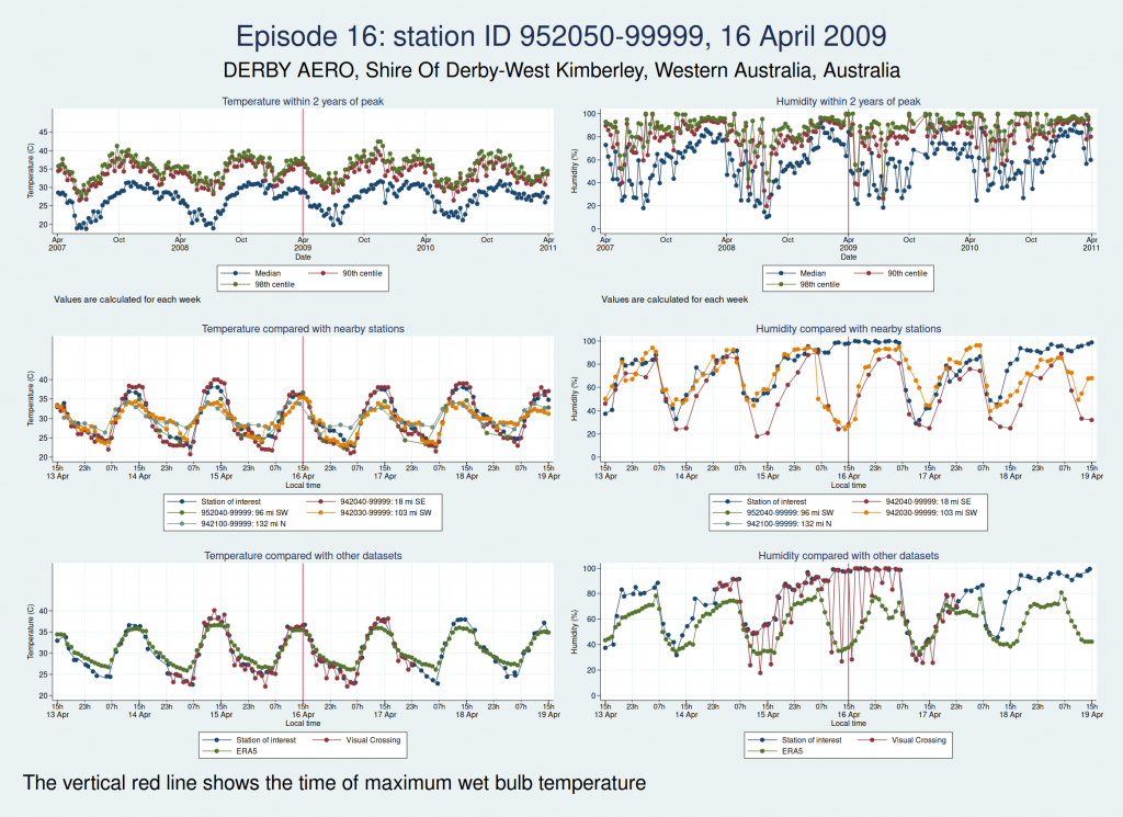
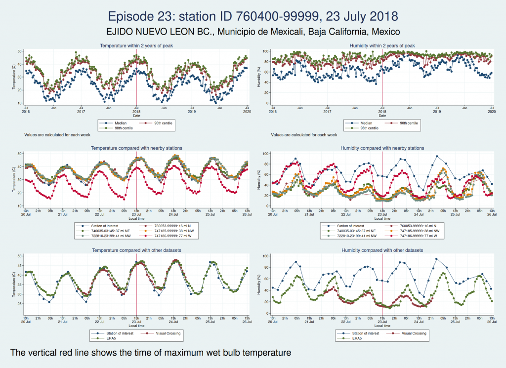
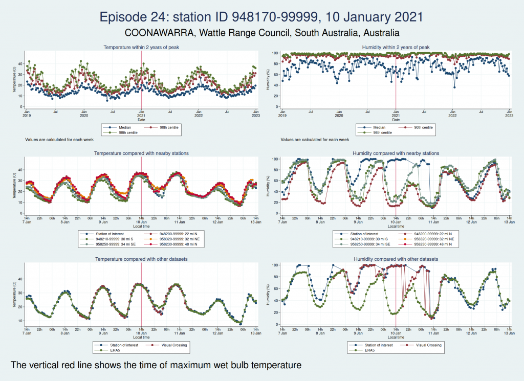
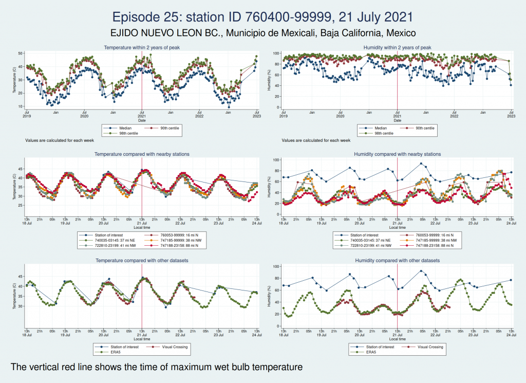
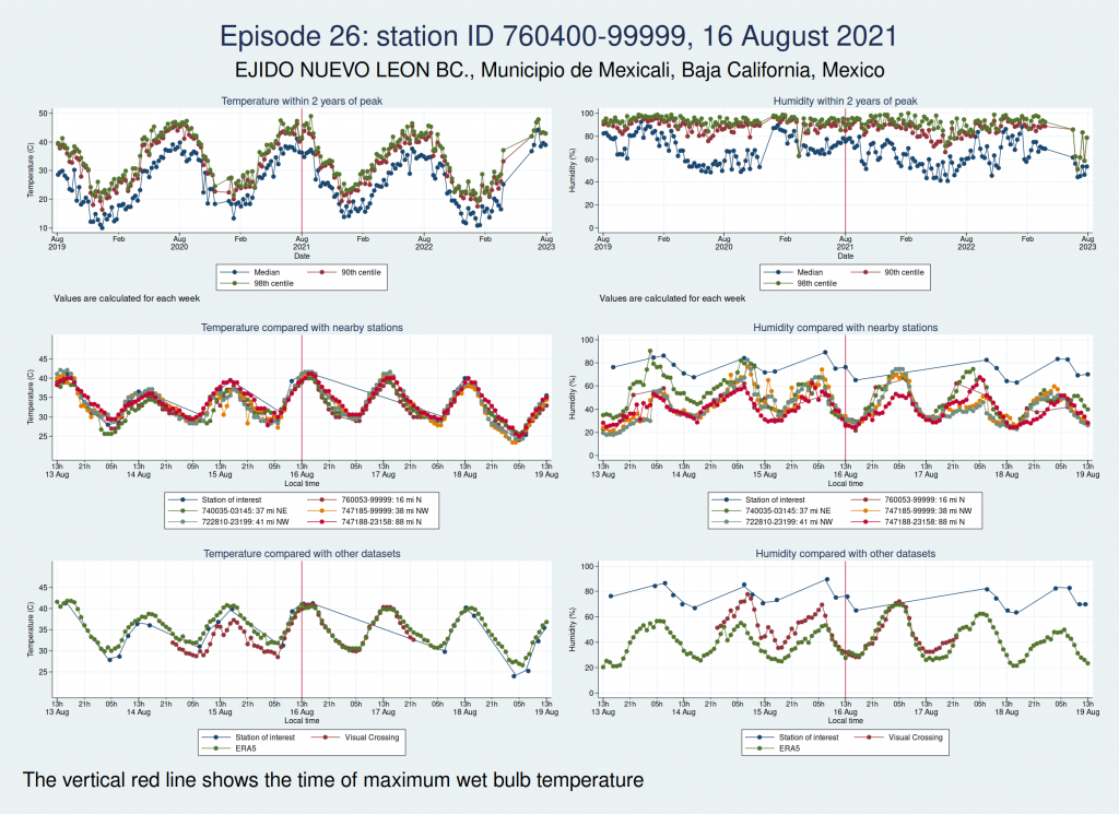
For each of those episodes, I have drawn a panel of 6 graphs which I hope is going to give us a clue about whether the data look reliable. I have plotted the dry bulb temperature (what we would normally call just “temperature”) on the left and the humidity on the right. WBT is calculated from dry bulb temperature and humidity, so if either of those variables looks wrong, then the calculated WBT is likely to be wrong as well.

The top graph shows the evolution over a 4 year period centred on the extreme episode. This lets us see if we’re following something approximating to normal seasonal variation for the location or if there has been some kind of spike. It’s a bit much to plot individual hourly values over that timescale, so I have calculated summary statistics for each week: the median, 90th centile, and 98th centile. If there’s a sudden increase in the gap between the median and higher centiles, that suggests that we may have weird outliers.

The middle graph shows a 6 day period centred on the maximum of WBT, this time plotting individual values, and shows nearby stations for comparison. I have included up to 5 other stations within 200 miles of the index station. There may be fewer than 5 other stations if there weren’t 5 stations within 200 miles. This lets us see whether the values are following a reasonable diurnal variation and whether they are obvious outliers compared with nearby stations.

The bottom graph compares the values with other datasets. I have used Visual Crossing and ERA5. Visual Crossing is a commercial weather service, and ERA5 is a publicly available dataset from the European Union’s Copernicus programme (part of the EU space programme). Often the Visual Crossing data are identical to the index station (I’ve added a tiny amount of random noise to the graphs here just so that you can still see both data series without one sitting on top of the other and hiding it), as Visual Crossing and the HadISD data that I used as my primary source both come from the same underlying dataset (the NOAA Integrated Surface Database). But Visual Crossing use different QC procedures to the ones the Met Office use, so where they do differ, that does suggest that something is up. The Visual Crossing data extend for only 3 days rather than the whole 6 days, as I’m a cheapskate and only subscribe to their free service and downloading much more data than that would have exceeded my download limits. ERA5 is a reanalysis dataset using data from various sources, and so is a more independent source of data.

The x axis for the 2 lower graphs is titled “Local time”, but I should point out that this isn’t necessarily exactly local time. Rather than go to the trouble of trying to look up local time zones for each location and date, I simply assumed that the world was divided into 24 equal sized time zones and that daylight savings time didn’t exist, for ease of calculation, and then just calculated the local time from the UTC time and the station longitude. So this may be an hour or two out from the actual local time, but should be close enough that we can tell if the diurnal variation seems reasonable. So if you’re keen enough to look up specific observations and find the times don’t quite match, that’s why.

As in my last post on this subject, I do need to emphasise that I am a medical statistician and not a climate scientist, and maybe I’ve overlooked something important or erred in my interpretation of the data. So please don’t assume that everything I write below is absolutely bullet-proof.

So, bearing that caveat in mind, let’s take a look at some graphs.

Here is the graph for the first episode:
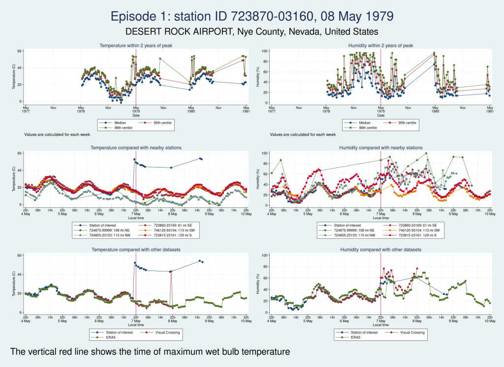
There are some really obvious problems here. The temperature data simply don’t look remotely plausible. I’d previously discussed this observation station with Dr Willett, and she thought maybe someone had mixed up Fahrenheit and Celsius in the temperature observations. The data do seem consistent with that: if you assume that some of those implausibly high values are actually figures in Fahrenheit, then they match up quite well with the other datasets.

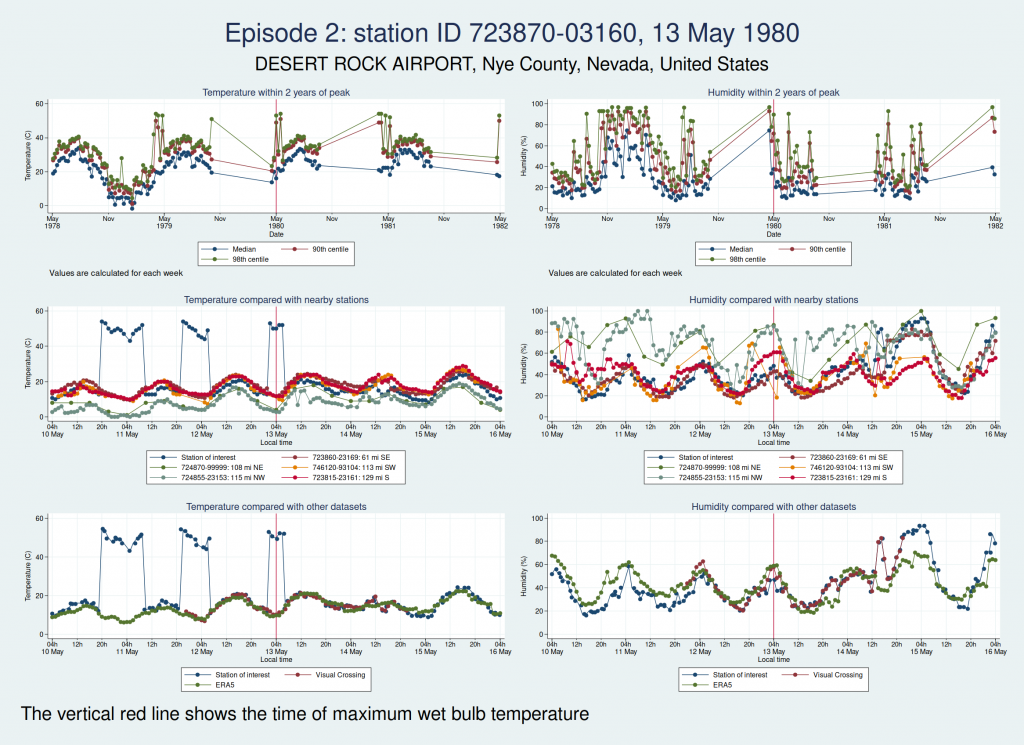
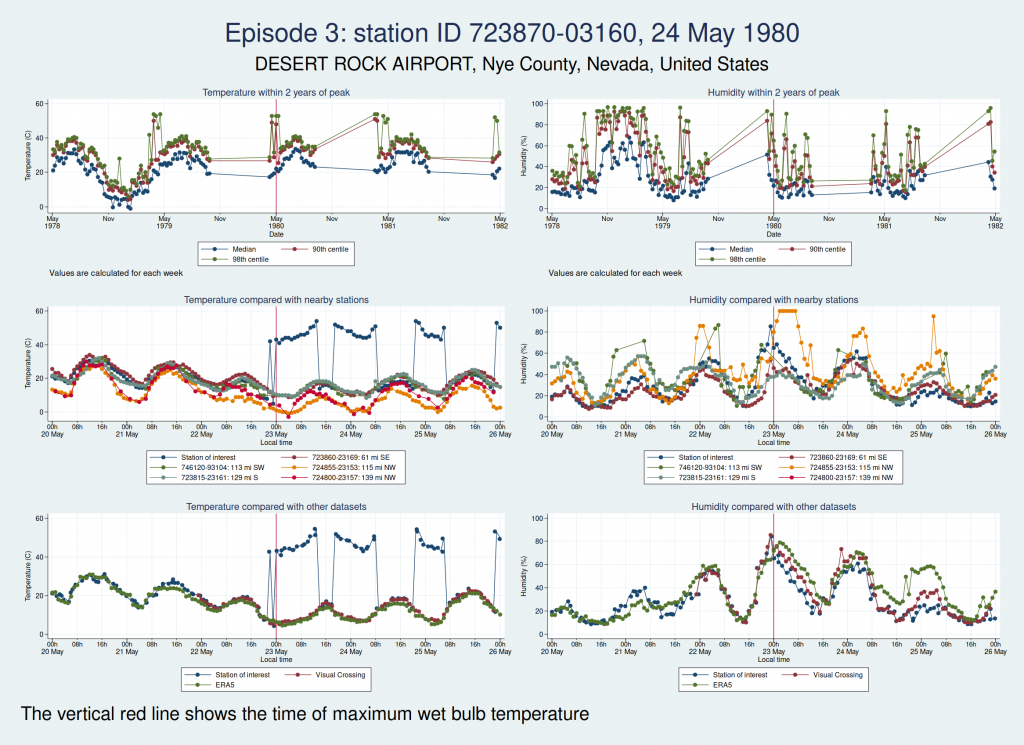
Here are the graphs for the next 2 episodes, at the same station. They are very similar. I won’t bore you with the graphs for the remaining episodes at that station, but they are also similar. It is clear that the episodes from this station are not trustworthy.
The next episode, episode 11, comes from Western Australia. The temperature looks perfectly plausible, but something looks wrong with the humidity, with an obvious spike around the time of the episode and a large deviation from the ERA5 dataset as well as the 2 nearest stations. This also doesn’t seem to be a genuine high WBT episode.
Episode 12, also from Western Australia, is similar, in that the temperature looks plausible but the humidity looks unreasonably high and seems more likely to be some kind of instrument malfunction than real extreme humidity.
Episode 13, from Saudi Arabia, is probably genuine. The temperature looks perfectly reasonable as judged by the seasonal average, the diurnal variation, and some nearby weather stations, though it is a little higher than the ERA5 dataset. The humidity doesn’t have the obvious red flags of the episodes 11 and 12, though it does seem to go up a bit within 24 h of the episode peak compared with a couple of days on each side. However, this web page from NOAA mentions that the highest dew point ever recorded was on 8 July 2003 at Dharhan, Saudia Arabia, which is more or less exactly the location of the weather station, and does suggest that some extreme weather was happening about that time.
Episode 14, from Pakistan, looks like it could be genuine, though again, it’s hard to be sure. The temperature certainly seems plausible, but the humidity, while broadly in line with nearby stations and not showing any obvious signs of a spike, is higher than the the ERA5 dataset. I haven’t been able to find a media report specifically about this location and date, but this article says that more than 500 people died from heat in May and June in Pakistan, India, and Bangladesh, which does seem consistent with this episode being genuine.
Episodes 15 to 22 are all from Australia. I don’t think any of them is genuine. The temperature looks plausible in all cases, but the humidity looks wrong: out of whack with the nearby stations and very different from the ERA5 data.
Episode 23 is from Mexico. Again, the temperature looks plausible, but the humidity is very different to both the ERA5 and the Visual Crossing data, as well as being considerably higher than several nearby weather stations. I don’t think this is genuine.
Episode 24 is from Australia again, and the humidity looks wrong again. I don’t think this is genuine either.
Episodes 25 and 26 are from the same weather station in Mexico as episode 23, and the humidity again looks implausible.
So of our 26 episodes, it looks like almost all of them are not real and are probably the result of faulty instrumentation or faulty data entry into a database. Episode 13 from Saudi Arabia in 2003 looks very likely to be real, and episode 14 from Pakistan in 2005 may very well be real, though it’s hard to be sure.

So in fact prolonged spells of WBT above 35°C do seem to be very rare, for now at least. In my next blogpost I shall look more at data quality and see if I can come up with a statistical algorithm for distinguishing the real episodes from the others, as I don’t think it’s going to be feasible to look at these graphs one at a time for the less extreme, but still worrying episodes of high WBT, for example episodes of WBT above 32°C, as these are much more common. Once I have been able to distinguish more reliably between the episodes that are real and those that aren’t, then I’ll be able to do a better job of looking at whether the frequency of dangerously high WBT episodes is increasing.
Wet Bulb Temperatures, Part 1

I’ve gotta be honest, I hadn’t heard of the concept of a “web bulb temperature” until earlier this year. I’ve heard about them quite a bit in recent months, and I’m sure we’ll all be hearing about them a lot more often from now on.

If the concept is also new to you, let me explain. It’s pretty much what it says. You take a traditional thermometer with a bulb of liquid at the bottom, and you wrap the bulb in a wet cloth. The water in the cloth evaporates, and the evaporative cooling means that the thermometer will read a lower temperature than it would have done if it were dry. The amount of cooling depends on the humidity of the air: in dry conditions, the evaporative cooling is efficient and the wet bulb temperature will be considerably lower than the dry bulb temperature, but in humid conditions, the difference is less marked. At the extreme, in 100% relative humidity, the water cannot evaporate at all and the wet bulb temperature (WBT) will be the same as the dry bulb temperature.

Why does this matter? And why am I writing about physics on a blog that’s mostly about medical statistics? Well, it has important implications for human health. People die in heat waves. And it turns out that WBT is important in understanding just how dangerous a heat wave is.

If you are exposed to 45°C heat for any length of time, that sounds pretty scary, but it need not necessarily be too dangerous as long as the air is not too humid, you are reasonably healthy, and you can stay well hydrated. We have evolved a cunning mechanism to stay cool in hot temperatures, namely sweating. This works in exactly the same way as the evaporative cooling in a wet bulb thermometer, and cools us down. Even if the air temperature is hotter than our body temperature, then in a dry atmosphere we can still cool down by sweating. But if we’re exposed to that kind of heat in humid conditions, then we’re in trouble.

So WBT is a way of measuring the combined effects of temperature and humidity. There is no magic cutoff for WBT below which everyone is fine and above which everyone dies. Moderately high WBTs that are mostly survivable for young healthy people may still kill large numbers of frail elderly people. However, the threshold of a WBT of 35°C is often mentioned as a limit of human survivability, and some research suggests that lower WBTs may be dangerous even to young healthy people. Certainly for people who aren’t young and healthy, high-ish WBTs below 35°C are likely to cause considerable excess mortality. The duration of high temperatures is also important. An extreme WBT may be survivable for 30 min, but not if you’re exposed to it for several hours.

The idea for writing this blogpost came from a conversation on social media. Fellow Mastodon user Kenneth Freeman asked the question of whether there is any way to know when WBTs hit 35°C somewhere on the planet. After a little bit of thought, I realised that this was a really important question to answer, so I thought I’d have a go.

If you are impatient to know what the answer is, feel free to skip to the results below. But if you are interested in all the geeky stuff about how I found out, then read on.

There are many weather-related websites that will let you search for the weather conditions at a given location at a given time. However, although they are presumably linked up to giant datasets of weather conditions at different locations and times, and so could in theory be easily queried to find the locations and times for specific weather conditions, I couldn’t find any website that would let you search that way round. But Kenneth tooted a link to an relevant scientific paper which had also examined the question of how often WBTs of 35°C are observed. They had used data from the HadISD dataset: a large dataset of observations from weather stations around the world, going back in some cases to the 1930s and updated monthly with the latest data, which is freely available online thanks to the UK Met Office. This seemed to be a good way to find out the answer to Kenneth’s question.

A good way, though not a trivially easy way. There are about 23GB of data in the dataset, which all needs to be sifted through. The dataset is stored in netCDF files, which apparently is a format used widely in climate science, but was new to me. However, there is of course a Python package to read netCDF files, so after a brief learning curve I was able to read the data and look for high values of WBT using Python code.

As an aside, this project turned out to be a brilliant example of the power of open data. One of the things that 20+ years’ professional experience as a statistician has taught me is that you should always make sure you understand exactly what you are looking at in your dataset before you try to do anything with the data. So as part of that process, I re-calculated the WBTs using the temperature and humidity data in the dataset to make sure I’d understood what the WBT variable in the dataset was and that it was what I was expecting it to be.

The WBTs that I calculated were not the same as the WBTs provided in the dataset.

I assumed at this stage that I must have got something wrong. I’m a medical statistician, not a climate scientist, and I figured that the climate scientists at the Met Office would know how to calculate WBT better than I do. So I emailed the Met Office to ask them what I was doing wrong, and it turned out that in fact my calculations were correct and they had an error in their code that they’d used to calculate WBT. I have to say that I am very impressed with the speed with which they corrected their data. The day after I emailed them, an updated version of the dataset appeared on their website, along with an explanation that they’d had to correct it.

It’s ever so easy to make mistakes when analysing data. We all do it. By making their data freely available online, the Met Office had vastly increased the chances that someone might come along and spot the mistake so it could be corrected. How long would that error have remained in the dataset if the data had not been freely available, one wonders? Top marks to the Met Office for making the data available and for promptly and transparently correcting the error once I’d alerted them to it.

Although the dataset goes back to the 1930s in some cases, most of the weather stations included in the dataset don’t go back that far. Many of the stations came on stream in the 1970s and 1980s. By 1990, 90% of the current number of weather stations were already contributing data. So I am starting my analysis at 1990, to avoid the problem of trying to make comparisons across time periods with vastly different amounts of data collection.

In addition to that, the data quality before 1990 looks like it may not always be that great. I did have a look back at earlier data to see what was there, and I found one weather station in the US with some very prolonged spells of WBT > 35°C around 1980. This seemed like such an outlier I contacted the Met Office about it (it has to be said that the team behind the HadISD dataset at the Met Office are wonderfully helpful people), and after taking a look at it they thought that the data really didn’t seem reliable, and that the most likely explanation was that the temperature data had been recorded in Fahrenheit and whoever originally uploaded the data had forgotten to convert it to Celsius.

Data quality is something that needs a lot of careful work, and the Met Office do have some extensive quality control procedures, which are described in a published paper. Of course the occasional spurious value can slip through even the most rigorous quality control, but having excluded the pre-1990 data, I am assuming that the Met Office’s quality control procedures are good enough and that the data are reliable. Certainly nothing else I’ve seen later than those values from the US station around 1980 leapt out at me as being obviously weird.

This analysis is somewhat quick and dirty at this stage. You will note that I’ve called this post “Wet Bulb Temperatures, Part 1”, as I plan to come back another day and tell you about some more sophisticated analyses. I don’t have any maps to show you today, and I’d love to do that in the reasonably near future. I have also used a very rough and ready method of calculating the duration of spells of high WBT: I have assumed that the spell lasted from the first time a weather station recorded a WBT above the threshold and ended at the last time the WBT was above the threshold at the same station, having been consistently above the threshold since. For long spells and stations that record data every hour, that’s probably not a bad approximation. However, consider a hypothetical example of a station reporting data only every 3 hours, with the WBT at 34.9 at 1200, 36 at 1500, and 34.9 at 1800. I would have counted this as a zero duration above 35, as there was only a single observation above 35. However, in practice, the WBT was probably above 35 for most of the time between 1200 and 1800. So my analysis here is rather conservative: the actual number of spells of long duration is probably higher than I’m reporting here. It wouldn’t be that hard to come up with more accurate estimates by interpolation between the observations, but I haven’t done that yet. I’ll do that another time and let you know what that looks like.

I have also not taken account of where stations are. If 2 stations that are close to each other both report episodes of high WBT at the same time, I have counted that as 2 separate episodes, although it might be more accurate to count it as 1 big episode. However, I guess it’s still a measure of how serious the extreme temperatures are. Also, what I’m focusing mostly on here is episodes where the WBT was at least 35°C for 6 h, as those as the episodes which are most likely to pose a serious threat to human survivability, and I have checked and none of those episodes were recorded at more than one station on a single day. I can’t promise that’s true of some of the less extreme episode durations. I hope to do some kind of analysis of the geographical extent of extreme WBT episodes some other time.

And my final caveat is that I am a medical statistician, not a climate scientist. I am aware that I’m going rather outside my field of expertise by analysing climate data, and I can’t exclude the possibility that I have overlooked something really important that would be obvious to any climate scientist. If you think I have erred in that way, do let me know via the comments below.

Anyway, with those caveats in mind, let’s look at the results.

Results

I’ll start with a list of extreme WBT episodes. These were any time the WBT was at least 35°C for 6 h or more (there were in fact no episodes longer than 6 h), or was at least 32°C for more than 12 h.

Weather stationDate of observationHours WBT
≥ 35
Hours WBT
≥ 32
Max WBT
944490-99999, LAVERTON AERO, Shire Of Laverton, Western Australia, 6440, Australia (-28.617, 122.417)22 Jan 19956636.2
412460-99999, SOHAR MAJIS, Al Batinah North Governorate, Oman (24.467, 56.65)5 Jul 19981532.9
412460-99999, SOHAR MAJIS, Al Batinah North Governorate, Oman (24.467, 56.65)12 Jul 19981834.2
412420-99999, DIBA, Musandam Governorate, Oman (25.617, 56.25)8 Jul 20011533.4
412420-99999, DIBA, Musandam Governorate, Oman (25.617, 56.25)4 Jul 20021833.2
412580-99999, MINA SULTAN QABOOS, Muscat, Muscat Governorate, Oman (23.633, 58.567)28 Jun 20041532.7
412420-99999, DIBA, Musandam Governorate, Oman (25.617, 56.25)12 Jul 20041533.5
417150-99999, SHAHBAZ AB, Shikārpur District, Sindh, Pakistan (28.284, 68.45)6 Jun 200561237.4
942170-99999, ARGYLE AERODROME, Shire Of Wyndham-East Kimberley, Western Australia, Australia (-16.633, 128.45)13 Jan 201361236.9
946590-99999, WOOMERA, Pastoral Unincorporated Area, South Australia, Australia (-31.144, 136.817)11 Mar 20136936.6
760400-99999, EJIDO NUEVO LEON BC., Municipio de Mexicali, Baja California, Mexico (32.4, -115.183)23 Jul 201861238.4
412170-99999, ABU DHABI INTL, Abu Dhabi, Abu Dhabi Emirate, United Arab Emirates (24.433, 54.651)19 Aug 20201533.1
760400-99999, EJIDO NUEVO LEON BC., Municipio de Mexicali, Baja California, Mexico (32.4, -115.183)21 Jul 20216637.5
760400-99999, EJIDO NUEVO LEON BC., Municipio de Mexicali, Baja California, Mexico (32.4, -115.183)16 Aug 20216637.2
412670-99999, QALHAT, Ash Sharqiyah South Governorate, Oman (22.667, 59.4)9 Jul 202233336.2
412400-99999, KHASAB PORT, Musandam Governorate, Oman (26.217, 56.25)24 Aug 20233033.1

(The “Weather station” details are the ID number of the weather station and its name as recorded in the HadISD dataset, followed by the address of its region, and finally the latitude and longitude coordinates.)

What we can see is that there have been only a handful of episodes of a WBT of ≥ 35°C that lasted for 6h, and they are skewed towards the more recent years of the dataset. What is particularly striking is that the paper by Raymond et al I linked to previously, published in 2020 and using data up to 2017, which looked at the emergence of high WBTs, is already badly out of date. Of the 7 episodes of WBT ≥ 35°C that I have found, 3 of them have occurred after 2017. There are also 2 episodes of WBT ≥ 32°C that lasted for over 24 hours, which must be very hard to deal with, which have both occurred in the last couple of years.

Although I haven’t done any statistical analysis to see how likely it is that the clustering of extreme heat episodes in the later period could be due to chance, it certainly looks at first glance that the frequency of such events is increasing.

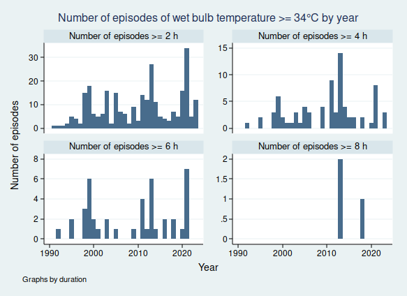
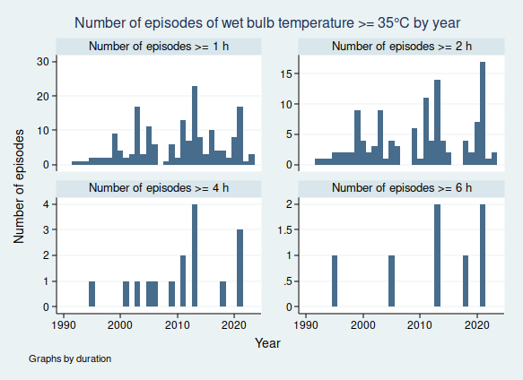
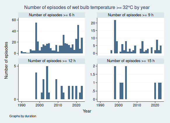
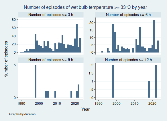
Let’s look at some graphs as well. Here are the number of episodes of WBTs above thresholds from 32 to 35°C of varying durations over time.

Again, I have not done any statistical analysis of this, but it does seem that there is an upward trend in many of those graphs with the frequency of high WBT events increasing over time.

If this trend of increasingly extreme WBT events continues, this could have serious implications for human health in the affected areas. It is no exaggeration to say that thousands, maybe millions, could die in such extreme weather events.

So this would be a really bad time to relax our efforts to reduce greenhouse gas emissions. But surely no-one would be stupid enough to do that, would they?

Update 29 December 2023: please see the next post, Wet Bulb Temperatures, Part 2, which explains why much of the data above may not be all it seems.

Coronavirus: when will we be back to normal?

Well, 2020 was quite a year. I’m sure it’s one that most of us are glad is over.

Here in the UK, we have been badly hit by the covid-19 pandemic, indeed we have one of the worst death rates in the world. It didn’t have to be this way: as an island nation with a well developed health system, we could have handled the pandemic far better. Unfortunately, we have a government of incompetent idiots who have simply not been up to the job of dealing with it.

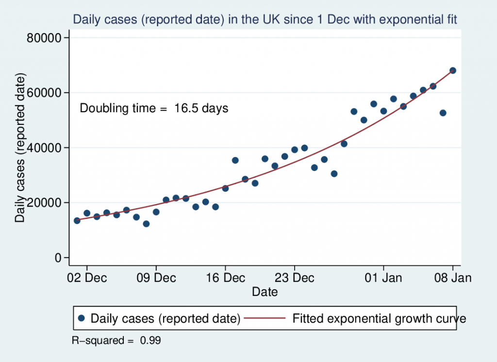
As I write this in early January 2021, covid-19 cases are at high levels and rising rapidly, following a reasonable approximation to exponential growth since the beginning of December with a doubling time of just over a fortnight. This is, frankly, terrifying, given that hospitals are already stretched to their limits.

But there is a ray of hope, in the shape of vaccines. We now have 3 vaccines approved for use in the UK, and over a million people have already been vaccinated. It has been an extraordinary achievement to get not one, but 3 vaccines invented, tested in large clinical trials, and approved in such a short space of time. The scientists, clinicians, clinical research professionals, statisticians, regulators, and last but by no means least clinical trial volunteers should be incredibly proud of what they have achieved.

It will take many months or possibly even years to vaccinate the whole UK population. But sensibly, vaccination is being prioritised for those most at risk, mainly starting with older age groups. The government have promised that they will have vaccinated the 15 million people at highest risk by the middle of February, including everyone over 70 as well as health and social care workers and those who are clinically extremely vulnerable.

They will break that promise of course, just like they break all their promises.

But hopefully at some time in the next few months, even if not as early as mid-February, all those high risk people will have been vaccinated. What does that mean for getting our lives and the economy back to normal?

Vaccinating that number of people will certainly not give us any meaningful herd immunity, but given that most deaths from covid-19 occur in the elderly, we would expect that vaccinating all the over 70s will dramatically cut the death rate.

At that stage, there may be a temptation on the part of politicians to open up the economy again, taking the view that perhaps it doesn’t matter if covid-19 is still circulating widely if few people are dying from it.

I think this would be a mistake. First, just because most deaths from covid-19 occur in the elderly, it does not mean that younger people don’t die from it at all. Very approximately 10% of covid-19 deaths are in people under the age of 60, and if the virus is spreading rampantly through the population and millions of people are infected, then the absolute numbers of younger people who die will not be negligible.

But there is a further reason to be cautious: long covid.

There is still much that we don’t know about long covid, but what we do know is that a small proportion of patients continue to have significant symptoms weeks or even months after the acute infection. It has been estimated that about 1 in 10 patients still have symptoms after 12 weeks.

If millions of people are being infected, then that suggests that hundreds of thousands of people may suffer from long covid.

What we don’t yet know is how long the symptoms of long covid last. Maybe most people will be back to normal within a year, or maybe the symptoms are generally permanent. We simply do not yet have enough long term data to know, given that the disease only first appeared just over a year ago.

Some of the symptoms of long covid are very worrying. Quite apart from potentially permanent lung and heart damage, one study found that cognitive performance could be reduced in a manner equivalent to 10 years of ageing.

If the symptoms of long covid do turn out to be permanent, then having hundreds of thousands of people affected by them would be nothing short of a public health catastrophe.

So while there will be a temptation to get back to normal life once deaths from covid are much reduced following vaccination of those at higher risk, I think that temptation needs to be resisted for a while longer until enough of the population have been vaccinated to give significant herd immunity.

At any rate, much as I miss my local pubs, I will not be going back to them until after I’ve had my vaccine.

Covid-19 deaths

I wrote last week about how the number of cases of coronavirus were following a textbook exponential growth pattern. I didn’t look at the number of deaths from coronavirus at the time, as there were too few cases in the UK for a meaningful analysis. Sadly, that is no longer true, so I’m going to take a look at that today.

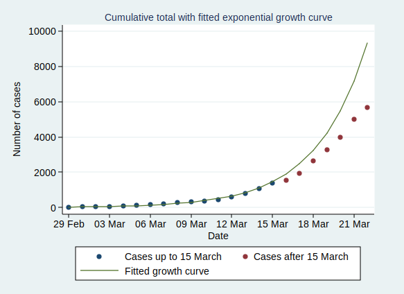
However, first, let’s have a little update on the number of cases. There is a glimmer of good news here, in that the number of cases has been rising more slowly than we might have predicted based on the figures I looked at last week. Here is the growth in cases with the predicted line based on last week’s numbers.

As you can see, cases in the last week have consistently been lower than predicted based on the trend up to last weekend. However, I’m afraid this is only a tiny glimmer of good news. It’s not clear whether this represents a real slowing in the number of cases or merely reflects the fact that not everyone showing symptoms is being tested any more. It may just be that fewer cases are being detected.

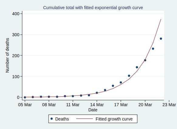
So what of the number of deaths? I’m afraid this does not look good. This is also showing a classic exponential growth pattern so far:

The last couple of days’ figures are below the fitted line, so there is a tiny shred of evidence that the rate may be slowing down here too, but I don’t think we can read too much into just 2 days’ figures. Hopefully it will become clearer over the coming days.

One thing which is noteworthy is that the rate of increase of deaths is faster than the rate of increase of total cases. While the number of cases is doubling, on average, every 2.8 days, the number of deaths is doubling, on average, every 1.9 days. Since it’s unlikely that the death rate from the disease is increasing over time, this does suggest that the number of cases is being recorded less completely as time goes by.

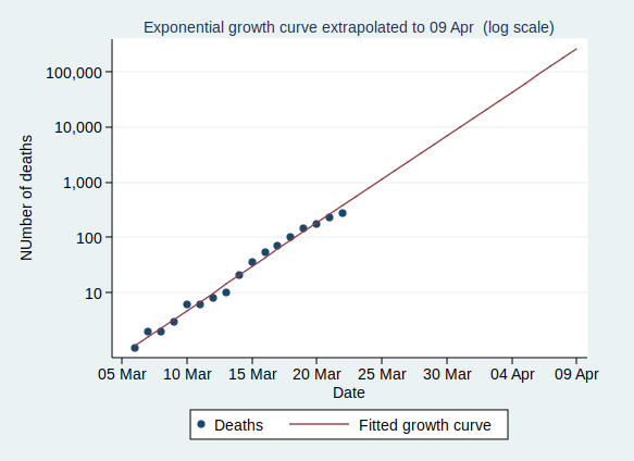
So what happens if the number of deaths continues growing at the current rate? I’m afraid it doesn’t look pretty:

(note that I’ve plotted this on a log scale).

At that rate of increase, we would reach 10,000 deaths by 1 April and 100,000 deaths by 7 April.

I really hope that the current restrictions being put in place take effect quickly so that the rate of increase slows down soon. If not, then this virus really is going to have horrific effects on the UK population (and of course on other countries, but I’ve only looked at UK figures here).

In the meantime, please keep away from other people as much as you can and keep washing those hands.

Covid-19 and exponential growth

One thing about the Covid-19 outbreak that has been particularly noticeable to me as a medical statistician is that the number of confirmed cases reported in the UK has been following a classic exponential growth pattern. For those who are not familiar with what exponential growth is, I’ll start with a short explanation before I move on to what this means for how the epidemic is likely to develop in the UK. If you already understand what exponential growth is, then feel free to skip to the section “Implications for the UK Covid-19 epidemic”.

A quick introduction to exponential growth

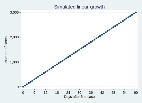
If we think of something, such as the number of cases of Covid-19 infection, as growing at a constant rate, then we might think that we would have a similar number of new cases each day. That would be a linear growth pattern. Let’s assume that we have 50 new cases each day, then after 60 days we’ll have 3000 cases. A graph of that would look like this:

That’s not what we’re seeing with Covid-19 cases. Rather than following a linear growth pattern, we’re seeing an exponential growth pattern. With exponential growth, rather than adding a constant number of new cases each day, the number of cases increases by a constant percentage amount each day. Equivalently, the number of cases multiplies by a constant factor in a constant time interval.

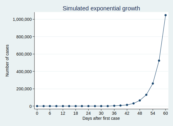
Let’s say that the number of cases doubles every 3 days. On day zero we have just one case, on day 3 we have 2 cases, and day 6 we have 4 cases, on day 9 we have 8 cases, and so on. This makes sense for an infectious disease epidemic. If you imagine that each person who is infected can infect (for example) 2 new people, then you would get a pattern very similar to this. When only one person is infected, that’s just 2 new people who get infected, but if 100 people have the disease, then 200 people will get infected in the same time.

On the face of it, the example above sounds like it’s growing much less quickly than my first example where we have 50 new cases each day. But if you are doubling the number of cases each time, then you start to get to scarily large numbers quite quickly. If we carry on for 60 days, then although the number of cases isn’t increasing much at first, it eventually starts to increase at an alarming rate, and by the end of 60 days we have over a million cases. This is what it looks like if you plot the graph:

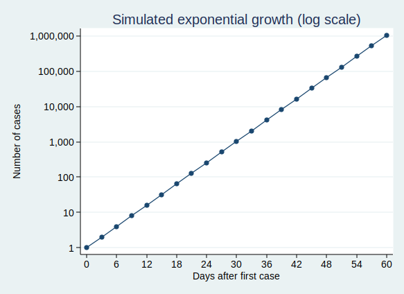
It’s actually quite hard to see what’s happening at the beginning of that curve, so to make it easier to see, let’s use the trick of plotting the number of cases on a logarithmic scale. What that means is that a constant interval on the vertical axis (generally known as the y axis) represents not a constant difference, but a constant ratio. Here, the ticks on the y axis represent an increase in cases by a factor of 10.

Note that when you plot exponential growth on a logarithmic scale, you get a straight line. That’s because we’re increasing the number of cases by a constant ratio in each unit time, and a constant ratio corresponds to a constant distance on the y axis.

Implications for the UK Covid-19 epidemic

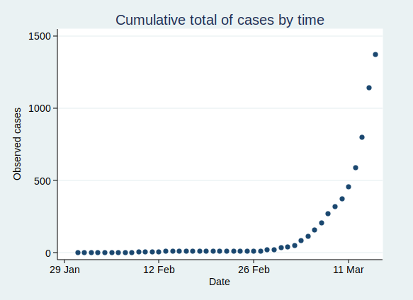
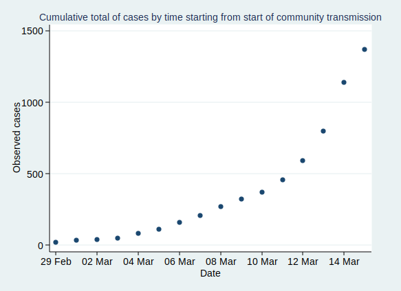
OK, so that’s what exponential growth looks like. What can we see about the number of confirmed Covid-19 cases in the UK? Public Health England makes the data available for download here. The data have not yet been updated with today’s count of cases as I write this, so I added in today’s number (1372) based on a tweet by the Department of Health and Social Care.

If you plot the number of cases by date, it looks like this:

That’s pretty reminiscent of our exponential growth curve above, isn’t it?

It’s worth noting that the numbers I’ve shown are almost certainly an underestimate of the true number of cases. First, it seems likely that some people who are infected will have only very mild (or even no) symptoms, and will not bother to contact the health services to get tested. You might say that it doesn’t matter if the numbers don’t include people who aren’t actually ill, and to some extent it doesn’t, but remember that they may still be able to infect others. Also, there is a delay from infection to appearing in the statistics. So the official number of confirmed cases includes people only after they have caught the disease, gone through the incubation period, developed symptoms that were bothersome enough to seek medical help, got tested, and have the test results come back. This represents people who were infected probably at least a week ago. Given that the number of cases are growing so rapidly, the number of people actually infected today will be considerably higher than today’s statistics for confirmed cases.

Now, before I get into analysis, I need to decide where to start the analysis. I’m going to start from 29 February, as that was when the first case of community transmission was reported, so by then the disease was circulating within the UK community. Before then it had mainly been driven by people arriving in the UK from places abroad where they caught the disease, so the pattern was probably a bit different then.

If we start the graph at 29 February, it looks like this:

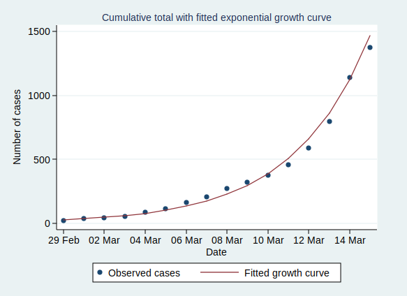
Now, what happens if we fit an exponential growth curve to it? It looks like this:

(Technical note for stats geeks: the way we actually do that is with a linear regression analysis of the logarithm of the number of cases on time, calculate the predicted values of the logarithm from that regression analysis, and then back-transform to get the number of cases.)

As you can see, it’s a pretty good fit to an exponential curve. In fact it’s really very good indeed. The R-squared value from the regression analysis is 0.99. R-squared is a measure of how well the data fit the modelled relationship on a scale of 0 to 1, so 0.99 is a damn near perfect fit.

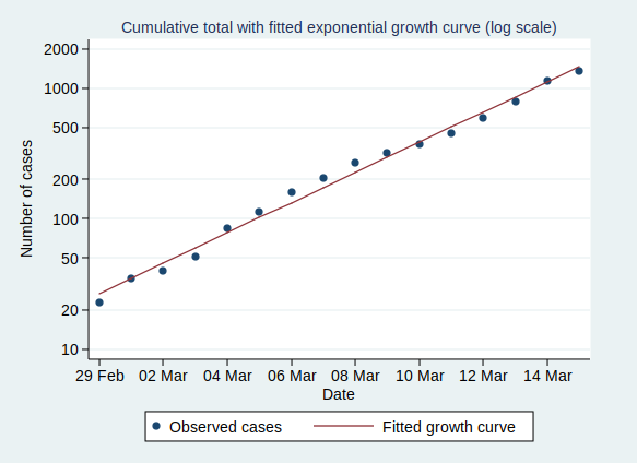
We can also plot it on a logarithmic scale, when it should look like a straight line:

And indeed it does.

There are some interesting statistics we can calculate from the above analysis. The average rate of growth is about a 30% increase in the number of cases each day. That means that the number of cases doubles about every 2.6 days, and increases tenfold in about 8.6 days.

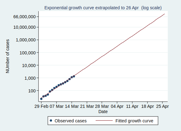
So what happens if the number of cases keeps growing at the same rate? Let’s extrapolate that line for another 6 weeks:

This looks pretty scary. If it continues at the same rate of exponential growth, we’ll get to 10,000 cases by 23 March (which is only just over a week away), to 100,000 cases by the end of March, to a million cases by 9 April, and to 10 million cases by 18 April. By 24 April the entire population of the UK (about 66 million) will be infected.

Now, obviously it’s not going to continue growing at the same rate for all that time. If nothing else, it will stop growing when it runs out of people to infect. And even if the entire population have not been infected, the rate of new infections will surely slow down once enough people have been infected, as it becomes increasingly unlikely that anyone with the disease who might be able to pass it on will encounter someone who hasn’t yet had it (I’m assuming here that people who have already had the disease will be immune to further infections, which seems likely, although we don’t yet know that for sure).

However, that effect won’t kick in until at least several million people have been infected, a situation which we will reach by the middle of April if other factors don’t cause the rate to slow down first.

Several million people being infected is a pretty scary prospect. Even if the fatality rate is “only” about 1%, then 1% of several million is several tens of thousands of deaths.

So will the rate slow down before we get to that stage?

I genuinely don’t know. I’m not an expert in infectious disease epidemiology. I can see that the data are following a textbook exponential growth pattern so far, but I don’t know how long it will continue.

Governments in many countries are introducing drastic measures to attempt to reduce the spread of the disease.

The UK government is not.

It is not clear to me why the UK government is taking a more relaxed approach. They say that they are being guided by the science, but since they have not published the details of their scientific modelling and reasoning, it is not possible for the rest of us to judge whether their interpretation of the science is more reasonable than that of many other European countries.

Maybe the rate of infection will start to slow down now that there is so much awareness of the disease and of precautions such as hand-washing, and that even in the absence of government advice, many large gatherings are being cancelled.

Or maybe it won’t. We will know more over the coming weeks.

One final thought. The government’s latest advice is for people with mild forms of the disease not to seek medical help. This means that the rate of increase of the disease may well appear to slow down as measured by the official statistics, as many people with mild disease will no longer be tested and so not be counted. It will be hard to know whether the rate of infection is really slowing down.

More nonsense about vaping

A paper was published in PLoS One a few days ago by Soneji et al that made the bold claim that “e-cigarette use currently represents more population-level harm than benefit”.

That claim, for reasons we’ll come to shortly, is not remotely supported by the evidence. But this leaves me with rather mixed feelings. On the one hand, I am disappointed that such a massively flawed paper can make it through peer review. It is a useful reminder that just because a paper is published in a peer reviewed journal does not mean that it is necessarily even approximately believable.

But on the other hand, the paper was largely ignored by the British media. I find that rather encouraging. We have seen flawed studies about e-cigarettes cheerfully picked up by the media before (here’s one example, but there are plenty of others), who don’t seem too bothered about whether the research is any good or not, just that it makes a good story. Perhaps the media are starting to learn that parroting press releases, when those press releases are a load of nonsense, is not such a great idea after all.

Sure, the paper made it into two of our most dreadful and unreliable newspapers, but as far as I can tell, the story was not picked up at all by the BBC or any of the broadsheet newspapers. And that’s a good thing.

So what was wrong with the paper then?

It’s important to understand that the paper did not collect any new data. There was no survey or clinical trial or review of health records or anything like that. It was purely a mathematical modelling study based on previously published data.

Soneji et al attempted to model the benefits and harms of e-cigarettes at the population level by considering what proportion of smokers are helped to quit by e-cigarettes, thus experiencing a health benefit, and what proportion of never-smokers are encouraged to start smoking by e-cigarettes, thus experiencing harm.

Of course a mathematical model is only as good as the assumptions that go into it. The big problem with this model is that there is no evidence that e-cigarettes encourage anyone to start smoking.

Now, there have been studies that show that young people who use e-cigarettes are more likely to start smoking that young people who don’t use e-cigarettes. Soneji et al used a meta-analysis of those studies to obtain the necessary estimates of just how much more likely that was.

But there is a big problem here. The assumption in Soneji et al’s modelling paper is that the observed association between e-cigarette use and subsequent smoking initiation is causal. In other words, they assume that those people who use e-cigarettes and then go on to start smoking have started smoking because they used e-cigarettes.

A moment’s thought shows that there are other perfectly plausible explanations rather than a causal relationship. Surely it is more likely that there is confounding by personality type here. The sort of person who uses e-cigarettes is probably the type of person who is more likely to start smoking. If e-cigarettes were not available, those people who first used e-cigarettes and then subsequently started smoking would probably have started smoking anyway.

But this is to some extent guesswork. While Soneji et al can most definitely not prove that the association between e-cigarette use and subsequent smoking is causal, no-one can prove it isn’t causal from those association studies, even if another explanation is more plausible.

We can, however, look at other data to help understand what is going on. Given that e-cigarettes are now far more available than they were a few years ago, if e-cigarettes were really causing people who wouldn’t otherwise have smoked to start smoking, then you would expect to see population-level rates of smoking start to increase.

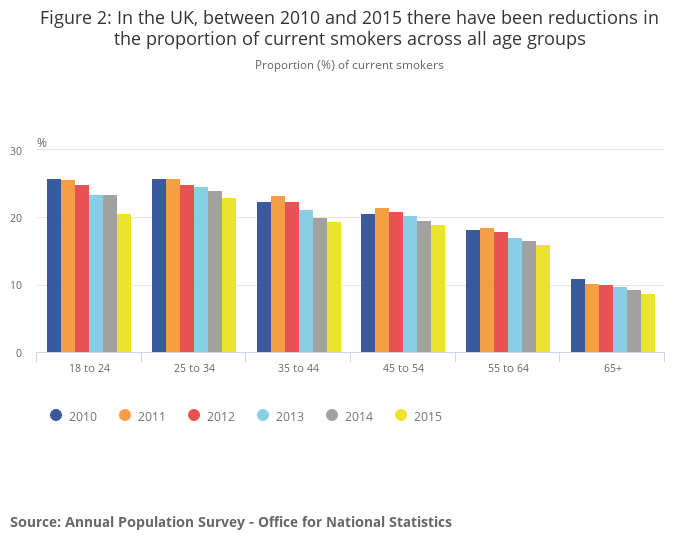
In fact, according to data from the Office for National Statistics, the opposite is happening. According to the ONS data, “Since 2010, smoking has become less common across all age groups in the UK, with the most pronounced decrease observed among those aged 18 to 24 years”.

Now, of course we can’t say that that decrease in smoking prevalence is because of e-cigarettes, but it does seem to argue strongly against the hypothesis that e-cigarettes are encouraging young people to start smoking on a grand scale.

And if you believe Soneji et al’s claims, people would be starting smoking on a grand scale. Prof Peter Hajek, quoted by the Science Media Centre, has calculated what Soneji et al’s claims would mean if they were true in the UK:

“This new ‘finding’ is based on the bizarre assumption that for every one smoker who uses e-cigs to quit, 80 non-smokers will try e-cigs and take up smoking. It flies in the face of available evidence but it is also mathematically impossible. In the UK alone, 1.5 million smokers have quit smoking with the help of e-cigarettes. The ‘modelling’ in this paper assumes that we also have 120 million young people who became smokers.”

I think we can all see that having 120 million young people who are smokers among the UK population doesn’t make a whole lot of sense. Why could the peer-reviewers of the paper not see that?

Do 41% of middle aged adults really walk for less than 10 minutes each month?

I was a little surprised when I heard the news on the radio this morning and heard that a new study had been published allegedly showing that millions of middle aged adults are so inactive that they don’t even walk for 10 minutes each month. The story has been widely covered in the media, for example here, here, and here.

The specific claim is that 41% of adults aged 40 to 60 in England, or about 6 million people, do not walk for 10 minutes in one go at a brisk pace at least once a month, based on a survey by Public Health England (PHE). I tracked down the source of this claim to this report on the PHE website.

I found that hard to believe. Walking for just 10 minutes a month is a pretty low bar. Can it really be true that 41% of middle aged adults don’t even manage that much?

Well, if it is, which I seriously doubt, then the statistic is at best highly misleading. The same survey tells us that less than 20% of the same sample of adults were physically inactive, where physical activity is defined as “participating in less than 30 minutes of moderate intensity physical activity per week”. Here is the table from the report about physical activity:

So we have about 6 million people doing less than 10 minutes of walking per month, but only 3 million people doing less than 30 minutes of moderate intensity physical activity per week. So somehow, there must be 3 million people who are doing at least 30 minutes of physical activity per week while simultaneously walking for less than 10 minutes per month.

I suppose that’s possible. Maybe those people cycle a lot, or perhaps drive to the gym and have a good old workout and then drive home again. But it seems unlikely.

And even if it’s true, the headline figure that 41% of middle aged adults are doing so little exercise that they don’t even manage 10 minutes of walking a month is grossly misleading. Because in fact over 80% of middle aged adults are exercising for at least 30 minutes per week.

I notice that the report on the PHE website doesn’t link to the precise questions asked in the survey. I am always sceptical of any survey results that aren’t accompanied by a detailed description of the survey methods, including specifying the precise questions asked, and this example only serves to remind me of the importance of maintaining that scepticism.

The news coverage focuses on the “41% walk for less than 10 minutes per month” figure and not on the far less alarming figure that less than 20% exercise for less than 30 minutes per week. The 41% figure is also presented first on the PHE website, and I’m guessing, given the similarity of stories in the media, that that was the figure they emphasised in their press release.

I find it disappointing that a body like PHE is prioritising newsworthiness over honest science.

Made up statistics on sugar tax

I woke up this morning to the sound of Radio 4 telling me that Cancer Research UK had done an analysis showing that a 20% tax on sugary drinks could reduce the number of obese people in the UK by 3.7 million by 2025. (That could be the start of the world’s worst ever blues song, but it isn’t.)

My first thought was that was rather surprising, as I wasn’t aware of any evidence on how sugar taxes impact on obesity. So I went hunting for the report with interest.

Bizarrely, Cancer Research UK didn’t link to the full report from their press release (once you’ve read the rest of this post, you may conclude that perhaps they were too embarrassed to let anyone see it), but I tracked it down here. Well, I’m not sure even that is the full report. It says it’s a “technical summary”, but the word “summary” makes me wonder if it is still not the full report. But that’s all that seems to be made publicly available.

There are a number of problems with this report. Christopher Snowdon has blogged about some of them here, but I want to focus on the extent to which the model is based on untested assumptions.

It turns out that the conclusions were indeed not based on any empirical data about how a sugar tax would impact on obesity, but on  a modelling study. This study made various assumptions about various things, principally the following:

  1. The price elasticity of demand for sugary drinks (ie the extent to which an increase in price reduces consumption)
  2. The extent to which a reduction in sugary drink consumption would reduce total calorie intake
  3. The effect of total calorie intake on body mass

The authors get 0/10 for transparent reporting for the first of those, as they don’t actually say what price elasticity they used. That’s pretty basic stuff, and not to report it is somewhat akin to reporting the results of a clinical trial of a new drug and not saying what dose of the drug you used.

However, the report does give a reference for their price elasticity data, namely this paper. I must say I don’t find the methods of that paper easy to follow. It’s not at all clear to me whether the price elasticities they calculated were actually based on empirical data or themselves the results of a modelling exercise. But the data that are used in that paper come from the period 2008 to 2010, when the UK was in the depths of  recession, and when it might be hypothesised that price elasticities were greater than in more economically buoyant times. They don’t give a single figure for price elasticity, but a range of 0.8 to 0.9. In other words, a 20% increase in the price of sugary drinks would be expected to lead to a 16-18% decrease in the quantity that consumers buy. At least in the depths of the worst recession since the 1930s.

That figure for price elasticity is a crucial input to the model, and if it is wrong, then the answers of the model will be wrong.

The next input is the extent to which a reduction in sugary drink consumption reduces total calorie intake.  Here, an assumption is made that total calorie intake is reduced by 60% of the amount of calories not consumed in sugary drinks. Or in other words, that if you forego the calories of a sugary drink, you only make up 40% of those from elsewhere.

Where does that 60% figure come from? Well, they give a reference to this paper. And how did that paper arrive at the 60% figure? Well, they in turn give a reference to this paper. And where did that get it from? As far as I can tell, it didn’t, though I note it reports the results of a clinical study in people trying to lose weight by dieting. Even if that 60% figure is based on actual data from that study, rather than just plucked out of thin air, I very much doubt that data on calorie substitution taken from people trying to lose weight would be applicable to the general population.

What about the third assumption, the weight loss effects of reduced calorie intake? We are told that reducing energy intake by 100 KJ per day results in 1 kg body weight loss. The citation given for that information is this study, which is another modelling study. Are none of the assumptions in this study based on actual empirical data?

A really basic part of making predictions by mathematical modelling is to use sensitivity analyses. The model is based on various assumptions, and sensitivity analyses answer the questions of what happens if those assumptions were wrong. Typically, the inputs to the model are varied over plausible ranges, and then you can see how the results are affected.

Unfortunately, no sensitivity analysis was done. This, folks, is real amateur hour stuff. The reason for the lack of sensitivity analysis is given in the report as follows:

“it was beyond the scope of this project to include an extensive sensitivity analysis. The microsimulation model is complex involving many thousands of calculations; therefore sensitivity analysis would require many thousands of consecutive runs using super computers to undertake this within a realistic time scale.”

That has to be one of the lamest excuses for shoddy methods I’ve seen in a long time. This is 2016. You don’t have to run the analysis on your ZX Spectrum.

So this result is based on a bunch of heroic assumptions which have little basis in reality, and the sensitivity of the model to those assumptions were not tested. Forgive me if I’m not convinced.


New alcohol guidelines

It has probably not escaped your attention that the Department of Health published new guidelines for alcohol consumption on Friday. These guidelines recommend lower limits than the previous guidelines, namely no more than 14 units per week. The figure is the same for men and women.

There are many odd things about these guidelines. But before I get into that, I was rightly picked up on a previous blogpost for not being clear about my own competing interests, so I’ll get those out of the way first, as I think it’s important.

I do not work either for the alcohol industry or in public health, so professionally speaking, I have no dog in this fight. However, at a personal level, I do like a glass of wine or two with my dinner, which I have pretty much every day. So my own drinking habits fall within the recommended limits of the previous guidelines (no more than 4 units per day for men), but under the new guidelines I would be classified as an excessive drinker. Do bear that in mind when reading this blogpost. I have tried to be as impartial as possible, but we are of course all subject to biases in the way we assess evidence, and I cannot claim that my assessment is completely unaffected by being classified as a heavy drinker under the new guidelines.

So, how were the new guidelines developed? This was a mixture of empirical evidence, mathematical modelling, and the judgement of the guidelines group. They were reasonably explicit about this process, and admit that the guidelines are “both pragmatic and evidence based”, so they get good marks for being transparent about their overall thinking.

However, it was not always easy to figure out what evidence was used, so they get considerably less good marks for being transparent about the precise evidence that led to the guidelines. It’s mostly available if you look hard enough, but the opacity of the referencing is disappointing. Very few statements in the guidelines document are explicitly referenced. But as far as I can tell, most of the evidence comes from two other documents, “A summary of the evidence of the health and social impacts of alcohol consumption” (see the document “Appendix 3 CMO Alcohol Guidelines Summary of evidence.pdf” within the zip file that you can download here) ,and the report of the Sheffield modelling group.

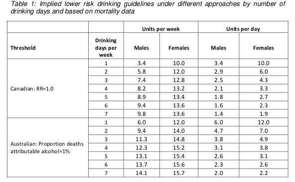
The specific way in which “14 units per week” was derived was as follows. The guidelines team investigated what level of alcohol consumption would be associated with no more than an “acceptable risk”, which is fair enough. Two definitions of “acceptable risk” were used, based on recent work in developing alcohol guidelines in Canada and Australia. The Canadian definition of acceptable risk was a relative risk of alcohol-related mortality of 1, in other words, the point at which the overall risk associated with drinking, taking account of both beneficial and harmful effects, was the same as the risk for a non-drinker. The Australian definition of acceptable risk was that the proportion of deaths in the population attributable to alcohol, assuming that everyone in the population drinks at the recommended limit, is 1%. In practice, both methods gave similar results, so choosing between them is not important.

To calculate the the levels of alcohol that would correspond to those risks, a mathematical model was used which incorporated empirical data on 43 diseases which are known to be associated with alcohol consumption. Risks for each were considered, and the total mortality attributable to alcohol was calculated from those risks (although the precise mathematical calculations used were not described in sufficient detail for my liking).

These results are summarised in the following table (table 1 in both the guidelines document and the Sheffield report). Results are presented separately for men and women, and also separately depending on how many days each week are drinking days. The more drinking days you have per week for the same weekly total, the less you have on any given day. So weekly limits are higher if you drink 7 days per week than if you drink 1 day per week, because of the harm involved with binge drinking if you have your entire weekly allowance on just one day.

Table 1

Assuming that drinking is spread out over a few days a week, these figures are roughly in the region of 14, so that is where the guideline figure comes from. The same figure is now being used for men and women.

Something you may have noticed about the table above is that it implies the safe drinking limits are lower for men than for women. You may think that’s a bit odd. I think that’s a bit odd too.

Nonetheless, the rationale is explained in the report. We are told (see paragraph 46 of the guidelines document) that the risks of immediate harm from alcohol consumption, usually associated with binge-drinking in a single session, “are greater for men than for women, in part because of men’s underlying risk taking behaviours”. That sounds reasonably plausible, although no supporting evidence is offered for the statement.

To be honest, I find this result surprising. According to table 6 on page 35 of the Sheffield modelling report, deaths from the chronic effects of alcohol (eg cancer) are about twice as common as deaths from the acute affects of alcohol (eg getting drunk and falling under a bus). We also know that women are more susceptible than men to the longer term effect of alcohol. And yet it appears that the acute effects dominate this analysis.

Unfortunately, although the Sheffield report is reasonably good at explaining the inputs to the mathematical model, specific details of how the model works are not presented. So it is impossible to know why the results come out in this surprising way and whether it is reasonable.

There are some other problems with the model.

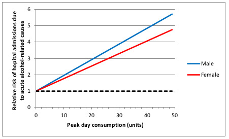
I think the most important one is that the relationship between alcohol consumption and risk was often assumed to be linear. This strikes me as a really bad assumption, perhaps best illustrated with the following graph (figure 11 on page 45 of the Sheffield report).

Figure 11

This shows how the risk of hospital admission for acute alcohol-related causes increases as a function of peak day consumption, ie the amount of alcohol drunk in a single day.

A few moments’ thought suggest that this is not remotely realistic.

The risk is expressed as a relative risk, in other words how many times more likely you are to be admitted to hospital for an alcohol-related cause than you are on a day when you drink no alcohol at all. Presumably they consider that there is a non-zero risk when you don’t drink at all, or a relative risk would make no sense. Perhaps that might be something like being injured in a road traffic crash where you were perfectly sober but the other driver was drunk.

But it’s probably safe to say that the risk of being hospitalised for an alcohol-related cause when you have not consumed any alcohol is low. The report does not make it clear what baseline risk they are using, but let’s assume conservatively that the daily risk is 1 in 100, or 1%. That means that you would expect to be admitted to hospital for an alcohol-related cause about 3 times a year if you don’t drink at all. I haven’t been admitted to hospital 3 times in the last year (or even once, in fact) for an alcohol related cause, and I’ve even drunk alcohol on most of those days. I doubt my experience of lack of hospitalisation is unusual. So I think it’s probably safe to assume that 1% is a substantial overestimate of the true baseline risk.

Now let’s look at the top right of the graph. That suggests that my relative risk of being admitted to hospital for an alcohol-related cause would be 6 times higher if I drink 50 units in a day. In other words, that my risk would be 6%. And remember that that is probably a massive overestimate.

Now, 50 units of alcohol is roughly equivalent to a bottle and a half of vodka. I don’t know about you, but I’m pretty sure that if I drank a bottle and a half of vodka in a single session then my chances of being hospitalised – if I survived that long – would be close to 100%.

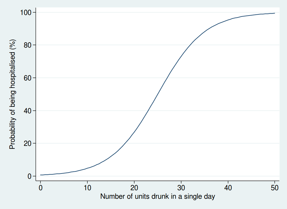
So I don’t think that a linear function is realistic. I don’t have any data on the actual risk, but I would expect it to look something more like this:

Alcohol graph

Here we see that the risk is negligible at low levels of alcohol consumption, then increases rapidly once you get into the range of serious binge drinking, and approaches 100% as you consume amounts of alcohol unlikely to be compatible with life. The precise form of that graph is something I have just guessed at, but I’m pretty sure it’s a more reasonable guess than a linear function.

A mathematical model is only as good as the data used as inputs to the model and the assumptions used in the modelling. Although the data used are reasonably clearly described and come mostly from systematic reviews of the literature, the way in which the data are modelled is not sufficiently clear, and also makes some highly questionable assumptions. Although some rudimentary sensitivity analyses were done, no sensitivity analyses were done using risk functions other than linear ones.

So I am not at all sure I consider the results of the mathematical modelling trustworthy. Especially when it comes up with the counter-intuitive result that women can safely drink more than men, which contradicts most of the empirical research in this area.

But perhaps more importantly, I am also puzzled why it was felt necessary to go through a complex modelling process in the first place.

It seems to me that the important question here is how does your risk of premature death depend on your alcohol consumption. That, at any rate, is what was modelled.

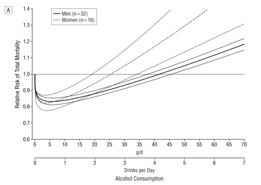
But there is no need to model it: we actually have empirical data. A systematic review of 34 prospective studies by Di Castelnuovo et al published in 2006 looked at the relationship between alcohol consumption and mortality. This is what it found (the lines on either side of the male and female lines are 99% confidence intervals).

Systematic review

This shows that the level of alcohol consumption associated with no increased mortality risk compared with non-drinkers is about 25 g/day for women and 40 g/day for men. A standard UK unit is 8 g of alcohol, so that converts to about 22 units per week for women and 35 units per week for men: not entirely dissimilar to the previous guidelines.

Some attempt is made to explain why the data on all cause mortality have not been used, but I do not find them convincing (see page 7 of the summary of evidence).

One problem we are told is that “most of the physiological mechanisms that have been suggested to explain the protective effect of moderate drinking only apply for cohorts with overall low levels of consumption and patterns of regular drinking that do not vary”. That seems a bizarre criticism. The data show that there is a protective effect only at relatively low levels of consumption, and that once consumption increases, so does the risk. So of course the protective effect only applies at low levels of consumption. As for the “patterns of regular drinking”, the summary makes the point that binge drinking is harmful. Well, we know that. The guidelines already warn of the dangers of binge drinking. It seems odd therefore, to also reject the findings for people who split their weekly consumption evenly over the week and avoid binge drinking, as this is exactly what the guidelines say you should do.

I do not understand why studies which apply to people who follow safe drinking guidelines are deemed to be unsuitable for informing safe drinking guidelines. That makes no sense to me.

The summary also mentions the “sick quitter hypothesis” as a reason to mistrust the epidemiological data. The sick quitter hypothesis suggests that the benefits of moderate drinking compared with no drinking may have been overestimated in epidemiological studies, as non-drinkers may include recovering alcoholics and other people who have given up alcohol for health reasons, and therefore include an unusually unhealthy population.

The hypothesis seems reasonable, but it is not exactly a new revelation to epidemiologists, and has been thoroughly investigated. The systematic review by Di Castelnuovo reported a sensitivity analysis including only studies which excluded former drinkers from their no-consumption category. That found a lower beneficial effect on mortality than in the main analysis, but the protective effect was still unambiguously present. The point at which drinkers had the same risk as non-drinkers in that analysis was about 26 units per week (this is an overall figure: separate figures for men and women were not presented in the sensitivity analysis).

A systematic review specifically of cardiovascular mortality by Ronksley et al published in 2011 also ran a sensitivity analysis where only lifelong non-drinkers were used as the reference category, and found it made little difference to the results.

So although the “sick quitter hypothesis” sounds like a legitimate concern, in fact it has been investigated and is not a reason to distrust the results of the epidemiological analyses.

So all in all, I really do not follow the logic of embarking on a complex modelling exercise instead of using readily available empirical data. Granted, the systematic review by Di Castelnuovo et al is 10 years old now, but surely a more appropriate response to that would have been to commission an updated systematic review rather than ignore the systematic review evidence on mortality altogether and go down a different and problematic route.

Does any of this matter? After all, the guidelines are not compulsory. If my own reading of the evidence tells me I can quite safely drink 2 glasses of wine with my dinner most nights, I am completely free to do so.

Well, I think this does matter. If the government are going to publish guidelines on healthy behaviours, I think it is important that they be as accurate and evidence-based as possible. Otherwise the whole system of public health guidelines will fall into disrepute, and then it is far less likely that even sensible guidelines will be followed.

What is particularly concerning here is the confused messages the guidelines give about whether moderate drinking has benefits. From my reading of the literature, it certainly seems likely that there is a health benefit at low levels of consumption. That, at any rate, is the obvious conclusion from Di Castelnuovo et al’s systematic review.

And yet the guidelines are very unclear about this. While even the Sheffield model used to support the guidelines shows decreased risks at low levels of alcohol consumption (and those decreased risks would extend to substantially higher drinking levels if you base your judgement on the systematic review evidence), the guidelines themselves say that such decreased risks do not exist.

The guideline itself says “The risk of developing a range of diseases (including, for example, cancers of the mouth, throat, and breast) increases with any amount you drink on a regular basis”. That is true, but it ignore the fact that it is not true for other diseases. To mention only the harms of alcohol and ignore the benefits in the guidelines seems a dishonest way to present data. Surely the net effect is what is important.

Paragraph 30 of the guidelines document says “there is no level of drinking that can be recommended as completely safe long term”, which is also an odd thing to say when moderate levels of drinking have a lower risk than not drinking at all.

There is no doubt that the evidence on alcohol and health outcomes is complex. For obvious reasons, there have been no long-term randomised controlled trials, so we have to rely on epidemiological research with all its limitations. So I do not pretend for a moment that developing guidelines on what is a safe amount of alcohol to drink is easy.

But despite that, I think the developers of these guidelines could have done better.

Dangerous nonsense about vaping

If you thought you already had a good contender for “most dangerous, irresponsible, and ill-informed piece of health journalism of 2015”, then I’m sorry to tell you that it has been beaten into second place at the last minute.

With less than 36 hours left of 2015, I am confident that this article by Sarah Knapton in the Telegraph will win the title.

The article is titled “E-cigarettes are no safer than smoking tobacco, scientists warn”. The first paragraph is

“Vaping is no safer that [sic] smoking, scientists have warned after finding that e-cigarette vapour damages DNA in ways that could lead to cancer.”

There are such crushing levels of stupid in this article it’s hard to know where to start. But perhaps I’ll start by pointing out that a detailed review of the evidence on vaping by Public Health England, published earlier this year, concluded that e-cigarettes are about 95% less harmful than smoking.

If you dig into the detail of that review, you find that most of the residual 5% is the harm of nicotine addiction. It’s debatable whether that can really be called a harm, given that most people who vape are already addicted to nicotine as a result of years of smoking cigarettes.

But either way, the evidence shows that vaping, while it may not be 100% safe (though let’s remember that nothing is 100% safe: even teddy bears kill people), is considerably safer than smoking. This should not be a surprise. We have a pretty good understanding of what the toxic components of cigarette smoke are that cause all the damage, and most of those are either absent from e-cigarette vapour or present at much lower concentrations.

So the question of whether vaping is 100% safe is not the most relevant thing here. The question is whether it is safer than smoking. Nicotine addiction is hard to beat, and if a smoker finds it impossible to stop using nicotine, but can switch from smoking to vaping, then that is a good thing for that person’s health.

Now, nothing is ever set in stone in science. If new evidence comes along, we should always be prepared to revise our beliefs.

But obviously to go from a conclusion that vaping is 95% safer than smoking to concluding they are both equally harmful would require some pretty robust evidence, wouldn’t it?

So let’s look at the evidence Knapton uses as proof that all the previous estimates were wrong and vaping is in fact as harmful as smoking.

The paper it was based on is this one, published in the journal Oral Oncology.  (Many thanks to @CaeruleanSea for finding the link for me, which had defeated me after Knapton gave the wrong journal name in her article.)

The first thing to notice about this is that it is all lab based, using cell cultures, and so tells us little about what might actually happen in real humans. But the real kicker is that if we are going to compare vaping and smoking and conclude that they are as harmful as each other, then the cell cultures should have been exposed to equivalent amounts of e-cigarette vapour and cigarette smoke.

The paper describes how solutions were made by drawing either the vapour or smoke through cell media. We are then told that the cells were treated with the vaping medium every 3 days for up to 8 weeks. So presumably the cigarette medium was also applied every 3 days, right?

Well, no. Not exactly. This is what the paper says:

“Because of the high toxicity of cigarette smoke extract, cigarette-treated samples of each cell line could only be treated for 24 h.”

Yes, that’s right. The cigarette smoke was applied at a much lower intensity, because otherwise it killed the cells altogether. So how can you possibly conclude that vaping is no worse than smoking, when smoking is so harmful it kills the cells altogether and makes it impossible to do the experiment?

And yet despite that, the cigarettes still had a larger effect than the vaping. It is also odd that the results for cigarettes are not presented at all for some of the assays. I wonder if that’s because it had killed the cells and made the assays impossible? As primarily a clinical researcher, I’m not an expert in lab science, but not showing the results of your positive control seems odd to me.

But the paper still shows that the e-cigarette extract was harming cells, so that’s still a worry, right?

Well, there is the question of dose. It’s hard for me to know from the paper how realistic the doses were, as this is not my area of expertise, but the press release accompanying this paper (which may well be the only thing that Knapton actually read before writing her article) tells us the following:

“In this particular study, it was similar to someone smoking continuously for hours on end, so it’s a higher amount than would normally be delivered,”

Well, most things probably damage cells in culture if used at a high enough dose, so I don’t think this study really tells us much. All it tells us is that cigarettes do far more damage to cell cultures than e-cigarette vapour does. Because, and I can’t emphasise this point enough, THEY COULDN’T DO THE STUDY WITH EQUIVALENT DOSES OF CIGARETTE SMOKE BECAUSE IT KILLED ALL THE CELLS.

A charitable explanation of how Knapton could write such nonsense might be that she simply took the press release on trust (to be clear, the press release also makes the claim that vaping is as dangerous as smoking) and didn’t have time to check it. But leaving aside the question of whether a journalist on a major national newspaper should be regurgitating press releases without any kind of fact checking, I note that many people (myself included) have been pointing out to Knapton on Twitter that there are flaws in the article, and her response has been not to engage with such criticism, but to insist she is right and to block anyone who disagrees: the Twitter equivalent of the “la la la I’m not listening” argument.

It seems hard to come up with any explanation other than that Knapton likes to write a sensational headline and simply doesn’t care whether it’s true, or, more importantly, what harm the article may do.

And make no mistake: articles like this do have the potential to cause harm. It is perfectly clear that, whether or not vaping is completely safe, it is vastly safer than smoking. It would be a really bad outcome if smokers who were planning to switch to vaping read Knapton’s article and thought “oh, well if vaping is just as bad as smoking, maybe I won’t bother”. Maybe some of those smokers will then go on to die a horrible death of lung cancer, which could have been avoided had they switched to vaping.

Is Knapton really so ignorant that she doesn’t realise that is a possible consequence of her article, or does she not care?

And in case you doubt that anyone would really be foolish enough to believe such nonsense, I’m afraid there is evidence that people do believe it. According to a survey by Action on Smoking and Health (ASH), the proportion of people who believe that vaping is as harmful or more harmful than smoking increased from 14% in 2014 to 22% in 2015. And in the USA, the figures may be even worse: this study found 38% of respondents thought e-cigarettes were as harmful or more harmful than smoking. (Thanks again to @CaeruleanSea for finding the links to the surveys.)

I’ll leave the last word to Deborah Arnott, Chief Executive of ASH:

“The number of ex-smokers who are staying off tobacco by using electronic cigarettes is growing, showing just what value they can have. But the number of people who wrongly believe that vaping is as harmful as smoking is worrying. The growth of this false perception risks discouraging many smokers from using electronic cigarettes to quit and keep them smoking instead which would be bad for their health and the health of those around them.”