One thing about the Covid-19 outbreak that has been particularly noticeable to me as a medical statistician is that the number of confirmed cases reported in the UK has been following a classic exponential growth pattern. For those who are not familiar with what exponential growth is, I’ll start with a short explanation before I move on to what this means for how the epidemic is likely to develop in the UK. If you already understand what exponential growth is, then feel free to skip to the section “Implications for the UK Covid-19 epidemic”.
A quick introduction to exponential growth
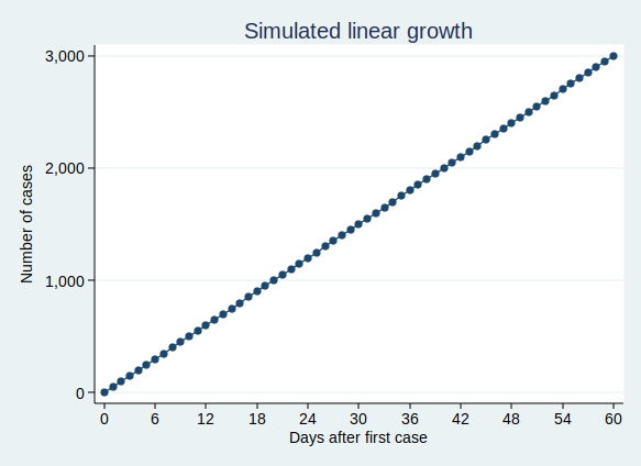
If we think of something, such as the number of cases of Covid-19 infection, as growing at a constant rate, then we might think that we would have a similar number of new cases each day. That would be a linear growth pattern. Let’s assume that we have 50 new cases each day, then after 60 days we’ll have 3000 cases. A graph of that would look like this:
That’s not what we’re seeing with Covid-19 cases. Rather than following a linear growth pattern, we’re seeing an exponential growth pattern. With exponential growth, rather than adding a constant number of new cases each day, the number of cases increases by a constant percentage amount each day. Equivalently, the number of cases multiplies by a constant factor in a constant time interval.
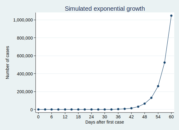
Let’s say that the number of cases doubles every 3 days. On day zero we have just one case, on day 3 we have 2 cases, and day 6 we have 4 cases, on day 9 we have 8 cases, and so on. This makes sense for an infectious disease epidemic. If you imagine that each person who is infected can infect (for example) 2 new people, then you would get a pattern very similar to this. When only one person is infected, that’s just 2 new people who get infected, but if 100 people have the disease, then 200 people will get infected in the same time.
On the face of it, the example above sounds like it’s growing much less quickly than my first example where we have 50 new cases each day. But if you are doubling the number of cases each time, then you start to get to scarily large numbers quite quickly. If we carry on for 60 days, then although the number of cases isn’t increasing much at first, it eventually starts to increase at an alarming rate, and by the end of 60 days we have over a million cases. This is what it looks like if you plot the graph:
It’s actually quite hard to see what’s happening at the beginning of that curve, so to make it easier to see, let’s use the trick of plotting the number of cases on a logarithmic scale. What that means is that a constant interval on the vertical axis (generally known as the y axis) represents not a constant difference, but a constant ratio. Here, the ticks on the y axis represent an increase in cases by a factor of 10.
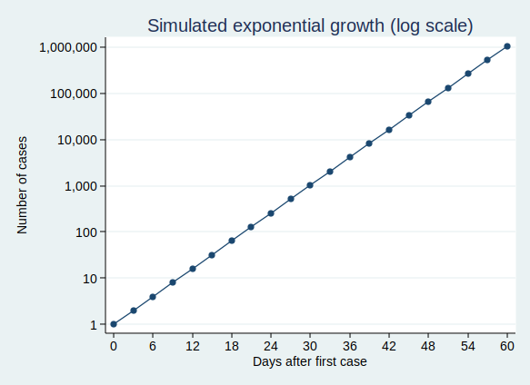
Note that when you plot exponential growth on a logarithmic scale, you get a straight line. That’s because we’re increasing the number of cases by a constant ratio in each unit time, and a constant ratio corresponds to a constant distance on the y axis.
Implications for the UK Covid-19 epidemic
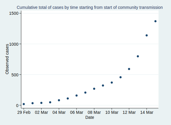
OK, so that’s what exponential growth looks like. What can we see about the number of confirmed Covid-19 cases in the UK? Public Health England makes the data available for download here. The data have not yet been updated with today’s count of cases as I write this, so I added in today’s number (1372) based on a tweet by the Department of Health and Social Care.
If you plot the number of cases by date, it looks like this:
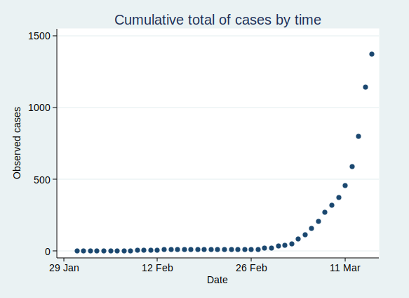
That’s pretty reminiscent of our exponential growth curve above, isn’t it?
It’s worth noting that the numbers I’ve shown are almost certainly an underestimate of the true number of cases. First, it seems likely that some people who are infected will have only very mild (or even no) symptoms, and will not bother to contact the health services to get tested. You might say that it doesn’t matter if the numbers don’t include people who aren’t actually ill, and to some extent it doesn’t, but remember that they may still be able to infect others. Also, there is a delay from infection to appearing in the statistics. So the official number of confirmed cases includes people only after they have caught the disease, gone through the incubation period, developed symptoms that were bothersome enough to seek medical help, got tested, and have the test results come back. This represents people who were infected probably at least a week ago. Given that the number of cases are growing so rapidly, the number of people actually infected today will be considerably higher than today’s statistics for confirmed cases.
Now, before I get into analysis, I need to decide where to start the analysis. I’m going to start from 29 February, as that was when the first case of community transmission was reported, so by then the disease was circulating within the UK community. Before then it had mainly been driven by people arriving in the UK from places abroad where they caught the disease, so the pattern was probably a bit different then.
If we start the graph at 29 February, it looks like this:
Now, what happens if we fit an exponential growth curve to it? It looks like this:
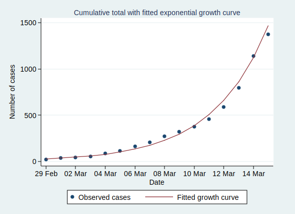
(Technical note for stats geeks: the way we actually do that is with a linear regression analysis of the logarithm of the number of cases on time, calculate the predicted values of the logarithm from that regression analysis, and then back-transform to get the number of cases.)
As you can see, it’s a pretty good fit to an exponential curve. In fact it’s really very good indeed. The R-squared value from the regression analysis is 0.99. R-squared is a measure of how well the data fit the modelled relationship on a scale of 0 to 1, so 0.99 is a damn near perfect fit.
We can also plot it on a logarithmic scale, when it should look like a straight line:
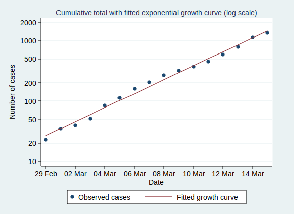
And indeed it does.
There are some interesting statistics we can calculate from the above analysis. The average rate of growth is about a 30% increase in the number of cases each day. That means that the number of cases doubles about every 2.6 days, and increases tenfold in about 8.6 days.
So what happens if the number of cases keeps growing at the same rate? Let’s extrapolate that line for another 6 weeks:
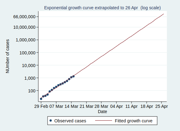
This looks pretty scary. If it continues at the same rate of exponential growth, we’ll get to 10,000 cases by 23 March (which is only just over a week away), to 100,000 cases by the end of March, to a million cases by 9 April, and to 10 million cases by 18 April. By 24 April the entire population of the UK (about 66 million) will be infected.
Now, obviously it’s not going to continue growing at the same rate for all that time. If nothing else, it will stop growing when it runs out of people to infect. And even if the entire population have not been infected, the rate of new infections will surely slow down once enough people have been infected, as it becomes increasingly unlikely that anyone with the disease who might be able to pass it on will encounter someone who hasn’t yet had it (I’m assuming here that people who have already had the disease will be immune to further infections, which seems likely, although we don’t yet know that for sure).
However, that effect won’t kick in until at least several million people have been infected, a situation which we will reach by the middle of April if other factors don’t cause the rate to slow down first.
Several million people being infected is a pretty scary prospect. Even if the fatality rate is “only” about 1%, then 1% of several million is several tens of thousands of deaths.
So will the rate slow down before we get to that stage?
I genuinely don’t know. I’m not an expert in infectious disease epidemiology. I can see that the data are following a textbook exponential growth pattern so far, but I don’t know how long it will continue.
Governments in many countries are introducing drastic measures to attempt to reduce the spread of the disease.
The UK government is not.
It is not clear to me why the UK government is taking a more relaxed approach. They say that they are being guided by the science, but since they have not published the details of their scientific modelling and reasoning, it is not possible for the rest of us to judge whether their interpretation of the science is more reasonable than that of many other European countries.
Maybe the rate of infection will start to slow down now that there is so much awareness of the disease and of precautions such as hand-washing, and that even in the absence of government advice, many large gatherings are being cancelled.
Or maybe it won’t. We will know more over the coming weeks.
One final thought. The government’s latest advice is for people with mild forms of the disease not to seek medical help. This means that the rate of increase of the disease may well appear to slow down as measured by the official statistics, as many people with mild disease will no longer be tested and so not be counted. It will be hard to know whether the rate of infection is really slowing down.
Very interesting Adam at risk of appearing foolish isn’t there a flaw in the suggested fatality rate? That currently would appear to be around 2.5% (35 deaths with 1400 cases) BUT whilst the number of deaths is probably quite accurate the number of confirmed cases is surely much lower than the actual number. My recollection is the government scientists were estimating 10,000 infections against some 500 or so declared so the actual number is maybe 20 times that recorded? What that I think does to the death rate is reduce it by one twentieth to 0.125 or one in 800? Surely somewhat less scary than the figure you were suggesting of several tens of thousands? In perspective annual U.K. flu deaths average around 17,000 pa. Keep up the good fight.
You mean the number of confirmed cases is surely much higher than the actual number?
So yes, you’re right, estimating the death rate from all infections is really difficult, as we just don’t know how many people have been infected, but it’s surely higher than the official figures.
But bear in mind that we could be in a position in a few short weeks when the number of people with disease serious enough to crop up in the statistics reaches the millions, so I think tens of thousands of deaths, while certainly not certain, is still a realistic prospect.
Oh, and don’t worry about appearing foolish! It’s really a very good question.
Very clear Adam.
One question: I don’t think your model reflects the “self limiting” effect (ok, ok, I just don’t like the word “herd” when applied to humans…)
-> the exponential model fits when (nearly) everyone who an infected person coughs over has not had the virus. Now imagine regular commuters on a train, once they recover, they get back into their same routine… and when that one person steps on who has the virus, it does not spread because everyone else is already immune.
So, after, say, three cycles of 14 days, I would expect to see the curve flatten because it is more difficult to spread to your regular Central Line commuter – because they are immune.
Keep publishing the charts!
Onwards and upwards
Thanks Peter.
You’re absolutely right, of course, that the spread of the virus will slow down when enough people become infected. I’m not sure exactly how many people would need to be infected before that slowdown becomes significant, but I fear there might need to be quite a few million infected before it does.
I wrote a bit more about that in the paragraph beginning “Now, obviously it’s not going to continue growing at the same rate for all that time.”
Hopefully the more stringent measures that we’ve seen introduced since I wrote the blogpost on Sunday will help too, but at the moment it’s too early to know if they will.
Very, very glad to see:
“Technical note for stats geeks: the way we actually do that is with a linear regression analysis of the logarithm of the number of cases on time”
With curated case data now publicly available, it seems to have brought a lot of armchair statisticians out of the woodwork. They might know how to run a black box curve-fitting function in a spreadsheet, but don’t recognize that the raw case data is deeply heteroskedastic – the variance in cases-per-day scales as cases-per-day itself.
Without either an initial log transform or very carefully applied error weighting, the result is that most canned curve-fitting algorithms apply too much weight to large values of cases-per-day (or equivalently, sharp changes in the number of total cases).
This is particularly dire when we only have exponentially rising cases-per-day, but folks attempt a fit to a normal or Gompertz distribution to determine the disease’s expected course. Any moderate sampling error in the latest data – where values are largest and variance is greatest – can be accidentally interpreted as an inflection point and change the entire predicted course by very substantial amounts.
I am not a statician so I humbly ask for mercy if what follows is considered equivelant to having sex in church .
My background is in engineering and management. Now engineers tend to doubt anything that is not hard fact and based on sound information. So as an engineering nerd I ask myself how can we make any analysis when one bit of key information is missing? i.e. the actual number who are laid low by the virus. Personally I am surprised that, seperate from the NHS and allied institutions, no one has set up a reporting system; perhaps run by volunteers.
One possibility that has been mentioned in medical circles, and supported by limited evidence, is that some people diagnosed with the virus have noticed no symptoms. (OK they could be false positives.) Is it possible that others may have such a robust immune system that they do no get the disease at all despite massive exposure?
In my early managment years one mentor drummed home to me the mantra “If you cannot measure it you cannot manage it”. So are we really managing the situation?
If I am missing something please let me know.
Why is it fitted to an exponential curve but not a Gompertz curve?
An excellent question. As you can see from the date, I wrote this very early in the pandemic, when cases were rising exponentially so the exponential curve gave a pretty good fit at that stage. A bit later on when the lockdowns had started and cases started coming down again, I did have a go at fitting to a Gompertz curve, and that fitted pretty well too.
Of course none of this would remotely fit any more, given the pattern over the last couple of years has been a whole series of peaks and troughs, so I don’t bother fitting curves any more.