Category Archives: Politics

Covid-19 deaths

I wrote last week about how the number of cases of coronavirus were following a textbook exponential growth pattern. I didn’t look at the number of deaths from coronavirus at the time, as there were too few cases in the UK for a meaningful analysis. Sadly, that is no longer true, so I’m going to take a look at that today.

However, first, let’s have a little update on the number of cases. There is a glimmer of good news here, in that the number of cases has been rising more slowly than we might have predicted based on the figures I looked at last week. Here is the growth in cases with the predicted line based on last week’s numbers.

As you can see, cases in the last week have consistently been lower than predicted based on the trend up to last weekend. However, I’m afraid this is only a tiny glimmer of good news. It’s not clear whether this represents a real slowing in the number of cases or merely reflects the fact that not everyone showing symptoms is being tested any more. It may just be that fewer cases are being detected.

So what of the number of deaths? I’m afraid this does not look good. This is also showing a classic exponential growth pattern so far:

The last couple of days’ figures are below the fitted line, so there is a tiny shred of evidence that the rate may be slowing down here too, but I don’t think we can read too much into just 2 days’ figures. Hopefully it will become clearer over the coming days.

One thing which is noteworthy is that the rate of increase of deaths is faster than the rate of increase of total cases. While the number of cases is doubling, on average, every 2.8 days, the number of deaths is doubling, on average, every 1.9 days. Since it’s unlikely that the death rate from the disease is increasing over time, this does suggest that the number of cases is being recorded less completely as time goes by.

So what happens if the number of deaths continues growing at the current rate? I’m afraid it doesn’t look pretty:

(note that I’ve plotted this on a log scale).

At that rate of increase, we would reach 10,000 deaths by 1 April and 100,000 deaths by 7 April.

I really hope that the current restrictions being put in place take effect quickly so that the rate of increase slows down soon. If not, then this virus really is going to have horrific effects on the UK population (and of course on other countries, but I’ve only looked at UK figures here).

In the meantime, please keep away from other people as much as you can and keep washing those hands.

Covid-19 and exponential growth

One thing about the Covid-19 outbreak that has been particularly noticeable to me as a medical statistician is that the number of confirmed cases reported in the UK has been following a classic exponential growth pattern. For those who are not familiar with what exponential growth is, I’ll start with a short explanation before I move on to what this means for how the epidemic is likely to develop in the UK. If you already understand what exponential growth is, then feel free to skip to the section “Implications for the UK Covid-19 epidemic”.

A quick introduction to exponential growth

If we think of something, such as the number of cases of Covid-19 infection, as growing at a constant rate, then we might think that we would have a similar number of new cases each day. That would be a linear growth pattern. Let’s assume that we have 50 new cases each day, then after 60 days we’ll have 3000 cases. A graph of that would look like this:

That’s not what we’re seeing with Covid-19 cases. Rather than following a linear growth pattern, we’re seeing an exponential growth pattern. With exponential growth, rather than adding a constant number of new cases each day, the number of cases increases by a constant percentage amount each day. Equivalently, the number of cases multiplies by a constant factor in a constant time interval.

Let’s say that the number of cases doubles every 3 days. On day zero we have just one case, on day 3 we have 2 cases, and day 6 we have 4 cases, on day 9 we have 8 cases, and so on. This makes sense for an infectious disease epidemic. If you imagine that each person who is infected can infect (for example) 2 new people, then you would get a pattern very similar to this. When only one person is infected, that’s just 2 new people who get infected, but if 100 people have the disease, then 200 people will get infected in the same time.

On the face of it, the example above sounds like it’s growing much less quickly than my first example where we have 50 new cases each day. But if you are doubling the number of cases each time, then you start to get to scarily large numbers quite quickly. If we carry on for 60 days, then although the number of cases isn’t increasing much at first, it eventually starts to increase at an alarming rate, and by the end of 60 days we have over a million cases. This is what it looks like if you plot the graph:

It’s actually quite hard to see what’s happening at the beginning of that curve, so to make it easier to see, let’s use the trick of plotting the number of cases on a logarithmic scale. What that means is that a constant interval on the vertical axis (generally known as the y axis) represents not a constant difference, but a constant ratio. Here, the ticks on the y axis represent an increase in cases by a factor of 10.

Note that when you plot exponential growth on a logarithmic scale, you get a straight line. That’s because we’re increasing the number of cases by a constant ratio in each unit time, and a constant ratio corresponds to a constant distance on the y axis.

Implications for the UK Covid-19 epidemic

OK, so that’s what exponential growth looks like. What can we see about the number of confirmed Covid-19 cases in the UK? Public Health England makes the data available for download here. The data have not yet been updated with today’s count of cases as I write this, so I added in today’s number (1372) based on a tweet by the Department of Health and Social Care.

If you plot the number of cases by date, it looks like this:

That’s pretty reminiscent of our exponential growth curve above, isn’t it?

It’s worth noting that the numbers I’ve shown are almost certainly an underestimate of the true number of cases. First, it seems likely that some people who are infected will have only very mild (or even no) symptoms, and will not bother to contact the health services to get tested. You might say that it doesn’t matter if the numbers don’t include people who aren’t actually ill, and to some extent it doesn’t, but remember that they may still be able to infect others. Also, there is a delay from infection to appearing in the statistics. So the official number of confirmed cases includes people only after they have caught the disease, gone through the incubation period, developed symptoms that were bothersome enough to seek medical help, got tested, and have the test results come back. This represents people who were infected probably at least a week ago. Given that the number of cases are growing so rapidly, the number of people actually infected today will be considerably higher than today’s statistics for confirmed cases.

Now, before I get into analysis, I need to decide where to start the analysis. I’m going to start from 29 February, as that was when the first case of community transmission was reported, so by then the disease was circulating within the UK community. Before then it had mainly been driven by people arriving in the UK from places abroad where they caught the disease, so the pattern was probably a bit different then.

If we start the graph at 29 February, it looks like this:

Now, what happens if we fit an exponential growth curve to it? It looks like this:

(Technical note for stats geeks: the way we actually do that is with a linear regression analysis of the logarithm of the number of cases on time, calculate the predicted values of the logarithm from that regression analysis, and then back-transform to get the number of cases.)

As you can see, it’s a pretty good fit to an exponential curve. In fact it’s really very good indeed. The R-squared value from the regression analysis is 0.99. R-squared is a measure of how well the data fit the modelled relationship on a scale of 0 to 1, so 0.99 is a damn near perfect fit.

We can also plot it on a logarithmic scale, when it should look like a straight line:

And indeed it does.

There are some interesting statistics we can calculate from the above analysis. The average rate of growth is about a 30% increase in the number of cases each day. That means that the number of cases doubles about every 2.6 days, and increases tenfold in about 8.6 days.

So what happens if the number of cases keeps growing at the same rate? Let’s extrapolate that line for another 6 weeks:

This looks pretty scary. If it continues at the same rate of exponential growth, we’ll get to 10,000 cases by 23 March (which is only just over a week away), to 100,000 cases by the end of March, to a million cases by 9 April, and to 10 million cases by 18 April. By 24 April the entire population of the UK (about 66 million) will be infected.

Now, obviously it’s not going to continue growing at the same rate for all that time. If nothing else, it will stop growing when it runs out of people to infect. And even if the entire population have not been infected, the rate of new infections will surely slow down once enough people have been infected, as it becomes increasingly unlikely that anyone with the disease who might be able to pass it on will encounter someone who hasn’t yet had it (I’m assuming here that people who have already had the disease will be immune to further infections, which seems likely, although we don’t yet know that for sure).

However, that effect won’t kick in until at least several million people have been infected, a situation which we will reach by the middle of April if other factors don’t cause the rate to slow down first.

Several million people being infected is a pretty scary prospect. Even if the fatality rate is “only” about 1%, then 1% of several million is several tens of thousands of deaths.

So will the rate slow down before we get to that stage?

I genuinely don’t know. I’m not an expert in infectious disease epidemiology. I can see that the data are following a textbook exponential growth pattern so far, but I don’t know how long it will continue.

Governments in many countries are introducing drastic measures to attempt to reduce the spread of the disease.

The UK government is not.

It is not clear to me why the UK government is taking a more relaxed approach. They say that they are being guided by the science, but since they have not published the details of their scientific modelling and reasoning, it is not possible for the rest of us to judge whether their interpretation of the science is more reasonable than that of many other European countries.

Maybe the rate of infection will start to slow down now that there is so much awareness of the disease and of precautions such as hand-washing, and that even in the absence of government advice, many large gatherings are being cancelled.

Or maybe it won’t. We will know more over the coming weeks.

One final thought. The government’s latest advice is for people with mild forms of the disease not to seek medical help. This means that the rate of increase of the disease may well appear to slow down as measured by the official statistics, as many people with mild disease will no longer be tested and so not be counted. It will be hard to know whether the rate of infection is really slowing down.

Lessons must be learned. It must never happen again.

Now that multiple accusations of rape and other serious sexual offences have been made against Harvey Weinstein, everyone agrees that what happened is terrible, that lessons must be learned, and that it must never happen again.

A few weeks ago, when Grenfell Tower burned down in London, with the loss of dozens of lives, everyone agreed that it was terrible, that lessons must be learned, and that it must never happen again.

When it turned out that British journalists had been hacking phones on a grand scale, including the phone of a dead schoolgirl, everyone agreed that it was terrible, that lessons must be learned, and that it must never happen again.

When it became clear that Jimmy Savile had been a prolific sexual abuser, everyone agreed that it was terrible, that lessons must be learned, and that it must never happen again.

When the banking system collapsed in 2008, causing immense damage to the wider economy, everyone agreed that it was terrible, that lessons must be learned, and that it must never happen again.

It seems to me that the lesson from all these things, and more, is clear. When people are in a position of power, sometimes they will abuse that power. And because they are in a position of power, they will probably get away with it.

This will happen again. People in a position of power are the ones who make the rules, and it doesn’t seem likely that they will change the rules to make it easier to hold powerful people to account.

I suppose it could happen, in a democracy such as the UK, if voters insist that their politicians prioritise holding the powerful to account. Sadly, I can’t see that happening. Most people prioritise other things when they go to the ballot box.

So unless that changes, all these things, and similar, will happen again.


Brexit voting and education

This post was inspired by an article on the BBC website by Martin Rosenbaum, which presented data on a localised breakdown of EU referendum voting figures, and a subsequent discussion of those results in a Facebook group.  In that discussion, I observed that the negative correlation between the percentage of graduates in an electoral ward and the leave vote in that ward was remarkable, and much higher than any correlation you normally see in the social sciences. My friend Barry observed that age was also correlated with voting leave, and that it was likely that age would be correlated with the percentage of graduates, and questioned whether the percentage of graduates was really an independent predictor, or whether a high percentage of graduates was more a marker for a young population.

The BBC article, fascinating though it is, didn’t really present its findings in enough detail to be able to answer that question. Happily, Rosenbaum made his raw data on voting results available, and data on age and education are readily downloadable from the Nomis website, so I was able to run the analysis myself to investigate.

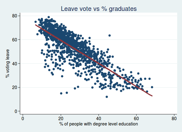
To start with, I ran the same analyses as described in Rosenbaum’s article, and I’m happy to say I got the same results. Here is the correlation between voting leave and the percentage of graduates, together with a best-fit regression line:

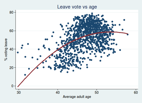
For age, I found that adding a quadratic term improved the regression model, so the relationship between age and voting leave is curved, and increases with age at first, but tails off at older age groups:

Rosenbaum also looked at the relationship with ethnicity, so I did too. Here I plot the percent voting leave against the % of people in each ward identifying as white. Again, I found the model was improved by a quadratic term, showing that the relationship is non linear. This fits with what Rosenbaum said in his article, namely that although populations with more white people were mostly more likely to vote leave, that relationship breaks down in populations with particularly high numbers of ethnic minorities:

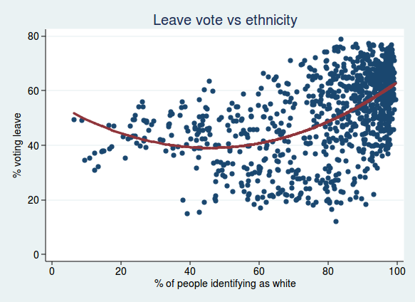
It’s interesting to note that the minimum for the % voting leave is a little over 40% white population. I suspect that the important thing here is not so much what the proportion of white people is, but how diverse a population is. Once the proportion of white people becomes very low, then maybe the population is just as lacking in diversity as populations where the proportion of white people is very high.

Anyway, the question I was interested in at the start was whether the percentage of graduates was an independent predictor of voting, even after taking account of age.

The short answer is yes, it is.

Let’s start by looking at it graphically. If we start with our regression model looking at the relationship between voting and age, we can calculate a residual for each data point, which is the difference between the data point in question and the line of best fit. We can then plot those residuals against the percentage of graduates. What we are now plotting is the voting patterns adjusted for age. So if we see a relationship with the percent of graduates, then we know that it’s still an independent predictor after adjusting for age.

This is what we get if we do that:

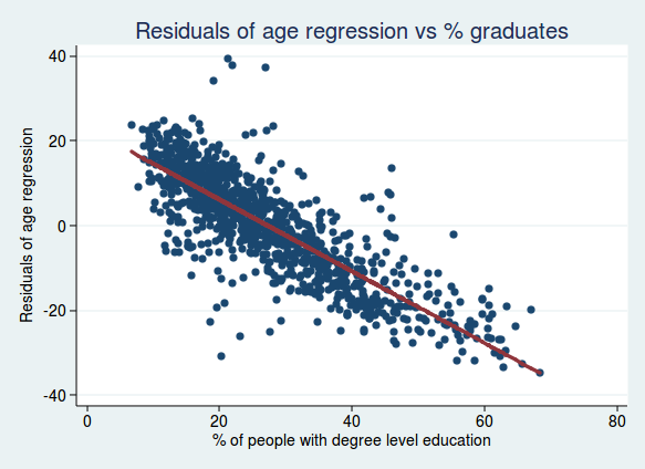
As you can see, it’s still a very strong relationship, so we can conclude that the percentage of graduates is a good predictor of voting, even after taking account of age.

What if we take account of both age and ethnicity? Here’s what we get if we do the same analysis but with the residuals from an analysis of both age and ethnicity:

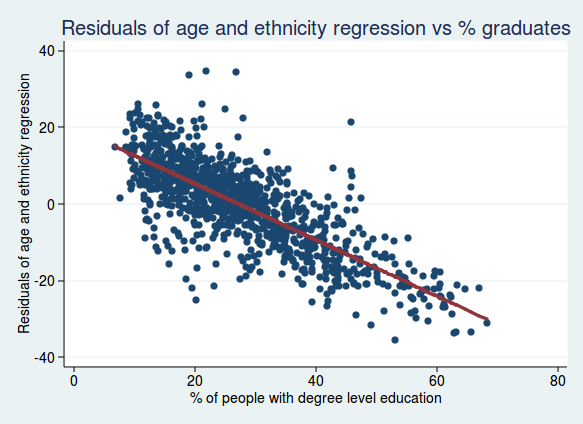
Again, the relationship still seems very strong, so the percentage of graduates really does seem to be a robust independent predictor of voting.

For the more statistically minded, another way of looking at this is to look at the regression coefficient for the percentage of graduates alone, or after adjusting for age and ethnicity (in all cases with the % voting leave as the dependent variable). Here is what we get:

Model Regression cofficient t P value
Education alone  -0.97  -45.9 < 0.001
Education and age  -0.90  -52.5 < 0.001
Education and ethnicity  -0.91  -55.0 < 0.001
Education, age, and ethnicity  -0.89  -53.9 < 0.001

So although the regression coefficient does get slightly smaller after adjusting for age and ethnicity, it doesn’t get much smaller, and remains highly statistically significant.

What if we turn this on its head and ask whether age is still an important predictor after adjusting for education?

Here is a graph of the residuals from the analysis of voting and education, plotted against age:

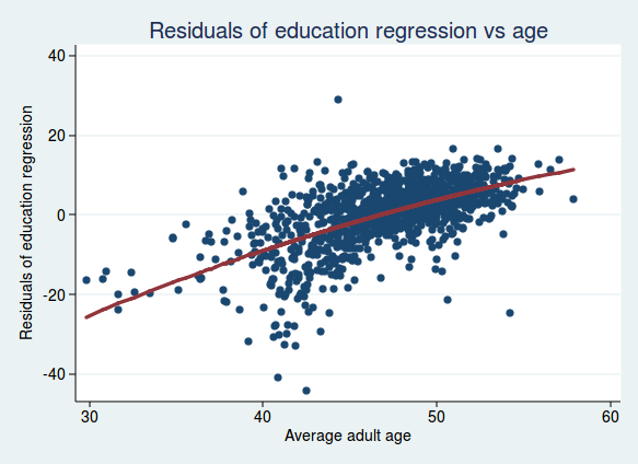
There is still a clear relationship, though perhaps not quite as strong as before. And what if we look at the residuals adjusted for both education and ethnicity, plotted against age?

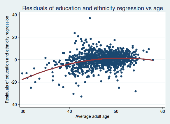
The relationship seems to be flattening out, so maybe age isn’t such a strong independent predictor once we take account of education and ethnicity (it turns out that areas with a higher proportion of white people also tend to be older).

For the statistically minded, here are what the regression coefficients look like (for ease of interpretation, I’m not using a quadratic term for age here and only looking at the linear relationship with age).

Model Regression cofficient t P value
Age alone 1.66 17.2 < 0.001
Age and education 1.28 25.3 < 0.001
Age and ethnicity 0.71 5.95 < 0.001
Age, education, and ethnicity 0.82 13.5 < 0.001

Here the adjusted regression coefficient is considerably smaller than the unadjusted one, showing that the initially strong looking relationship with age isn’t quite as strong as it seems once we take account of education and ethnicity.

So after all this I think it is safe to conclude that education is a remarkably strong predictor of voting outcome in the EU referendum, and that that relationship is not much affected by age or ethnicity. On the other hand, the relationship between age and voting outcome, while still certainly strong and statistically significant, is not quite as strong as it first appears before education and ethnicity are taken into account.

One important caveat with all these analyses of course is that they are based on aggregate data for electoral wards rather than individual data, so they may be subject to the ecological fallacy. We know that wards with a high percentage of graduates are more likely to have voted remain, but we don’t know whether individuals with degrees are more likely to have voted remain. It seems reasonably likely that that would also be true, but we can’t conclude it with certainty from the data here.

Another caveat is that data were not available from all electoral wards, and the analysis above is based on a subset of 1070 wards in England only (there are 8750 wards in England and Wales). However, the average percent voting leave in the sample analysed here was 52%, so it seems that it is probably broadly representative of the national picture.

All of this of course raises the question of why wards with a higher proportion of graduates were less likely to vote leave, but that’s probably a question for another day, unless you want to have a go at answering it in the comments.

Update 12 February 2017:

Since I posted this yesterday, I have done some further analysis, this time looking at the effect of socioeconomic classification. This classifies people according to the socioeconomic status (SES) of the job they do, ranging from 1 (higher managerial and professional occupations) to 8 (long term unemployed).

I thought it would be interesting to see the extent to which education was a marker for socioeconomic status. Perhaps it’s not really having a degree level education that predicts voting remain, but it’s being in a higher socioeconomic group?

To get a single number I could use for socioeconomic status, I calculated the percentage of people in each ward in categories 1 and 2 (the highest status categories). (I also repeated the analysis calculating the average status for each ward, and the conclusions were essentially the same, so I’m not presenting those results here.)

The relationship between socioeconomic status and voting leave looks like this:

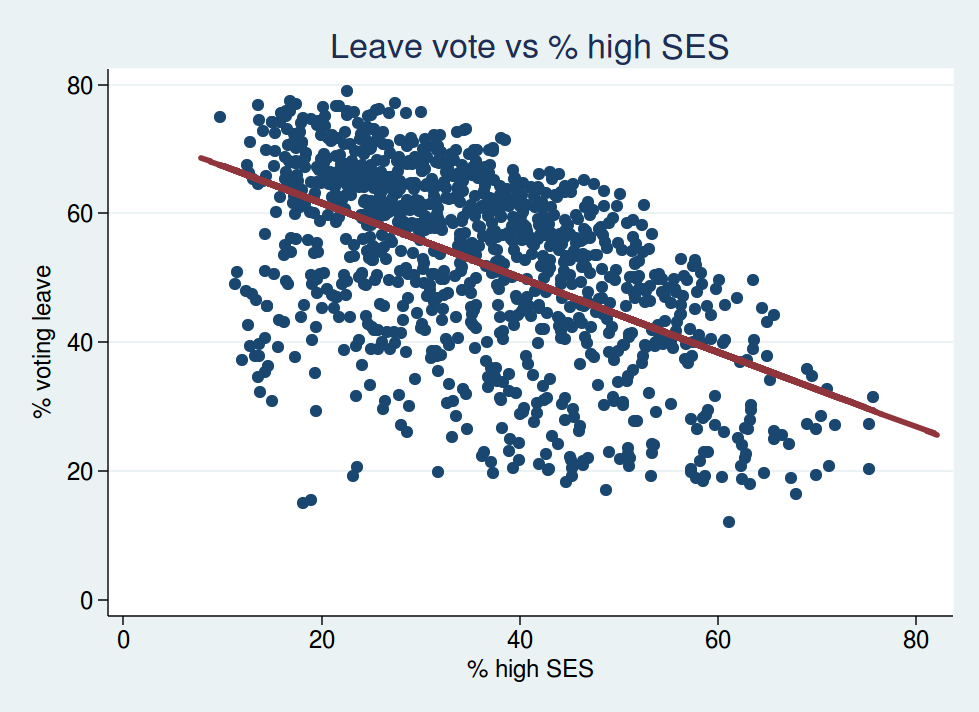
This shouldn’t come as a surprise. Wards with more people in higher SES groups were less likely to vote leave. That fits with what you would expect from the education data: wards with more people with higher SES are probably also those with more graduates.

However, if we look at the multivariable analyses, this is where it starts to get interesting.

Let’s look at the residuals from the analysis of education plotted against SES. This shows the relationship between voting leave and SES after adjusting for education.

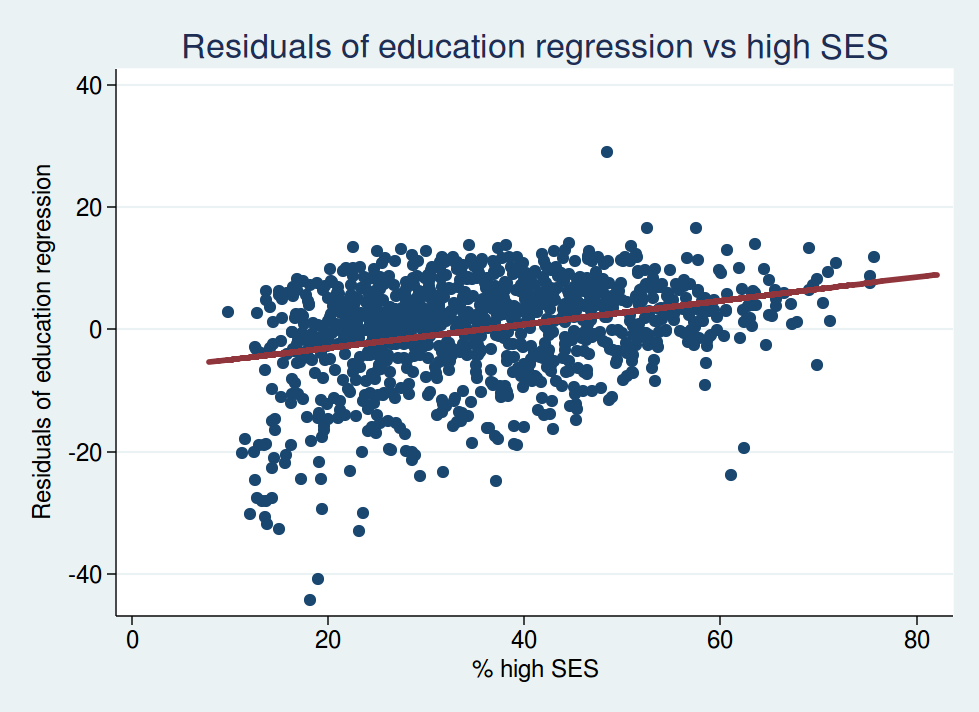
You’ll note that the slope of the best-fit regression line is now going the other way: it now slopes upwards instead of downwards. This tells us that, for wards with identical proportions of graduates, the ones with higher SES are now more likely to vote leave.

So what we are seeing here is most definitely a correlation between education and voting behaviour. Other things (ie education) being equal, wards with a higher proportion of people in high SES categories were more likely to vote leave.

For the statistically minded, here is what the regression coefficients look like. Here are the regression coefficients for the effect of socioeconomic status on voting leave:

Model Regression cofficient t P value
SES alone -0.58 -20.6 < 0.001
SES and education 0.81 26.5 < 0.001
SES, education, and ethnicity 0.49 12.4 < 0.001
SES, education, age, and ethnicity 0.31 6.5 < 0.001

Note how the sign of the regression coefficient reverses in the adjusted analyses, consistent with the slope in the graph changing from downward sloping to upward sloping.

And what happens to the regression coefficients for education once we adjust for SES?

Model Regression cofficient t P value
Education alone -0.97 -45.9 < 0.001
Education and SES -1.75 -51.9 < 0.001
Education, SES, age, and ethnicity -1.20 -23.4 < 0.001

Here the relationship between education and voting remain becomes even stronger after adjusting for SES. This shows us that it really is education that is correlated with voting behaviour, and it’s not simply a marker for higher SES. In fact once you adjust for education, higher SES predicts a greater likelihood of voting leave.

To be honest, I’m not sure these results are what I expected to see. I think it’s worth reiterating the caveat above about the ecological fallacy. We do not know whether individuals of higher socioeconomic status are more likely to vote leave after adjusting for education. All we can say is that electoral wards with a higher proportion of people of high SES are more likely to vote leave after adjusting for the proportion of people in that ward with degree level education.

But with those caveats in mind, it certainly seems as if it is a more educated population first and foremost which predicts a higher remain vote, and not a population of higher socioeconomic status.

The Trials Tracker and post-truth politics

The All Trials campaign was founded in 2013 with the stated aim of ensuring that all clinical trials are disclosed in the public domain. This is, of course, an entirely worthy aim. There is no doubt that sponsors of clinical trials have an ethical responsibility to make sure that the results of their trials are made public.

However, as I have written before, I am not impressed by the way the All Trials campaign misuses statistics in pursuit of its aims. Specifically, the statistic they keep promoting, “about half of all clinical trials are unpublished”, is simply not evidence based. Most recent studies show that the extent of trials that are undisclosed is more like 20% than 50%.

The latest initiative by the All Trials campaign is the Trials Tracker. This is an automated tool that looks at all trials registered on clinicaltrials.gov since 2006 and determines, using an automated algorithm, which of them have been disclosed. They found 45% were undisclosed (27% of industry sponsored-trials and 54% of non-industry trials). So, surely this is evidence to support the All Trials claim that about half of trials are undisclosed, right?

Wrong.

In fact it looks like the true figure for undisclosed trials is not 45%, but at most 21%. Let me explain.

The problem is that an automated algorithm is not very good at determining whether trials are disclosed or not. The algorithm can tell if results have been posted on clinicaltrials.gov, and also searches PubMed for publications with a matching clinicaltrials.gov ID number. You can probably see the flaw in this already. There are many ways that results could be disclosed that would not be picked up by that algorithm.

Many pharmaceutical companies make results of clinical trials available on their own websites. The algorithm would not pick that up. Also, although journal publications of clinical trials should ideally make sure they are indexed by the clinicaltrials.gov ID number, in practice that system is imperfect. So the automated algorithm misses many journal articles that aren’t indexed correctly with their ID number.

So how bad is the algorithm?

The sponsor with the greatest number of unreported trials, according to the algorithm, is Sanofi. I started by downloading the raw data, picked the first 10 trials sponsored by Sanofi that were supposedly “undisclosed”, and tried searching for results manually.

As an aside, the Trials Tracker team get 7/10 for transparency. They make their raw data available for download, which is great, but they don’t disclose their metadata (descriptions of what each variable in the dataset represents), so it was rather hard work figuring out how to use the data. But I think I figured it out in the end, as after trying a few combinations of interpretations I was able to replicate their published results exactly.

Anyway, of those 10 “undisclosed” trials by Sanofi, 8 of them were reported on Sanofi’s own website, and one of the remaining 2 was published in a journal. So in fact only 1 of the 10 was actually undisclosed. I posted this information in a comment on the journal article in which the Trials Tracker is described, and it prompted another reader, Tamas Ferenci, to investigate the Sanofi trials more systematically. He found that 227 of the 285 Sanofi trials (80%) listed as undisclosed by Trials Tracker were in fact published on Sanofi’s website. He then went on to look at “undisclosed” trials sponsored by AstraZeneca, and found that 38 of the 68 supposedly undisclosed trials (56%) were actually published on AstraZeneca’s website. Ferenci’s search only looked at company websites, so it’s possible that more of the trials were reported in journal articles.

The above analyses only looked at a couple of sponsors, and we don’t know if they are representative. So to investigate more systematically the extent to which the Trials Tracker algorithm underestimates disclosure, I searched for results manually for 100 trials: a random selection of 50 industry trials and a random selection of 50 non-industry trials.

I found that 54% (95% confidence interval 40-68%) of industry trials and 52% (95% CI 38-66%) of non-industry trials that had been classified as undisclosed by Trials Tracker were available in the public domain. This might be an underestimate, as my search was not especially thorough. I searched Google, Google Scholar, and PubMed, and if I couldn’t find any results in a few minutes then I gave up. A more systematic search might have found more articles.

If you’d like to check the results yourself, my findings are in a csv file here. This follows the same structure as the original dataset (I’d love to be able to give you the metadata for that, but as mentioned above, I can’t), but with the addition of 3 variables at the end. “Disclosed” specifies whether the trial was disclosed, and if so, how (journal, company website, etc). It’s possible that trials were disclosed in more than one place, but once I’d found a trial in one place I stopped searching. “Link” is a link to the results if available, and “Comment” is any other information that struck me as relevant, such as whether a trial was terminated prematurely or was of a product which has since been discontinued.

Putting these figures together with the Trials Tracker main results, this suggests that only 12% of industry trials and 26% of non-industry trials are undisclosed, or 21% overall (34% of the trials were sponsored by industry). And given the rough and ready nature of my search strategy, this is probably an upper bound for the proportion of undisclosed trials. A far cry from “about half”, and in fact broadly consistent with the recent studies showing that about 80% of trials are disclosed. It’s also worth noting that industry are clearly doing better at disclosure than academia. Much of the narrative that the All Trials campaign has encouraged is of the form “evil secretive Big Pharma deliberately withholding their results”. The data don’t seem to support this. It seems far more likely that trials are undisclosed simply because triallists lack the resources to write them up for publication. Research in industry is generally better funded than research in academia, and my guess is that the better funding explains why industry do better at disclosing their results. I and some colleagues have previously suggested that one way to increase trial disclosure rates would be to ensure that funders of research ringfence a part of their budget specifically for the costs of publication.

There are some interesting features of the 23 out of the 50 industry-sponsored trials that really did seem to be undisclosed. 9 of them were not trials of a drug intervention. Of the 14 undisclosed drug trials, 4 were of products that had been discontinued and a further 3 had sample sizes less than 12 subjects, so none of those 7 studies are likely to be relevant to clinical practice. It seems that undisclosed industry-sponsored drug trials of relevance to clinical practice are very rare indeed.

The Trials Tracker team would no doubt respond by saying that the trials missed by their algorithm have been badly indexed, which is bad in itself. And they would be right about that. Trial sponsors should update clinicaltrials.gov with their results. They should also make sure that the clinicaltrials.gov ID number is included in the publication (although in several cases of published trials that were missed by the algorithm, the ID number was in fact included in the abstract of the paper, so this seems to be a fault of Medline indexing rather than any fault of the triallists).

However, the claim made by the Trials Tracker is not that trials are badly indexed. If they stuck to making only that claim, then the Trials Tracker would be a perfectly worthy and admirable project. But the problem is they go beyond that, and claim something which their data simply do not show. Their claim is that the trials are undisclosed. This is just wrong. It is another example of what seems to be all the rage these days, namely “post-truth politics”. It is no different from when the Brexit campaign said “We spend £350 million a week on the EU and could spend it on the NHS instead” or when Donald Trump said, well, pretty much every time his lips moved really.

Welcome to the post-truth world.


Sugar tax

One of the most newsworthy features of yesterday’s budget was the announcement that the UK will introduce a tax on sugary drinks.

There is reason to think this may have primarily been done as a dead cat move, to draw attention away from the fact the the Chancellor is missing all his deficit reduction targets and cutting disability benefits (though apparently he can still afford tax cuts for higher rate tax payers).

But what effect might a tax on sugary drinks have?

Obviously it will reduce consumption of sugary drinks:  it’s economics 101 that when the price of something goes up, consumption falls. But that by itself is not interesting or useful. The question is what effect will that have on health and well-being?

The only honest answer to that is we don’t know, as few countries have tried such a tax, and we do not have good data on what the effects have been in countries that have.

For millionaires such as George Osborne and Jamie Oliver, the tax is unlikely to make much difference. Sugary drinks are such a tiny part of their expenditure, they will probably not notice.

But what about those at the other end of the income scale? While George Osborne may not realise this, there are some people for whom the weekly grocery shop is a significant proportion of their total expenditure. For such people, taxing sugary drinks may well have a noticeable effect.

For a family who currently spends money on sugary drinks, 3 outcomes are possible.

The first possibility is that they continue to buy the same quantity of sugary drinks as before (or sufficiently close to the same quantity that their total expenditure still rises). They will then be worse off, as they will have less money to spend on other things. This is bad in itself, but also one of the strongest determinants of ill health is poverty, so taking money away from people is unlikely to make them healthier.

The second possibility is that they reduce their consumption of sugary drinks by an amount roughly equivalent to the increased price. They will then be no better or worse off in terms of the money left in their pocket after the weekly grocery shopping, but they will be worse off in welfare terms, as they will have less of something that they value (sugary drinks). We know that they value sugary drinks, because if they didn’t, they wouldn’t buy them in the first place.

Proponents of the sugar tax will argue that they will be better off in health terms, as sugary drinks are bad for you, and they are now consuming less of them. Well, maybe. But that really needs a great big [citation needed]. This would be a relatively modest decrease in sugary drink consumption, and personally I would be surprised if it made much difference to health. There is certainly no good evidence that it would have benefits on health, and given that you are harming people by depriving them of something they value, I think it is up to proponents of the sugar tax to come up with evidence that the benefits outweigh those harms. It seems rather simplistic to suppose that obesity, diabetes, and the other things the the sugar tax is supposed to benefit are primarily a function of sugary drink consumption, when there are so many other aspects of diet, and of course exercise, which the sugar tax will not affect.

The third possibility is that they reduce their consumption by more than the amount of the price increase. They will now have more money in their pocket at the end of the weekly grocery shop. Perhaps they will spend that money on vegan tofu health drinks and gym membership, and be healthier as a result, as the supporters of the sugar tax seem to believe. Or maybe they’ll spend it on cigarettes and boiled sweets. We simply don’t know, as there are no data to show what happens here. The supposed health benefits of the sugar tax are at this stage entirely hypothetical.

But whatever they spend it on, they would have preferred to spend it on sugary drinks, so we are again making them worse off in terms of the things that they value.

All these considerations are trivial for people on high incomes. They may not be for people on low incomes. What seems certain is that the costs of the sugar tax will fall disproportionately on the poor.

You may think that’s a good idea. George Osborne obviously does. But personally, I’m not a fan of regressive taxation.

The amazing magic Saatchi Bill

Yesterday saw the dangerous and misguided Saatchi Bill (now reincarnated as the Access to Medical Treatments (Innovation) Bill) debated in the House of Commons.

The bill started out as an attempt by the Conservative peer Lord Saatchi to write a new law to encourage innovation in medical research. I have no doubt that the motivation for doing so was based entirely on good intentions, but sadly the attempt was badly misguided. Although many people explained to Lord Saatchi why he was wrong to tackle the problem in the way he did, it turns out that listening to experts is not Saatchi’s strong suit, and he blundered on with his flawed plan anyway.

If you want to know what is wrong with the bill I can do no better than direct you to the Stop the Saatchi Bill website, which explains the problems with the bill very clearly. But briefly, it sets out to solve a problem that does not exist, and causes harm at the same time. It attempts to promote innovation in medical research by removing the fear of litigation from doctors who innovate, despite the fact that fear of litigation is not what stops doctors innovating. But worse, it removes important legal protection for patients. Although the vast majority of doctors put their patients’ best interests firmly at the heart of everything they do, there will always be a small number of unscrupulous quacks who will be only too eager to hoodwink patients into paying for ineffective or dangerous treatments if they think there is money in it.

If the bill is passed, any patients harmed by unscrupulous quacks will find it harder to get redress through the legal system. That does not protect patients.

Although the bill as originally introduced by Saatchi failed to make sufficient progress through Parliament, it has now been resurrected in a new, though essentially similar, form as a private member’s bill in the House of Commons.

I’m afraid to say that the debate in the House of Commons did not show our lawmakers in a good light.

We were treated to several speeches by people who clearly either didn’t understand what the bill was about or were being dishonest. The two notable exceptions were Heidi Alexander, the Shadow Health Secretary, and Sarah Wollaston, chair of the Health Select Committee and a doctor herself in a previous career. Both Alexander and Wollaston clearly showed that they had taken the trouble to read the bill and other relevant information carefully, and based their contributions on facts rather than empty rhetoric.

I won’t go into detail on all the speeches, but if you want to read them you can do so in Hansard.

The one speech I want to focus on is by George Freeman, the Parliamentary Under-Secretary of State for Life Sciences. As he is a government minister, his speech gives us a clue about the government’s official thinking on the bill. Remember that it is a private member’s bill, so government support is crucial if it is to have a chance of becoming law. Sadly, Freeman seems to have swallowed the PR surrounding the bill and was in favour of it.

Although Freeman said many things, many of which showed either a poor understanding of the issues or blatant dishonesty, the one I particularly want to focus on is where he imbued the bill with magic powers.

He repeated the myths about fear of litigation holding back medical research. He was challenged in those claims by both Sarah Wollaston and Heidi Alexander.

When he reeled off a whole bunch of statistics about how much money medical litigation cost the NHS, Wollaston asked him how much of that was specifically related to complaints about innovative treatments. His reply was telling:

“Most of the cases are a result of other contexts— as my hon. Friend will know, obstetrics is a big part of that—rather than innovation. I am happy to write to her with the actual figure as I do not have it to hand.”

Surely that is the one statistic he should have had to hand if he’d wanted to appear even remotely prepared for his speech? What is the point of being able to quote all sorts of irrelevant statistics about the total cost of litigation in the NHS if he didn’t know the one statistic that actually mattered? Could it be that he knew it was so tiny it would completely undermine his case?

He then proceeded to talk about the fear of litigation, at which point Heidi Alexander asked him what evidence he had. He had to admit that he had none, and muttered something about “anecdotally”.

But anyway, despite having failed to make a convincing case that fear of litigation was holding back innovation, he was very clear that he thought the bill would remove that fear.

And now we come to the magic bit.

How exactly was that fear of litigation to be removed? Was it by changing the law on medical negligence to make it harder to sue “innovative” doctors? This is what Freeman said:

“As currently drafted the Bill provides no change to existing protections on medical negligence, and that is important. It sets out the power to create a database, and a mechanism to make clear to clinicians how they can demonstrate compliance with existing legal protection—the Bolam test has been referred to—and allow innovations to be recorded for the benefit of other clinicians and their patients. Importantly for the Government, that does not change existing protections on medical negligence, and it is crucial to understand that.”

So the bill makes no change whatsoever to the law on medical negligence, but removes the fear that doctors will be sued for negligence. If you can think of a way that that could work other than by magic, I’m all ears.

In the end, the bill passed its second reading by 32 votes to 19. Yes, that’s right: 599 well over 500* MPs didn’t think protection of vulnerable patients from unscrupulous quacks was worth turning up to vote about.

I find it very sad that such a misguided bill can make progress through Parliament on the basis of at best misunderstandings and at worst deliberate lies.

Although the bill has passed its second reading, it has not yet become law. It needs to go through its committee stage and then return to the House of Commons for its third reading first. It is to be hoped that common sense will prevail some time during that process, or patients harmed by unscrupulous quacks will find that the law does not protect them as much as it does now.

If you want to write to your MP to urge them to turn up and vote against this dreadful bill when it comes back for its third reading, now would be a good time.

* Many thanks to @_mattl on Twitter for pointing out the flaw in my original figure of 599: I hadn’t taken into account that the Speaker doesn’t vote, the Tellers aren’t counted in the totals, Sinn Fein MPs never turn up at all, and SNP MPs are unlikely to vote as this bill doesn’t apply to Scotland.

Equality of opportunity

Although this is primarily a blog about medical stuff, I did warn you that there might be the occasional social science themed post. This is one such post.

In his recent speech to the Conservative Party conference, David Cameron came up with many fine words about equality of opportunity. He led us to believe that he was for it. Here is an extract from the relevant part of his speech:

If we tackle the causes of poverty, we can make our country greater.

But there’s another big social problem we need to fix.

In politicians’ speak: a “lack of social mobility”.

In normal language: people unable to rise from the bottom to the top, or even from the middle to the top, because of their background.

Listen to this: Britain has the lowest social mobility in the developed world.

Here, the salary you earn is more linked to what your father got paid than in any other major country.

I’m sorry, for us Conservatives, the party of aspiration, we cannot accept that.

We know that education is the springboard to opportunity.

Fine words indeed. Cameron is quite right to identify lack of social mobility as a major problem. It cannot be right that your life chances should depend so much on who your parents are.

Cameron is also quite right to highlight the important role of education. Inequality of opportunity starts at school. If you have pushy middle class parents who get you into a good school, then you are likely to do better than if you have disadvantaged parents and end up in a poor school.

But it is very hard to reconcile Cameron’s fine words with today’s announcement of a new grammar school. In theory, grammar schools are supposed to aid social mobility by allowing bright kids from disadvantaged backgrounds to have a great education.

But in practice, they do no such thing.

In practice, grammar schools perpetuate social inequalities. Grammar schools are largely the preserve of the middle classes. According to research from the Institute for Fiscal studies, children from disadvantaged backgrounds are less likely than their better off peers to get into grammar schools, even if they have the same level of academic achievement.

It’s almost as if Cameron says one thing but means something else entirely, isn’t it?

If Cameron is serious about equality of opportunity, I have one little trick from the statistician’s toolkit which I think could help, namely randomisation.

My suggestion is this. All children should be randomly allocated to a school. Parents would have no say in which school their child goes to: it would be determined purely by randomisation. The available pool of schools would of course need to be within reasonable travelling distance of where the child lives, but that distance could be defined quite generously, so that you wouldn’t still have cosy middle class schools in cosy middle class neighbourhoods and poor schools in disadvantaged neighbourhoods.

At the moment, it is perfectly accepted by the political classes that some schools are good schools and others are poor. Once the middle classes realise that their own children might have to go to the poor schools, my guess is that the acceptance of the existence of poor schools would rapidly diminish. Political pressure would soon make sure that all schools are good schools.

That way, all children would have an equal start in life, no matter how rich their parents were.

This suggestion is, of course, pure fantasy. There is absolutely no way that our political classes would ever allow it. Under a system like that, their own children might have to go to school with the plebs, and that would never do, would it?

But please don’t expect me to take any politician seriously if they talk about equality of opportunity on the one hand but still support a system in which the school that kids go to is determined mainly by the socioeconomic status of their parents.

Energy prices rip off

Today we have learned that the big six energy providers have been overcharging customers to the tune of over £1 billion per year.

Obviously your first thought on this story is “And what will we learn next week? Which religion the Pope follows? Or perhaps what do bears do in the woods?” But I think it’s worth taking a moment to think about why the energy companies have got away with this, and what might be done about it.

Energy companies were privatised by the Thatcher government back in the late 1980s and early 1990s, based on the ideological belief that competition would make the market more efficient. I’m not sure I’d call overcharging consumers by over £1 billion efficient.

It’s as if Thatcher had read the first few pages of an economics textbook that talks about the advantages of competition and the free market, and then gave up on the book without reading the rest of it to find out what can go wrong with free markets in practice.

Many things can go wrong with free markets, but the big one here is information asymmetry. It’s an important assumption of free market competition that buyers and sellers have perfect information. If buyers do not know how much something is costing them, how can they choose the cheapest supplier?

It is extraordinarily difficult to compare prices among energy suppliers. When I last switched my energy supplier, I spent well over an hour constructing a spreadsheet to figure out which supplier would be cheapest for me. And I’m a professional statistician, so I’m probably better equipped to do that task than most.

Even finding out the prices is a struggle. Here is what I was presented with after I looked on NPower’s website to try to find the prices of their energy:

Screenshot from 2015-07-07 08:24:19

It seems that they want to know everything about me before they’ll reveal their prices. And I’d already had to give them my postcode before I even got that far. Not exactly transparent, is it?

It was similarly impossible to find out Eon’s prices without giving them my entire life history. EDF and SSE were a bit more transparent, though both of them needed to know my postcode before they’d reveal their prices.

Here are EDF’s rates:

Screenshot from 2015-07-07 08:31:06

And here are SSE’s rates:

Screenshot from 2015-07-07 08:30:20

Which of those is cheaper? Without going through that spreadsheet exercise, I have no idea. And that’s just the electricity prices. Obviously I have to do the same calculations for gas, and given that they all give dual fuel discounts, I then have to calculate a total as well as figuring out whether I would be better off going with separate suppliers for gas and electricity to take the cheapest deal on each and whether that would compensate for the dual fuel discount.

And then of course I also have to take into account how long prices are fixed for, what the exit charges are, etc etc.

Seriously, if I as a professional statistician find this impossibly difficult, how is anyone else supposed to figure it out? There are price comparison websites that are supposed to help people compare prices, but of course they have to make a living, and have their own problems.

It’s no wonder that competition is not working for the benefit of consumers.

So what is to be done about it?

I think there is a simple solution here. All suppliers should be required to charge in a simple and transparent way. The standing charge should go. Suppliers should be required simply to quote a price per unit, and should also be required to publish those prices prominently on their website without consumers having to give their inside leg measurements first. If different rates are given for day and night use, a common ratio of day rate to night rate should be required (the ratio used could be reviewed annually in response to market conditions).

Suppliers will no doubt argue that a flat price per unit is inefficient, as there are costs involved in simply having a customer even before any energy is used, and a customer who uses twice as much energy as another does not cost them twice as much.

Tough. The energy companies have had over 20 years to sort out their act, and have failed. While I’m not a fan of governments intervening in markets as a general principle, there are times when it is useful, and this is one of them. I don’t see how anyone can argue that an industry that overcharges consumers by over £1 billion per year is efficient. No one energy company would be at  a disadvantage, as all their competitors would be in the same position.

There would be a further benefit to this idea, in that it would add an element of progressiveness to energy pricing. At the moment, poor people who don’t use much energy pay more per unit than rich people. That doesn’t really seem fair, does it?

This is such a simple and workable idea it is hard to understand why it hasn’t already been implemented. Unless, of course, recent governments were somehow on the side of big business and cared far less about ordinary consumers.

But that can’t be true, can it?

What my hip tells me about the Saatchi bill

I have a hospital appointment tomorrow, at which I shall have a non-evidence-based treatment.

This is something I find somewhat troubling. I’m a medical statistician: I should know about evidence for the efficacy of medical interventions. And yet even I find myself ignoring the lack of good evidence when it comes to my own health.

I have had pain in my hip for the last few months. It’s been diagnosed by one doctor as trochanteric bursitis and by another as gluteus medius tendinopathy. Either way, something in my hip is inflammed, and is taking longer than it should to settle down.

So tomorrow, I’m having a steroid injection. This seems to be the consensus among those treating me. My physiotherapist was very keen that I should have it. My GP thought it would be a good idea. The consultant sports physician I saw last week thought it was the obvious next step.

And yet there is no good evidence that steroid injections work. I found a couple of open label randomised trials which showed reasonably good short-term effects for steroid injections, albeit little evidence of benefit in the long term. Here’s one of them. The results look impressive on a cursory glance, but something that really sticks out at me is that the trials weren’t blinded. Pain is subjective, and I fear the results are entirely compatible with a placebo effect. Perhaps my literature searching skills are going the same way as my hip, but I really couldn’t find any double-blind trials.

So in other words, I have no confidence whatsoever that a steroid injection is effective for inflammation in the hip.

So why am I doing this? To be honest, I’m really not sure. I’m bored of the pain, and even more bored of not being able to go running, and I’m hoping something will help. I guess I like to think that the health professionals treating me know what they’re doing, though I really don’t see how they can know, given the lack of good evidence from double blind trials.

What this little episode has taught me is how powerful the desire is to have some sort of treatment when you’re ill. I have some pain in my hip, which is pretty insignificant in the grand scheme of things, and yet even I’m getting a treatment which I have no particular reason to think is effective. Just imagine how much more powerful that desire must be if you’re really ill, for example with cancer. I have no reason to doubt that the health professionals treating me are highly competent and well qualified professionals who have my best interests at heart. But it has made me think how easy it must be to follow advice from whichever doctor is treating you, even if that doctor might be less scrupulous.

This has made me even more sure than ever that the Saatchi bill is a really bad thing. If a medical statistician who thinks quite carefully about these things is prepared to undergo a non-evidence-based treatment for what is really quite a trivial condition, just think how much the average person with a serious disease is going to be at the mercy of anyone treating them. The last thing we want to do is give a free pass for quacks to push completely cranky treatments at anyone who will have them.

And that’s exactly what the Saatchi bill will facilitate.