I wrote recently about wet bulb temperatures (WBTs), and why we should be worried if they get too high. In that post, I mentioned that I had excluded data from before 1990, as I was concerned about the data quality. For the rest of that post, I assumed that the quality control of the HadISD dataset that the Met Office does would be adequate and that the episodes of extreme WBTs that I found in the dataset were real.
I’ve been thinking about that some more, and I think I probably need to be a bit more careful about data quality. Although the Met Office’s quality control procedures are very thorough, the observations that I’ve been looking at are by definition outliers. So even if 99.99% of the observations in the dataset are genuine (and I don’t know if that’s the right figure), the extreme observations I was interested in are far more likely to be in that remaining 0.01% than some randomly selected observation.
I’ve had some discussions about this with Dr Kate Willett from the Met Office, who has been supremely helpful and has given me some great ideas about how to look in more detail at the data quality. I’m very grateful to Dr Willett for her support, and much of the deep dive into data quality in the rest of this blog post uses her ideas. Any errors in my interpretation of the data below are mine.
So, for today I’d like to look at some of the extreme WBT episodes I found and look in more detail about whether they appear to be genuine or some artefact of faulty instruments or similar.
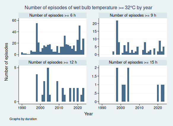
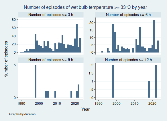
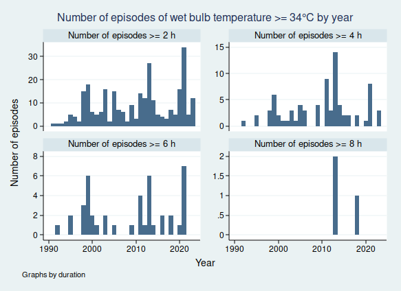
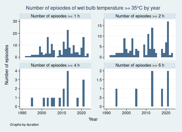
I gave a list of extreme WBT episodes in my last post, and I’m going to use a slightly different one here, though several of the episodes are common to both lists. Today I’m looking at all episodes where the WBT was recorded as being at least 35°C for at least 4 h, and I’m including all data at any time in the dataset (last time I excluded any observations before 1990). This gives us the following list of 26 episodes:
| Weather station | Date of observation | Hours WBT ≥ 35 | Max WBT |
| 723870-03160, DESERT ROCK AIRPORT, Nye County, Nevada, United States (36.621, -116.028) | 08 May 1979 | 6 | 38.8 |
| 13 May 1980 | 4 | 39 | |
| 24 May 1980 | 5 | 36.7 | |
| 25 May 1980 | 12 | 38.6 | |
| 29 May 1980 | 5 | 39.4 | |
| 19 Apr 1981 | 6 | 39 | |
| 20 Apr 1981 | 11 | 39.8 | |
| 21 Apr 1981 | 4 | 38.8 | |
| 20 May 1981 | 9 | 39.8 | |
| 09 May 1982 | 4 | 39.1 | |
| 944490-99999, LAVERTON AERO, Shire Of Laverton, Western Australia, 6440, Australia (-28.617, 122.417) | 22 Jan 1995 | 6 | 36.2 |
| 952050-99999, DERBY AERO, Shire Of Derby-West Kimberley, Western Australia, Australia (-17.367, 123.667) | 03 Feb 2001 | 4 | 36.8 |
| 404160-99999, KING ABDULAZIZ AB, Dammam Governorate, Eastern Province, Saudi Arabia (26.265, 50.152) | 08 Jul 2003 | 5 | 36.5 |
| 417150-99999, SHAHBAZ AB, Jacobabad District, Larkana Division, Sindh, 79000, Pakistan (28.284, 68.45) | 06 Jun 2005 | 6 | 37.4 |
| 954820-99999, BIRDSVILLE, Diamantina Shire, Queensland, Australia (-25.898, 139.348) | 30 Dec 2006 | 4 | 36.6 |
| 952050-99999, DERBY AERO, Shire Of Derby-West Kimberley, Western Australia, Australia (-17.367, 123.667) | 16 Apr 2009 | 4 | 36.5 |
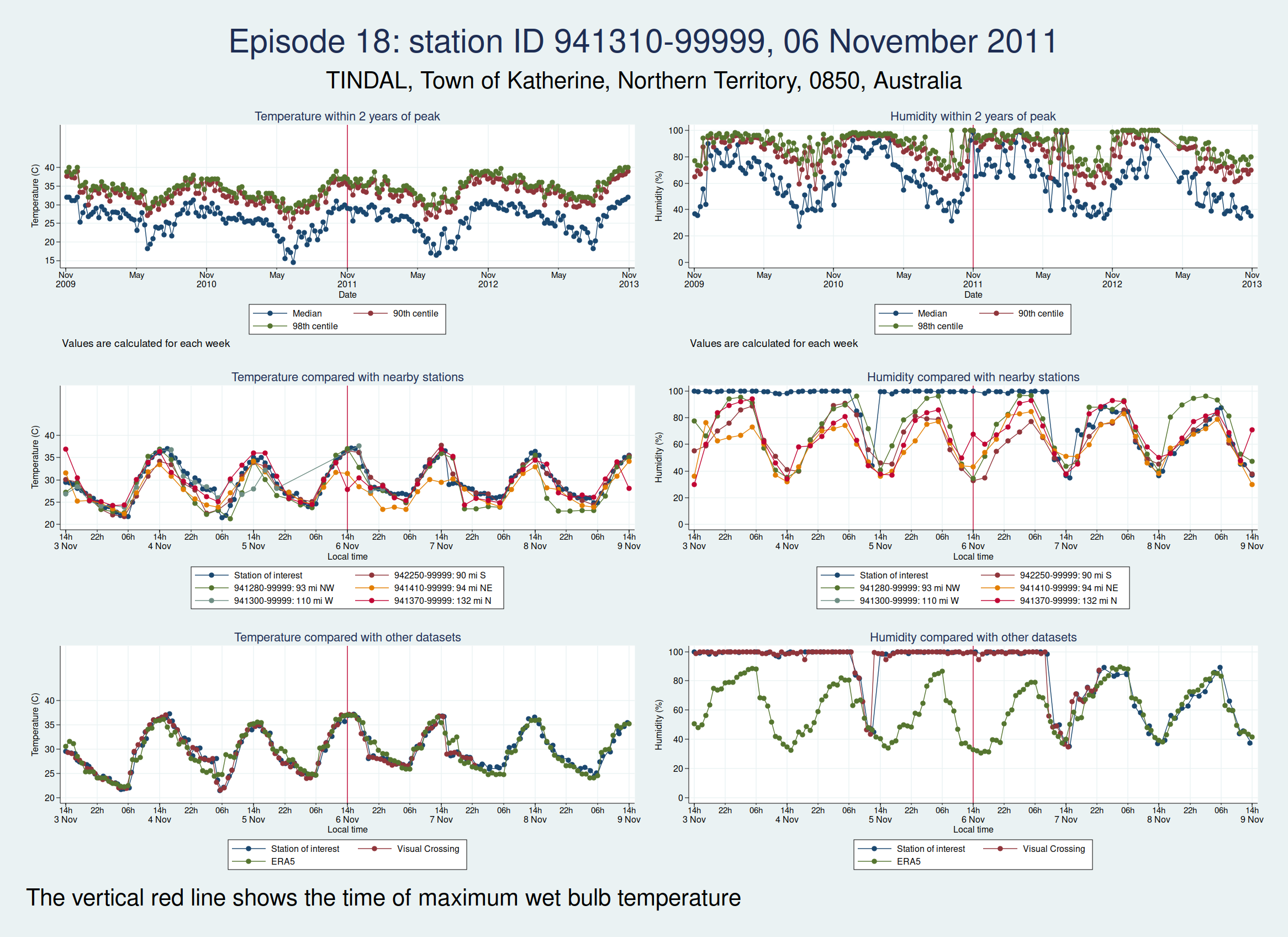
| 941310-99999, TINDAL, Town of Katherine, Northern Territory, 0850, Australia (-14.521, 132.378) | 04 Nov 2011 | 4 | 36.5 |
| 06 Nov 2011 | 5 | 36.9 | |
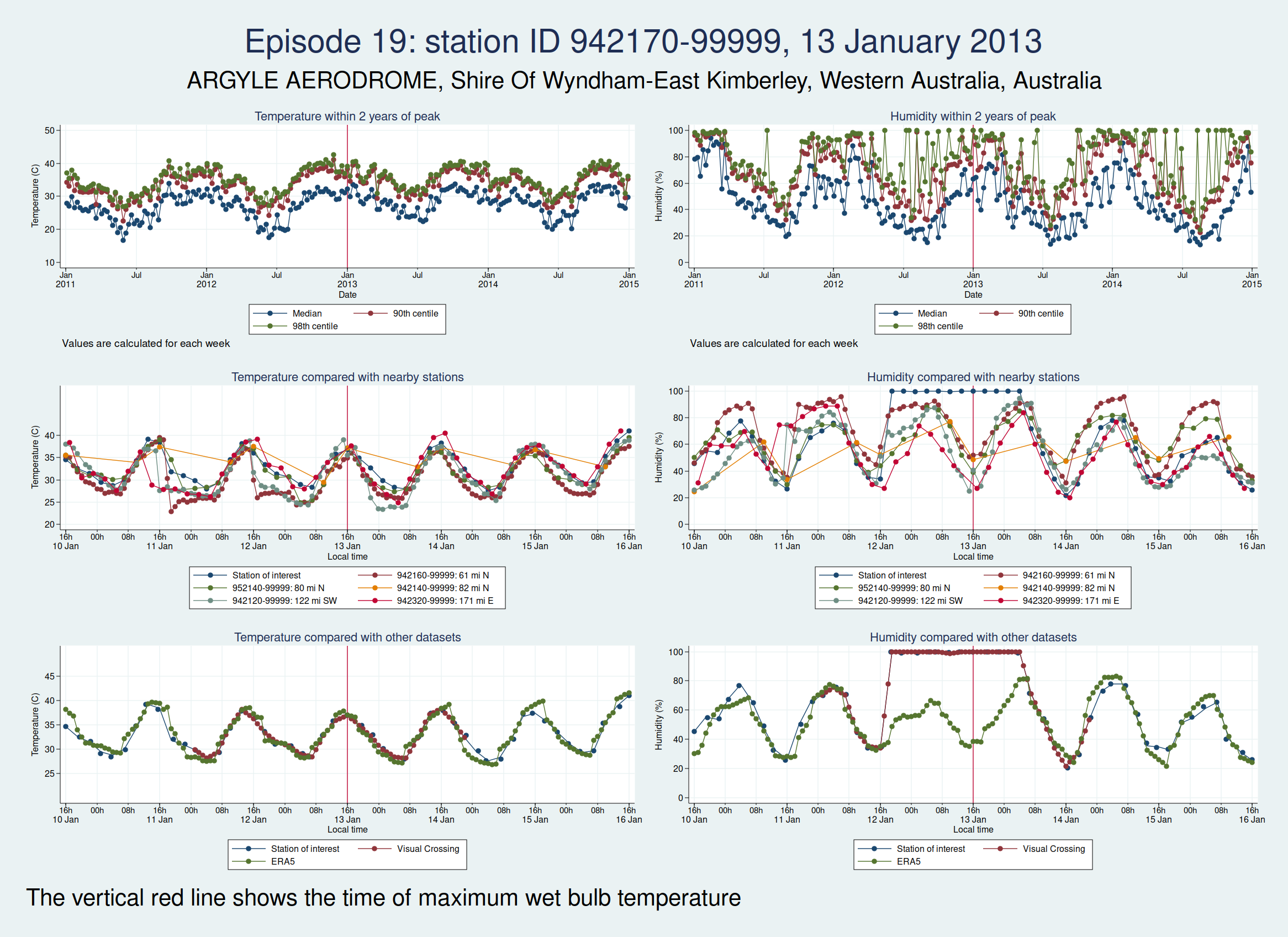
| 942170-99999, ARGYLE AERODROME, Shire Of Wyndham-East Kimberley, Western Australia, Australia (-16.633, 128.45) | 13 Jan 2013 | 6 | 36.9 |
| 946590-99999, WOOMERA, Pastoral Unincorporated Area, South Australia, Australia (-31.144, 136.817) | 11 Mar 2013 | 6 | 36.6 |
| 943120-99999, PORT HEDLAND INTL, Town Of Port Hedland, Western Australia, Australia (-20.378, 118.626) | 24 Mar 2013 | 4 | 36.9 |
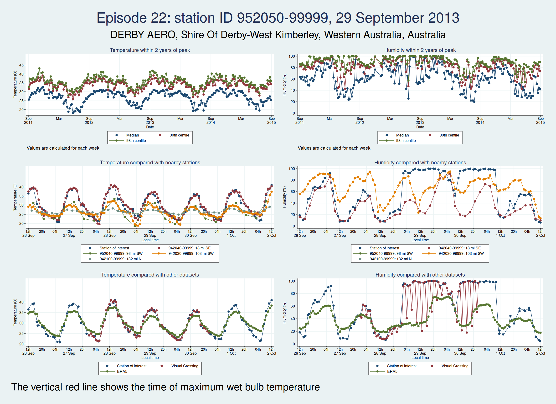
| 952050-99999, DERBY AERO, Shire Of Derby-West Kimberley, Western Australia, Australia (-17.367, 123.667) | 29 Sep 2013 | 4 | 35.8 |
| 760400-99999, EJIDO NUEVO LEON BC., Municipio de Mexicali, Baja California, Mexico (32.4, -115.183) | 23 Jul 2018 | 6 | 38.4 |
| 948170-99999, COONAWARRA, Wattle Range Council, South Australia, Australia (-37.3, 140.817) | 10 Jan 2021 | 4 | 36.5 |
| 760400-99999, EJIDO NUEVO LEON BC., Municipio de Mexicali, Baja California, Mexico (32.4, -115.183) | 21 Jul 2021 | 6 | 37.5 |
| 16 Aug 2021 | 6 | 37.2 |
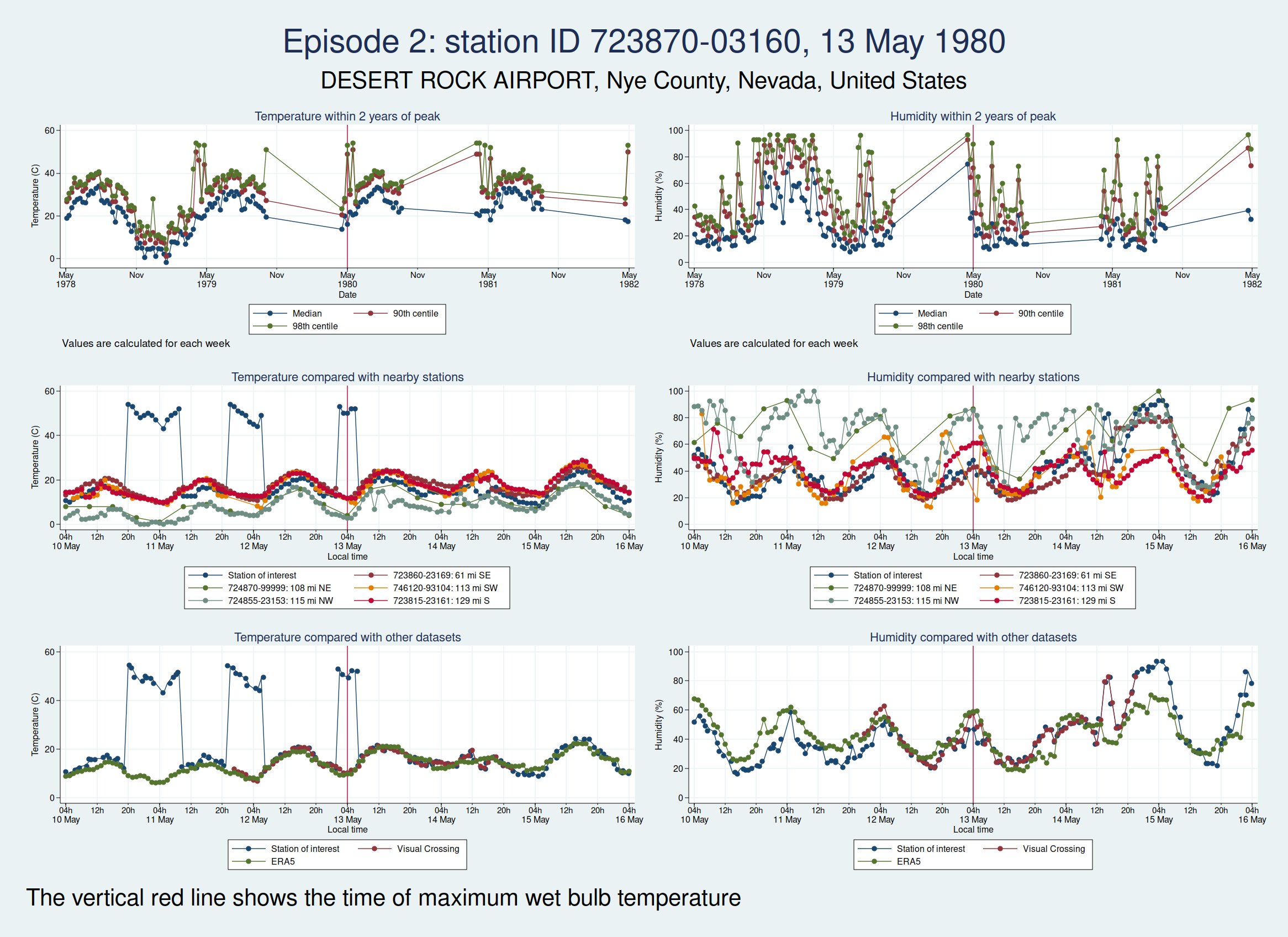
For each of those episodes, I have drawn a panel of 6 graphs which I hope is going to give us a clue about whether the data look reliable. I have plotted the dry bulb temperature (what we would normally call just “temperature”) on the left and the humidity on the right. WBT is calculated from dry bulb temperature and humidity, so if either of those variables looks wrong, then the calculated WBT is likely to be wrong as well.
The top graph shows the evolution over a 4 year period centred on the extreme episode. This lets us see if we’re following something approximating to normal seasonal variation for the location or if there has been some kind of spike. It’s a bit much to plot individual hourly values over that timescale, so I have calculated summary statistics for each week: the median, 90th centile, and 98th centile. If there’s a sudden increase in the gap between the median and higher centiles, that suggests that we may have weird outliers.
The middle graph shows a 6 day period centred on the maximum of WBT, this time plotting individual values, and shows nearby stations for comparison. I have included up to 5 other stations within 200 miles of the index station. There may be fewer than 5 other stations if there weren’t 5 stations within 200 miles. This lets us see whether the values are following a reasonable diurnal variation and whether they are obvious outliers compared with nearby stations.
The bottom graph compares the values with other datasets. I have used Visual Crossing and ERA5. Visual Crossing is a commercial weather service, and ERA5 is a publicly available dataset from the European Union’s Copernicus programme (part of the EU space programme). Often the Visual Crossing data are identical to the index station (I’ve added a tiny amount of random noise to the graphs here just so that you can still see both data series without one sitting on top of the other and hiding it), as Visual Crossing and the HadISD data that I used as my primary source both come from the same underlying dataset (the NOAA Integrated Surface Database). But Visual Crossing use different QC procedures to the ones the Met Office use, so where they do differ, that does suggest that something is up. The Visual Crossing data extend for only 3 days rather than the whole 6 days, as I’m a cheapskate and only subscribe to their free service and downloading much more data than that would have exceeded my download limits. ERA5 is a reanalysis dataset using data from various sources, and so is a more independent source of data.
The x axis for the 2 lower graphs is titled “Local time”, but I should point out that this isn’t necessarily exactly local time. Rather than go to the trouble of trying to look up local time zones for each location and date, I simply assumed that the world was divided into 24 equal sized time zones and that daylight savings time didn’t exist, for ease of calculation, and then just calculated the local time from the UTC time and the station longitude. So this may be an hour or two out from the actual local time, but should be close enough that we can tell if the diurnal variation seems reasonable. So if you’re keen enough to look up specific observations and find the times don’t quite match, that’s why.
As in my last post on this subject, I do need to emphasise that I am a medical statistician and not a climate scientist, and maybe I’ve overlooked something important or erred in my interpretation of the data. So please don’t assume that everything I write below is absolutely bullet-proof.
So, bearing that caveat in mind, let’s take a look at some graphs.
Here is the graph for the first episode:

There are some really obvious problems here. The temperature data simply don’t look remotely plausible. I’d previously discussed this observation station with Dr Willett, and she thought maybe someone had mixed up Fahrenheit and Celsius in the temperature observations. The data do seem consistent with that: if you assume that some of those implausibly high values are actually figures in Fahrenheit, then they match up quite well with the other datasets.
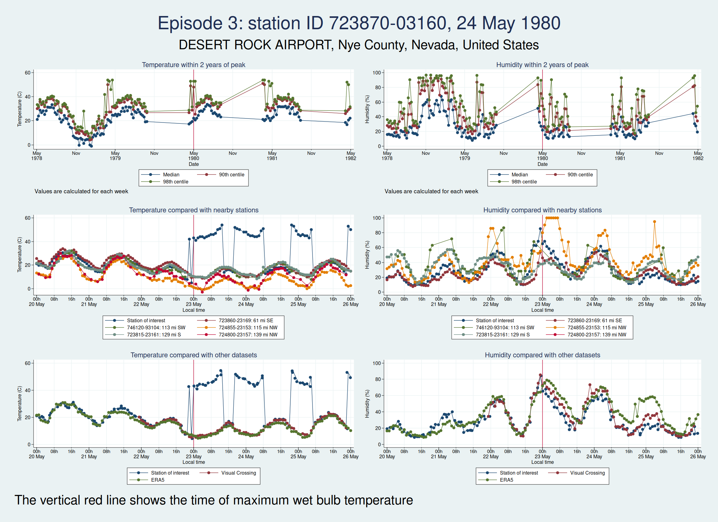
Here are the graphs for the next 2 episodes, at the same station. They are very similar. I won’t bore you with the graphs for the remaining episodes at that station, but they are also similar. It is clear that the episodes from this station are not trustworthy.
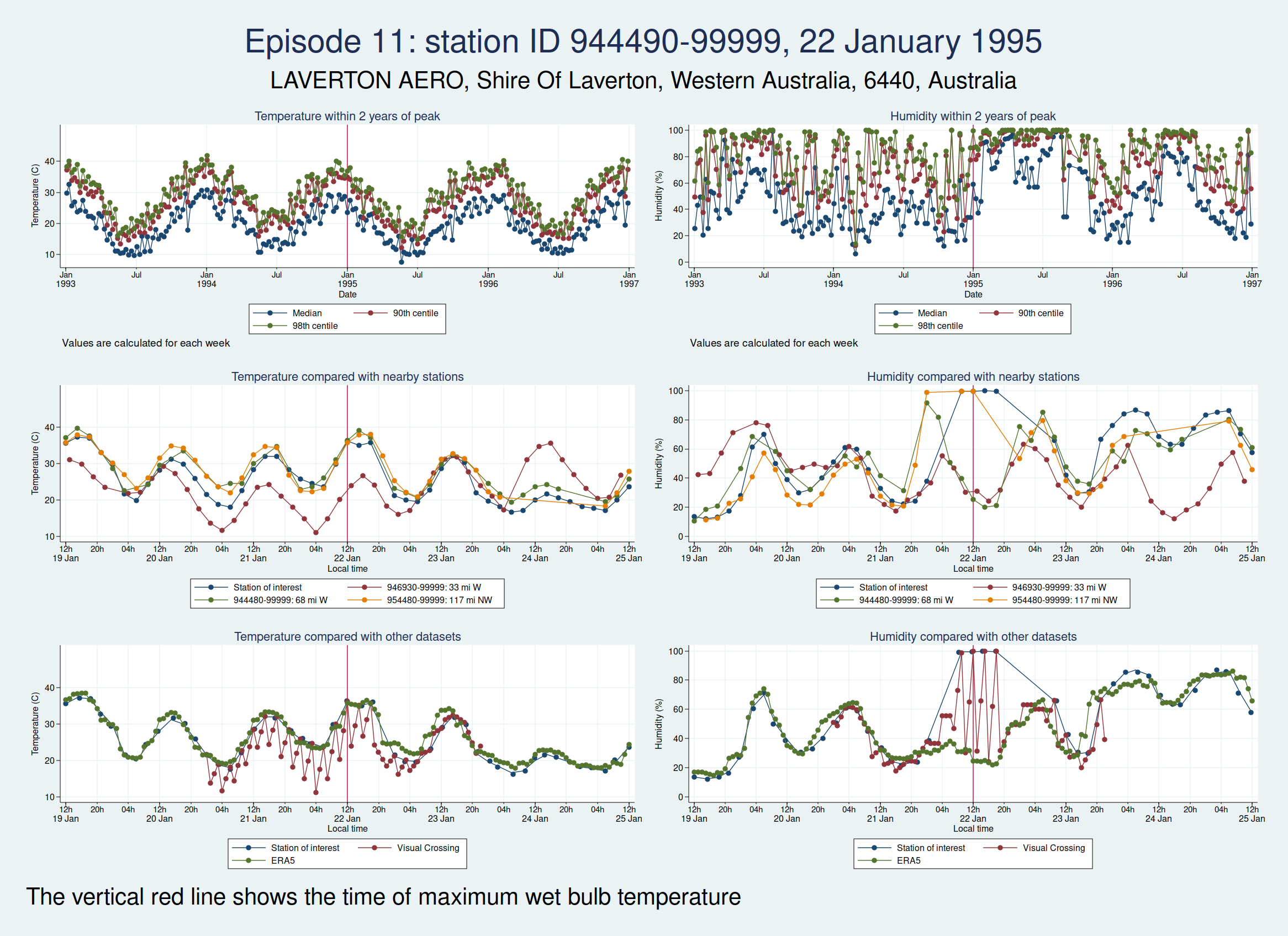
The next episode, episode 11, comes from Western Australia. The temperature looks perfectly plausible, but something looks wrong with the humidity, with an obvious spike around the time of the episode and a large deviation from the ERA5 dataset as well as the 2 nearest stations. This also doesn’t seem to be a genuine high WBT episode.
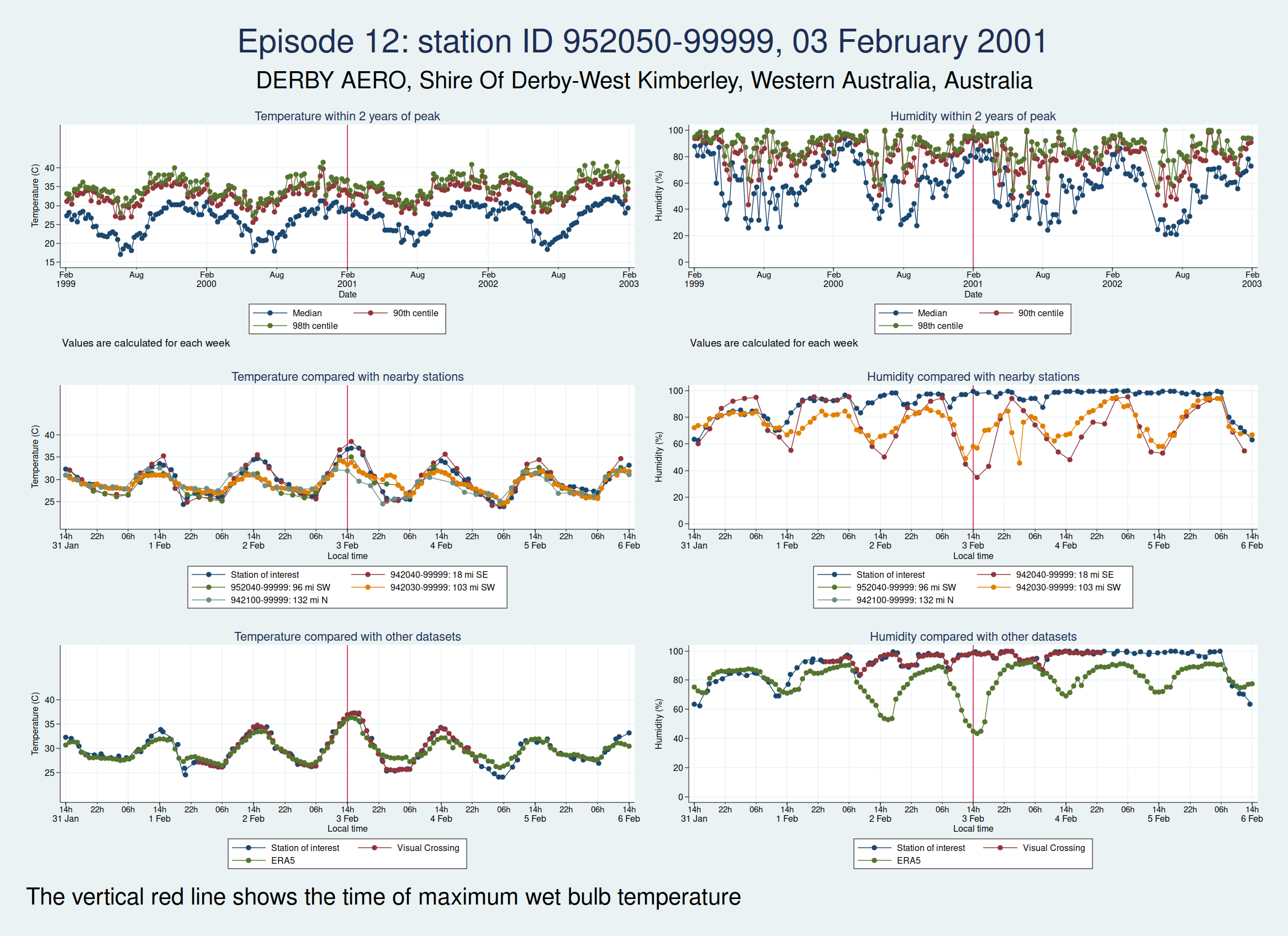
Episode 12, also from Western Australia, is similar, in that the temperature looks plausible but the humidity looks unreasonably high and seems more likely to be some kind of instrument malfunction than real extreme humidity.
Episode 13, from Saudi Arabia, is probably genuine. The temperature looks perfectly reasonable as judged by the seasonal average, the diurnal variation, and some nearby weather stations, though it is a little higher than the ERA5 dataset. The humidity doesn’t have the obvious red flags of the episodes 11 and 12, though it does seem to go up a bit within 24 h of the episode peak compared with a couple of days on each side. However, this web page from NOAA mentions that the highest dew point ever recorded was on 8 July 2003 at Dharhan, Saudia Arabia, which is more or less exactly the location of the weather station, and does suggest that some extreme weather was happening about that time.

Episode 14, from Pakistan, looks like it could be genuine, though again, it’s hard to be sure. The temperature certainly seems plausible, but the humidity, while broadly in line with nearby stations and not showing any obvious signs of a spike, is higher than the the ERA5 dataset. I haven’t been able to find a media report specifically about this location and date, but this article says that more than 500 people died from heat in May and June in Pakistan, India, and Bangladesh, which does seem consistent with this episode being genuine.

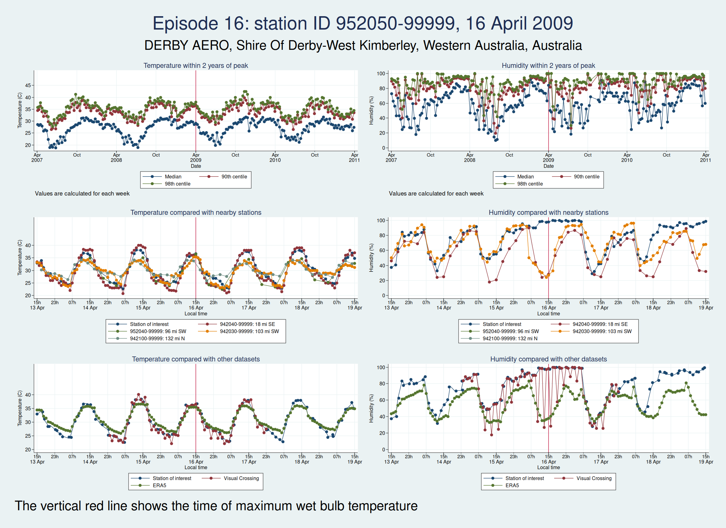
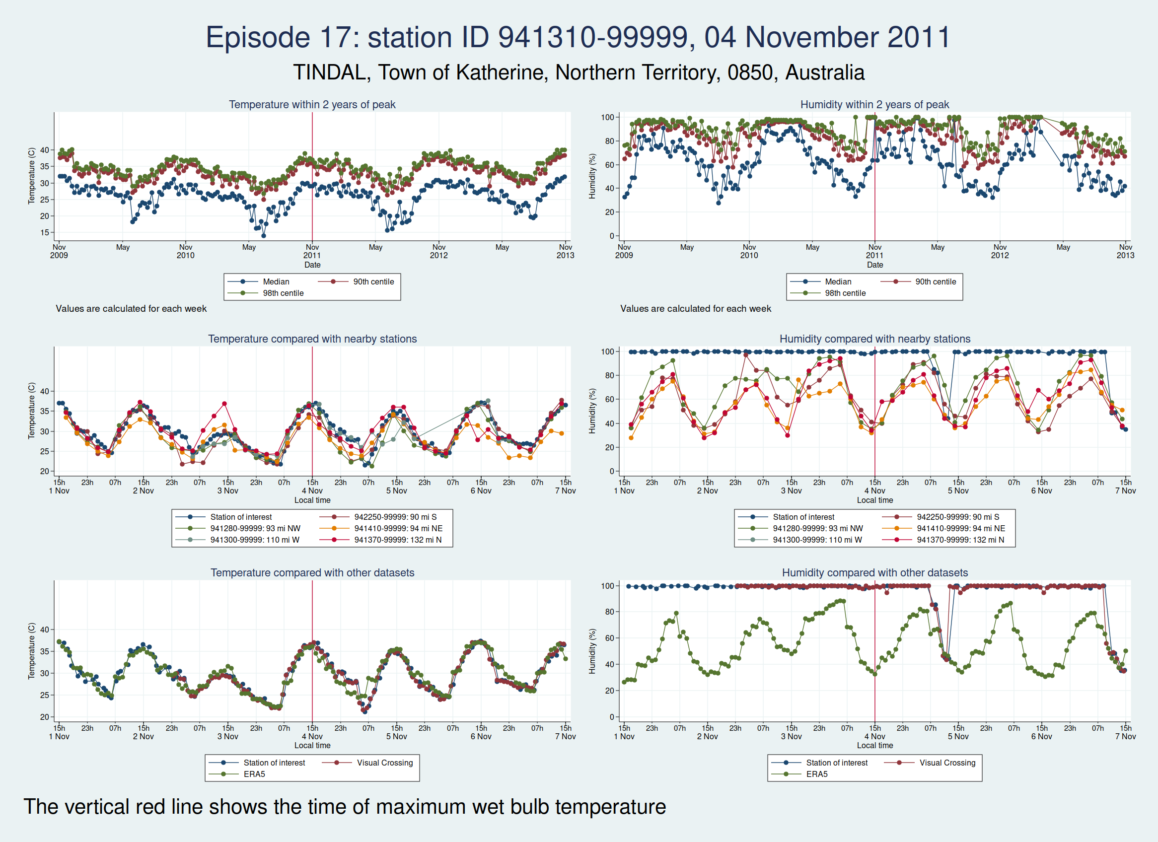
Episodes 15 to 22 are all from Australia. I don’t think any of them is genuine. The temperature looks plausible in all cases, but the humidity looks wrong: out of whack with the nearby stations and very different from the ERA5 data.


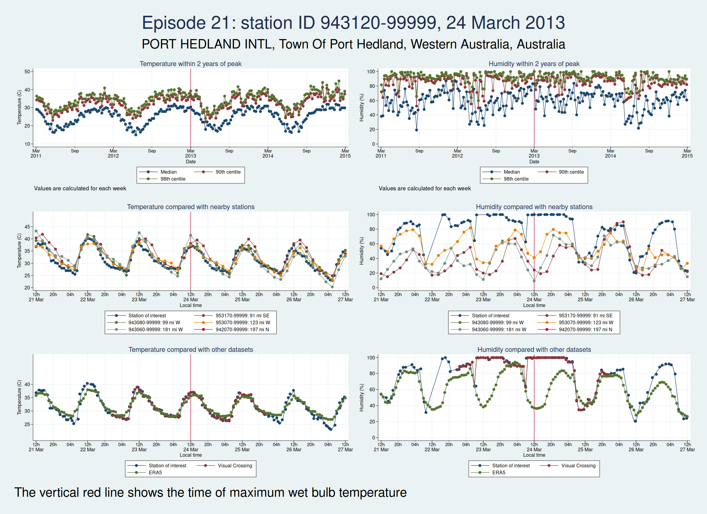
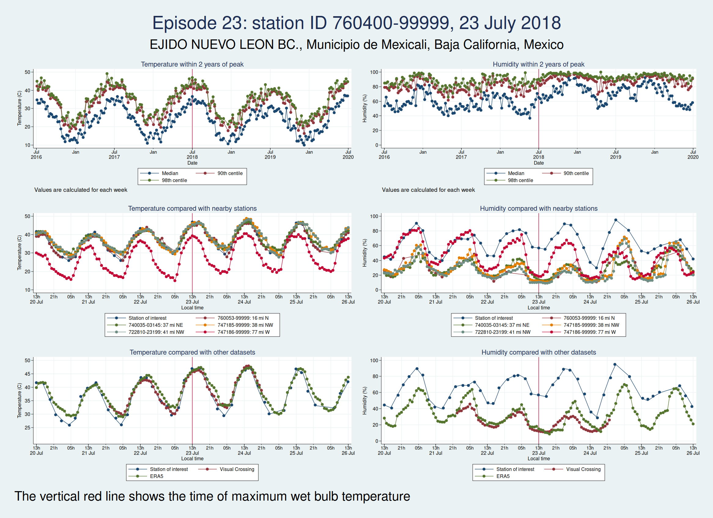
Episode 23 is from Mexico. Again, the temperature looks plausible, but the humidity is very different to both the ERA5 and the Visual Crossing data, as well as being considerably higher than several nearby weather stations. I don’t think this is genuine.
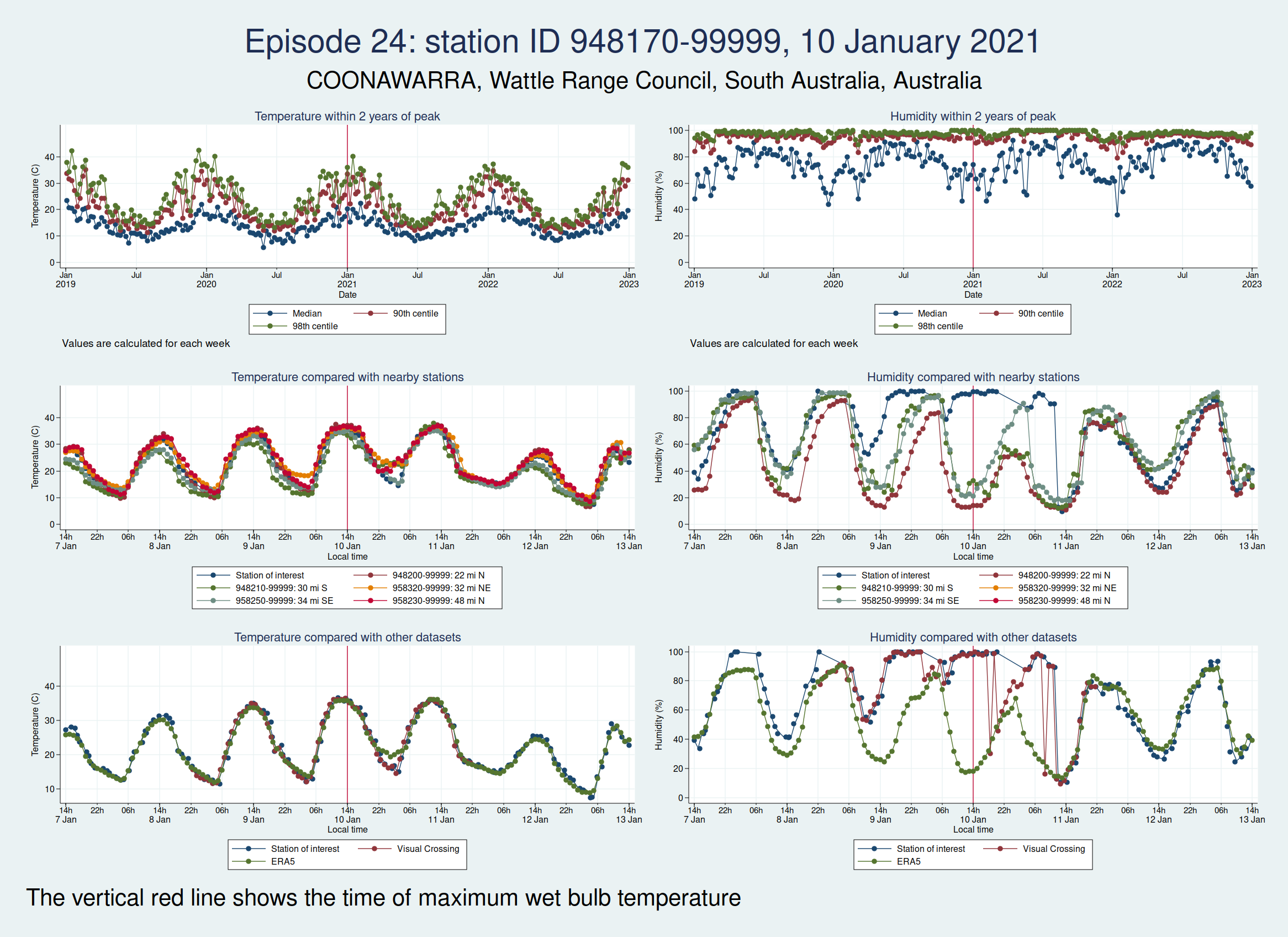
Episode 24 is from Australia again, and the humidity looks wrong again. I don’t think this is genuine either.
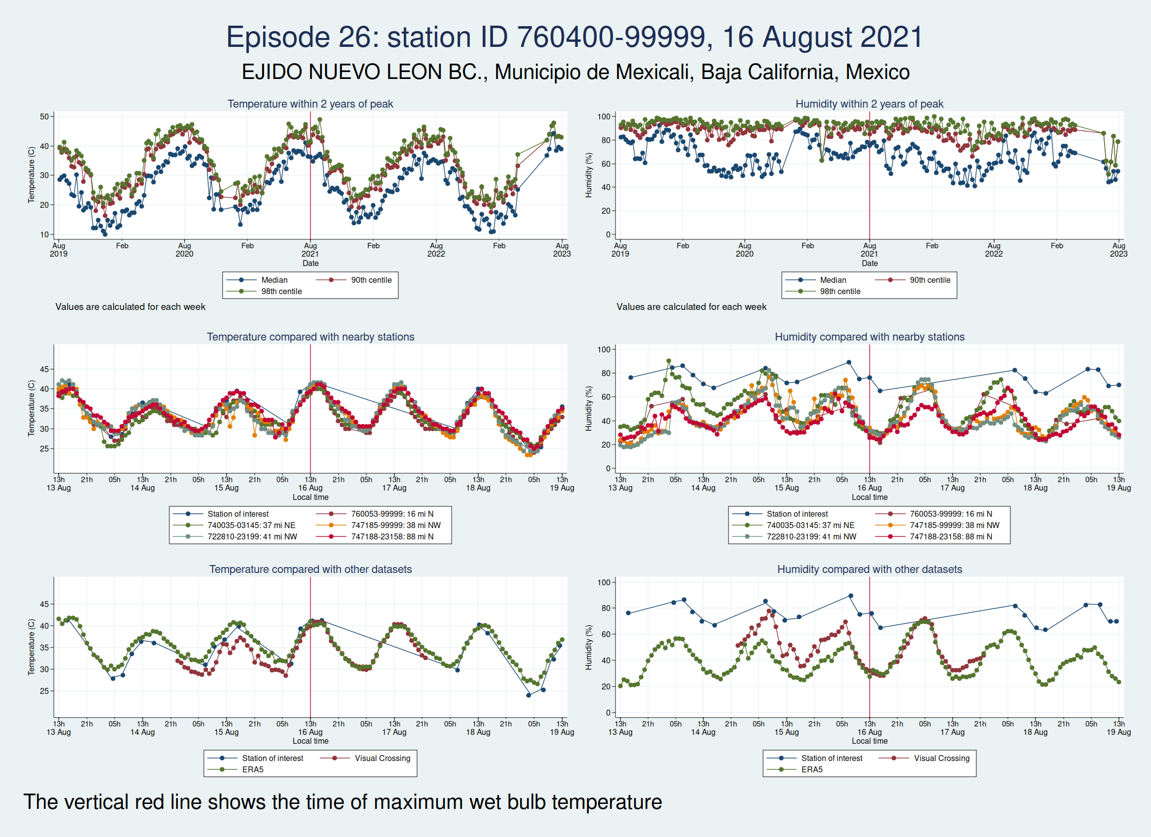
Episodes 25 and 26 are from the same weather station in Mexico as episode 23, and the humidity again looks implausible.

So of our 26 episodes, it looks like almost all of them are not real and are probably the result of faulty instrumentation or faulty data entry into a database. Episode 13 from Saudi Arabia in 2003 looks very likely to be real, and episode 14 from Pakistan in 2005 may very well be real, though it’s hard to be sure.
So in fact prolonged spells of WBT above 35°C do seem to be very rare, for now at least. In my next blogpost I shall look more at data quality and see if I can come up with a statistical algorithm for distinguishing the real episodes from the others, as I don’t think it’s going to be feasible to look at these graphs one at a time for the less extreme, but still worrying episodes of high WBT, for example episodes of WBT above 32°C, as these are much more common. Once I have been able to distinguish more reliably between the episodes that are real and those that aren’t, then I’ll be able to do a better job of looking at whether the frequency of dangerously high WBT episodes is increasing.