All posts by Adam

New alcohol guidelines

It has probably not escaped your attention that the Department of Health published new guidelines for alcohol consumption on Friday. These guidelines recommend lower limits than the previous guidelines, namely no more than 14 units per week. The figure is the same for men and women.

There are many odd things about these guidelines. But before I get into that, I was rightly picked up on a previous blogpost for not being clear about my own competing interests, so I’ll get those out of the way first, as I think it’s important.

I do not work either for the alcohol industry or in public health, so professionally speaking, I have no dog in this fight. However, at a personal level, I do like a glass of wine or two with my dinner, which I have pretty much every day. So my own drinking habits fall within the recommended limits of the previous guidelines (no more than 4 units per day for men), but under the new guidelines I would be classified as an excessive drinker. Do bear that in mind when reading this blogpost. I have tried to be as impartial as possible, but we are of course all subject to biases in the way we assess evidence, and I cannot claim that my assessment is completely unaffected by being classified as a heavy drinker under the new guidelines.

So, how were the new guidelines developed? This was a mixture of empirical evidence, mathematical modelling, and the judgement of the guidelines group. They were reasonably explicit about this process, and admit that the guidelines are “both pragmatic and evidence based”, so they get good marks for being transparent about their overall thinking.

However, it was not always easy to figure out what evidence was used, so they get considerably less good marks for being transparent about the precise evidence that led to the guidelines. It’s mostly available if you look hard enough, but the opacity of the referencing is disappointing. Very few statements in the guidelines document are explicitly referenced. But as far as I can tell, most of the evidence comes from two other documents, “A summary of the evidence of the health and social impacts of alcohol consumption” (see the document “Appendix 3 CMO Alcohol Guidelines Summary of evidence.pdf” within the zip file that you can download here) ,and the report of the Sheffield modelling group.

The specific way in which “14 units per week” was derived was as follows. The guidelines team investigated what level of alcohol consumption would be associated with no more than an “acceptable risk”, which is fair enough. Two definitions of “acceptable risk” were used, based on recent work in developing alcohol guidelines in Canada and Australia. The Canadian definition of acceptable risk was a relative risk of alcohol-related mortality of 1, in other words, the point at which the overall risk associated with drinking, taking account of both beneficial and harmful effects, was the same as the risk for a non-drinker. The Australian definition of acceptable risk was that the proportion of deaths in the population attributable to alcohol, assuming that everyone in the population drinks at the recommended limit, is 1%. In practice, both methods gave similar results, so choosing between them is not important.

To calculate the the levels of alcohol that would correspond to those risks, a mathematical model was used which incorporated empirical data on 43 diseases which are known to be associated with alcohol consumption. Risks for each were considered, and the total mortality attributable to alcohol was calculated from those risks (although the precise mathematical calculations used were not described in sufficient detail for my liking).

These results are summarised in the following table (table 1 in both the guidelines document and the Sheffield report). Results are presented separately for men and women, and also separately depending on how many days each week are drinking days. The more drinking days you have per week for the same weekly total, the less you have on any given day. So weekly limits are higher if you drink 7 days per week than if you drink 1 day per week, because of the harm involved with binge drinking if you have your entire weekly allowance on just one day.

Table 1

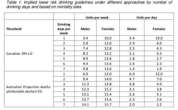
Assuming that drinking is spread out over a few days a week, these figures are roughly in the region of 14, so that is where the guideline figure comes from. The same figure is now being used for men and women.

Something you may have noticed about the table above is that it implies the safe drinking limits are lower for men than for women. You may think that’s a bit odd. I think that’s a bit odd too.

Nonetheless, the rationale is explained in the report. We are told (see paragraph 46 of the guidelines document) that the risks of immediate harm from alcohol consumption, usually associated with binge-drinking in a single session, “are greater for men than for women, in part because of men’s underlying risk taking behaviours”. That sounds reasonably plausible, although no supporting evidence is offered for the statement.

To be honest, I find this result surprising. According to table 6 on page 35 of the Sheffield modelling report, deaths from the chronic effects of alcohol (eg cancer) are about twice as common as deaths from the acute affects of alcohol (eg getting drunk and falling under a bus). We also know that women are more susceptible than men to the longer term effect of alcohol. And yet it appears that the acute effects dominate this analysis.

Unfortunately, although the Sheffield report is reasonably good at explaining the inputs to the mathematical model, specific details of how the model works are not presented. So it is impossible to know why the results come out in this surprising way and whether it is reasonable.

There are some other problems with the model.

I think the most important one is that the relationship between alcohol consumption and risk was often assumed to be linear. This strikes me as a really bad assumption, perhaps best illustrated with the following graph (figure 11 on page 45 of the Sheffield report).

Figure 11

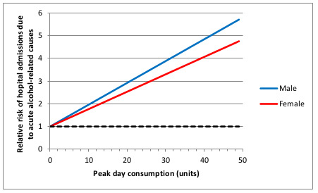
This shows how the risk of hospital admission for acute alcohol-related causes increases as a function of peak day consumption, ie the amount of alcohol drunk in a single day.

A few moments’ thought suggest that this is not remotely realistic.

The risk is expressed as a relative risk, in other words how many times more likely you are to be admitted to hospital for an alcohol-related cause than you are on a day when you drink no alcohol at all. Presumably they consider that there is a non-zero risk when you don’t drink at all, or a relative risk would make no sense. Perhaps that might be something like being injured in a road traffic crash where you were perfectly sober but the other driver was drunk.

But it’s probably safe to say that the risk of being hospitalised for an alcohol-related cause when you have not consumed any alcohol is low. The report does not make it clear what baseline risk they are using, but let’s assume conservatively that the daily risk is 1 in 100, or 1%. That means that you would expect to be admitted to hospital for an alcohol-related cause about 3 times a year if you don’t drink at all. I haven’t been admitted to hospital 3 times in the last year (or even once, in fact) for an alcohol related cause, and I’ve even drunk alcohol on most of those days. I doubt my experience of lack of hospitalisation is unusual. So I think it’s probably safe to assume that 1% is a substantial overestimate of the true baseline risk.

Now let’s look at the top right of the graph. That suggests that my relative risk of being admitted to hospital for an alcohol-related cause would be 6 times higher if I drink 50 units in a day. In other words, that my risk would be 6%. And remember that that is probably a massive overestimate.

Now, 50 units of alcohol is roughly equivalent to a bottle and a half of vodka. I don’t know about you, but I’m pretty sure that if I drank a bottle and a half of vodka in a single session then my chances of being hospitalised – if I survived that long – would be close to 100%.

So I don’t think that a linear function is realistic. I don’t have any data on the actual risk, but I would expect it to look something more like this:

Alcohol graph

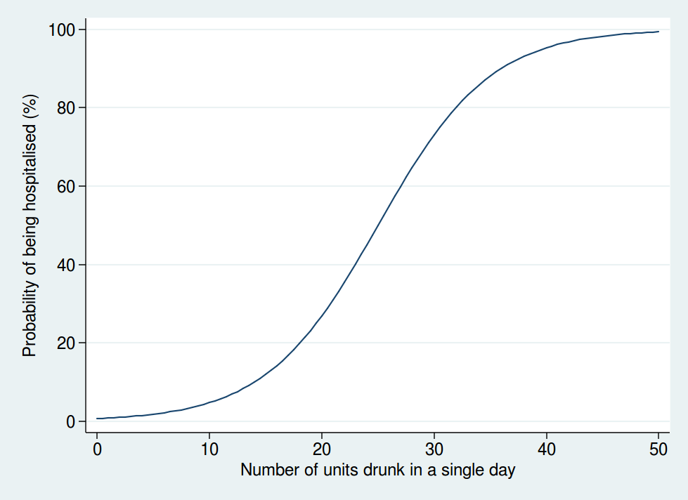
Here we see that the risk is negligible at low levels of alcohol consumption, then increases rapidly once you get into the range of serious binge drinking, and approaches 100% as you consume amounts of alcohol unlikely to be compatible with life. The precise form of that graph is something I have just guessed at, but I’m pretty sure it’s a more reasonable guess than a linear function.

A mathematical model is only as good as the data used as inputs to the model and the assumptions used in the modelling. Although the data used are reasonably clearly described and come mostly from systematic reviews of the literature, the way in which the data are modelled is not sufficiently clear, and also makes some highly questionable assumptions. Although some rudimentary sensitivity analyses were done, no sensitivity analyses were done using risk functions other than linear ones.

So I am not at all sure I consider the results of the mathematical modelling trustworthy. Especially when it comes up with the counter-intuitive result that women can safely drink more than men, which contradicts most of the empirical research in this area.

But perhaps more importantly, I am also puzzled why it was felt necessary to go through a complex modelling process in the first place.

It seems to me that the important question here is how does your risk of premature death depend on your alcohol consumption. That, at any rate, is what was modelled.

But there is no need to model it: we actually have empirical data. A systematic review of 34 prospective studies by Di Castelnuovo et al published in 2006 looked at the relationship between alcohol consumption and mortality. This is what it found (the lines on either side of the male and female lines are 99% confidence intervals).

Systematic review

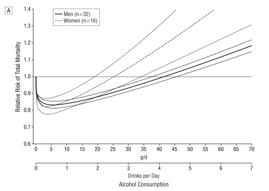
This shows that the level of alcohol consumption associated with no increased mortality risk compared with non-drinkers is about 25 g/day for women and 40 g/day for men. A standard UK unit is 8 g of alcohol, so that converts to about 22 units per week for women and 35 units per week for men: not entirely dissimilar to the previous guidelines.

Some attempt is made to explain why the data on all cause mortality have not been used, but I do not find them convincing (see page 7 of the summary of evidence).

One problem we are told is that “most of the physiological mechanisms that have been suggested to explain the protective effect of moderate drinking only apply for cohorts with overall low levels of consumption and patterns of regular drinking that do not vary”. That seems a bizarre criticism. The data show that there is a protective effect only at relatively low levels of consumption, and that once consumption increases, so does the risk. So of course the protective effect only applies at low levels of consumption. As for the “patterns of regular drinking”, the summary makes the point that binge drinking is harmful. Well, we know that. The guidelines already warn of the dangers of binge drinking. It seems odd therefore, to also reject the findings for people who split their weekly consumption evenly over the week and avoid binge drinking, as this is exactly what the guidelines say you should do.

I do not understand why studies which apply to people who follow safe drinking guidelines are deemed to be unsuitable for informing safe drinking guidelines. That makes no sense to me.

The summary also mentions the “sick quitter hypothesis” as a reason to mistrust the epidemiological data. The sick quitter hypothesis suggests that the benefits of moderate drinking compared with no drinking may have been overestimated in epidemiological studies, as non-drinkers may include recovering alcoholics and other people who have given up alcohol for health reasons, and therefore include an unusually unhealthy population.

The hypothesis seems reasonable, but it is not exactly a new revelation to epidemiologists, and has been thoroughly investigated. The systematic review by Di Castelnuovo reported a sensitivity analysis including only studies which excluded former drinkers from their no-consumption category. That found a lower beneficial effect on mortality than in the main analysis, but the protective effect was still unambiguously present. The point at which drinkers had the same risk as non-drinkers in that analysis was about 26 units per week (this is an overall figure: separate figures for men and women were not presented in the sensitivity analysis).

A systematic review specifically of cardiovascular mortality by Ronksley et al published in 2011 also ran a sensitivity analysis where only lifelong non-drinkers were used as the reference category, and found it made little difference to the results.

So although the “sick quitter hypothesis” sounds like a legitimate concern, in fact it has been investigated and is not a reason to distrust the results of the epidemiological analyses.

So all in all, I really do not follow the logic of embarking on a complex modelling exercise instead of using readily available empirical data. Granted, the systematic review by Di Castelnuovo et al is 10 years old now, but surely a more appropriate response to that would have been to commission an updated systematic review rather than ignore the systematic review evidence on mortality altogether and go down a different and problematic route.

Does any of this matter? After all, the guidelines are not compulsory. If my own reading of the evidence tells me I can quite safely drink 2 glasses of wine with my dinner most nights, I am completely free to do so.

Well, I think this does matter. If the government are going to publish guidelines on healthy behaviours, I think it is important that they be as accurate and evidence-based as possible. Otherwise the whole system of public health guidelines will fall into disrepute, and then it is far less likely that even sensible guidelines will be followed.

What is particularly concerning here is the confused messages the guidelines give about whether moderate drinking has benefits. From my reading of the literature, it certainly seems likely that there is a health benefit at low levels of consumption. That, at any rate, is the obvious conclusion from Di Castelnuovo et al’s systematic review.

And yet the guidelines are very unclear about this. While even the Sheffield model used to support the guidelines shows decreased risks at low levels of alcohol consumption (and those decreased risks would extend to substantially higher drinking levels if you base your judgement on the systematic review evidence), the guidelines themselves say that such decreased risks do not exist.

The guideline itself says “The risk of developing a range of diseases (including, for example, cancers of the mouth, throat, and breast) increases with any amount you drink on a regular basis”. That is true, but it ignore the fact that it is not true for other diseases. To mention only the harms of alcohol and ignore the benefits in the guidelines seems a dishonest way to present data. Surely the net effect is what is important.

Paragraph 30 of the guidelines document says “there is no level of drinking that can be recommended as completely safe long term”, which is also an odd thing to say when moderate levels of drinking have a lower risk than not drinking at all.

There is no doubt that the evidence on alcohol and health outcomes is complex. For obvious reasons, there have been no long-term randomised controlled trials, so we have to rely on epidemiological research with all its limitations. So I do not pretend for a moment that developing guidelines on what is a safe amount of alcohol to drink is easy.

But despite that, I think the developers of these guidelines could have done better.

Dangerous nonsense about vaping

If you thought you already had a good contender for “most dangerous, irresponsible, and ill-informed piece of health journalism of 2015”, then I’m sorry to tell you that it has been beaten into second place at the last minute.

With less than 36 hours left of 2015, I am confident that this article by Sarah Knapton in the Telegraph will win the title.

The article is titled “E-cigarettes are no safer than smoking tobacco, scientists warn”. The first paragraph is

“Vaping is no safer that [sic] smoking, scientists have warned after finding that e-cigarette vapour damages DNA in ways that could lead to cancer.”

There are such crushing levels of stupid in this article it’s hard to know where to start. But perhaps I’ll start by pointing out that a detailed review of the evidence on vaping by Public Health England, published earlier this year, concluded that e-cigarettes are about 95% less harmful than smoking.

If you dig into the detail of that review, you find that most of the residual 5% is the harm of nicotine addiction. It’s debatable whether that can really be called a harm, given that most people who vape are already addicted to nicotine as a result of years of smoking cigarettes.

But either way, the evidence shows that vaping, while it may not be 100% safe (though let’s remember that nothing is 100% safe: even teddy bears kill people), is considerably safer than smoking. This should not be a surprise. We have a pretty good understanding of what the toxic components of cigarette smoke are that cause all the damage, and most of those are either absent from e-cigarette vapour or present at much lower concentrations.

So the question of whether vaping is 100% safe is not the most relevant thing here. The question is whether it is safer than smoking. Nicotine addiction is hard to beat, and if a smoker finds it impossible to stop using nicotine, but can switch from smoking to vaping, then that is a good thing for that person’s health.

Now, nothing is ever set in stone in science. If new evidence comes along, we should always be prepared to revise our beliefs.

But obviously to go from a conclusion that vaping is 95% safer than smoking to concluding they are both equally harmful would require some pretty robust evidence, wouldn’t it?

So let’s look at the evidence Knapton uses as proof that all the previous estimates were wrong and vaping is in fact as harmful as smoking.

The paper it was based on is this one, published in the journal Oral Oncology.  (Many thanks to @CaeruleanSea for finding the link for me, which had defeated me after Knapton gave the wrong journal name in her article.)

The first thing to notice about this is that it is all lab based, using cell cultures, and so tells us little about what might actually happen in real humans. But the real kicker is that if we are going to compare vaping and smoking and conclude that they are as harmful as each other, then the cell cultures should have been exposed to equivalent amounts of e-cigarette vapour and cigarette smoke.

The paper describes how solutions were made by drawing either the vapour or smoke through cell media. We are then told that the cells were treated with the vaping medium every 3 days for up to 8 weeks. So presumably the cigarette medium was also applied every 3 days, right?

Well, no. Not exactly. This is what the paper says:

“Because of the high toxicity of cigarette smoke extract, cigarette-treated samples of each cell line could only be treated for 24 h.”

Yes, that’s right. The cigarette smoke was applied at a much lower intensity, because otherwise it killed the cells altogether. So how can you possibly conclude that vaping is no worse than smoking, when smoking is so harmful it kills the cells altogether and makes it impossible to do the experiment?

And yet despite that, the cigarettes still had a larger effect than the vaping. It is also odd that the results for cigarettes are not presented at all for some of the assays. I wonder if that’s because it had killed the cells and made the assays impossible? As primarily a clinical researcher, I’m not an expert in lab science, but not showing the results of your positive control seems odd to me.

But the paper still shows that the e-cigarette extract was harming cells, so that’s still a worry, right?

Well, there is the question of dose. It’s hard for me to know from the paper how realistic the doses were, as this is not my area of expertise, but the press release accompanying this paper (which may well be the only thing that Knapton actually read before writing her article) tells us the following:

“In this particular study, it was similar to someone smoking continuously for hours on end, so it’s a higher amount than would normally be delivered,”

Well, most things probably damage cells in culture if used at a high enough dose, so I don’t think this study really tells us much. All it tells us is that cigarettes do far more damage to cell cultures than e-cigarette vapour does. Because, and I can’t emphasise this point enough, THEY COULDN’T DO THE STUDY WITH EQUIVALENT DOSES OF CIGARETTE SMOKE BECAUSE IT KILLED ALL THE CELLS.

A charitable explanation of how Knapton could write such nonsense might be that she simply took the press release on trust (to be clear, the press release also makes the claim that vaping is as dangerous as smoking) and didn’t have time to check it. But leaving aside the question of whether a journalist on a major national newspaper should be regurgitating press releases without any kind of fact checking, I note that many people (myself included) have been pointing out to Knapton on Twitter that there are flaws in the article, and her response has been not to engage with such criticism, but to insist she is right and to block anyone who disagrees: the Twitter equivalent of the “la la la I’m not listening” argument.

It seems hard to come up with any explanation other than that Knapton likes to write a sensational headline and simply doesn’t care whether it’s true, or, more importantly, what harm the article may do.

And make no mistake: articles like this do have the potential to cause harm. It is perfectly clear that, whether or not vaping is completely safe, it is vastly safer than smoking. It would be a really bad outcome if smokers who were planning to switch to vaping read Knapton’s article and thought “oh, well if vaping is just as bad as smoking, maybe I won’t bother”. Maybe some of those smokers will then go on to die a horrible death of lung cancer, which could have been avoided had they switched to vaping.

Is Knapton really so ignorant that she doesn’t realise that is a possible consequence of her article, or does she not care?

And in case you doubt that anyone would really be foolish enough to believe such nonsense, I’m afraid there is evidence that people do believe it. According to a survey by Action on Smoking and Health (ASH), the proportion of people who believe that vaping is as harmful or more harmful than smoking increased from 14% in 2014 to 22% in 2015. And in the USA, the figures may be even worse: this study found 38% of respondents thought e-cigarettes were as harmful or more harmful than smoking. (Thanks again to @CaeruleanSea for finding the links to the surveys.)

I’ll leave the last word to Deborah Arnott, Chief Executive of ASH:

“The number of ex-smokers who are staying off tobacco by using electronic cigarettes is growing, showing just what value they can have. But the number of people who wrongly believe that vaping is as harmful as smoking is worrying. The growth of this false perception risks discouraging many smokers from using electronic cigarettes to quit and keep them smoking instead which would be bad for their health and the health of those around them.”

STAT investigation on failure to report research results

A news story by the American health news website STAT has appeared in my Twitter feed many times over the last few days.

The story claims to show that “prestigious medical research institutions have flagrantly violated a federal law requiring public reporting of study results, depriving patients and doctors of complete data to gauge the safety and benefits of treatments”. They looked at whether results of clinical trials that should have been posted on the clinicaltrials.gov website actually were posted, and found that many of them were not. It’s all scary stuff, and once again, shows that those evil scientists are hiding the results of their clinical trials.

Or are they?

To be honest, it’s hard to know what to make of this one. The problem is that the “research” on which the story is based has not been published in a peer reviewed journal. It seems that the only place the “research” has been reported is on the website itself. This is a significant problem, as the research is simply not reported in enough detail to know whether the methods it used were reliable enough to allow us to trust its conclusions. Maybe it was a fantastically thorough and entirely valid piece of research, or maybe it was dreadful. Without the sort of detail we would expect to see in a peer-reviewed research paper, it is impossible to know.

For example, the rather brief “methods section” of the article tells us that they filtered the data to exclude trials which were not required to report results, but they give no detail about how. So how do we know whether their dataset really contained only trials subject to mandatory reporting?

They also tell us that they excluded trials for which the deadline had not yet arrived, but again, they don’t tell us how. That’s actually quite important. If a trial has not yet reported results, then it’s hard to be sure when the trial finished. The clinicaltrials.gov website uses both actual and estimated dates of trial completion, and also has two different definitions of trial completion. We don’t know which definition was used, and if estimated dates were used, we don’t know if those estimates were accurate. In my experience, estimates of the end date of a clinical trial are frequently inaccurate.

Some really basic statistical details are missing. We are told that the results include “average” times by which results were late, but not whether they are mean or medians. With skewed data such as time to report something, the difference is important.

It appears that the researchers did not determine whether results had been published in peer-reviewed journals. So the claim that results are being hidden may be totally wrong. Even if a trial was not posted on clinicaltrials.gov, it’s hard to support a claim that the results are hidden if they’ve been published in a medical journal.

It is hardly surprising there are important details missing. Publishing “research” on a news website rather than in a peer reviewed journal is not how you do science. A wise man once said “If you have a serious new claim to make, it should go through scientific publication and peer review before you present it to the media“. Only a fool would describe the STAT story as “excellent“.

One of the findings of the STAT story was that academic institutions were worse than pharmaceutical companies at reporting their trials. Although it’s hard to be sure if that result is trustworthy, for all the reasons I describe above, it is at least consistent with more than one other piece of research (and I’m not aware of any research that has found the opposite).

There is a popular narrative that says clinical trial results are hidden because of evil conspiracies. However, no-one ever has yet given a satisfactory explanation of how hiding their clinical trial results furthers academics’ evil plans for global domination.

A far more likely explanation is that posting results is a time consuming and faffy business, which may often be overlooked in the face of competing priorities. That doesn’t excuse it, of course, but it does help to understand why results posting on clinicaltrials.gov is not as good as it should be, particularly from academic researchers, who are usually less well resourced than their colleagues in the pharmaceutical industry.

If the claims of the STAT article are true and researchers are indeed falling below the standards we expect in terms of clinical trial disclosure, then I suggest that rather than getting indignant and seeking to apportion blame, the sensible approach would be to figure out how to fix things.

I and some colleagues published a paper about 3 years ago in which we suggest how to do exactly that. I hope that our suggestions may help to solve the problem of inadequate clinical trial disclosure.

Spinning good news as bad

It seems to have become a popular sport to try to exaggerate problems with disclosure of clinical trials, and to pretend that the problem of “secret hidden trials” is far worse than it really is. Perhaps the most prominent example of this is the All Trials campaign’s favourite statistic that “only half of all clinical trials have ever been published”, which I’ve debunked before. But a new paper was published last month which has given fresh material to the conspiracy theorists.

The paper in question was published in BMJ Open by Jennifer Miller and colleagues. They looked at 15 of the 48 drugs approved by the FDA in 2012. It’s not entirely clear to me why they focused on this particular subgroup: they state that they focused on large companies because they represented the majority of new drug applications. Now I’m no mathematician, but I have picked up some of the basics of maths in my career as a statistician, and I’m pretty sure that 15 out of 48 isn’t a majority. Remember that we are dealing with a subgroup analysis here: I think it might be important, and I’ll come back to it later.

Anyway, for each of those 15 drugs, Miller et al looked at the trials that had been used for the drug application, and then determined whether the trials had been registered and whether the results had been disclosed. They found that a median (per drug) of 65% of trials had been disclosed and 57% had been registered.

This study drew the kinds of responses you might expect from the usual suspects, describing the results as “inexcusable” and “appalling”.

SAS tweet

Goldacre tweet

(Note that both of those tweets imply that only 15 drugs were approved by the FDA in 2012, and don’t mention that it was a subgroup analysis from the 48 drugs that were really approved that year.)

The story was picked up in the media as well. “How pharma keeps a trove of drug trials out of public view” was how the Washington Post covered it. The Scientist obviously decided that even 65% disclosure wasn’t sensational enough, and reported “just one-third of the clinical trials that ought to have been reported by the trial sponsors were indeed published”.

But as you have probably guessed by now, when you start to look below the surface, some of these figures are not quite as they seem.

Let’s start with the figures for trial registration (the practice of making the design a trial publicly available before it starts, which makes it harder to hide negative results or pretend that secondary outcomes were really primary). Trial registration is a fairly recent phenomenon. It only really came into being in the early 2000s, and did not become mandatory until 2007. Bear in mind that drugs take many years to develop, so some of the early trials done for drugs that were licensed in 2012 would have been done many years earlier, perhaps before the investigators had even heard of trial registration, and certainly before it was mandatory. So it’s not surprising that such old studies had not been prospectively registered.

Happily, Miller et al reported a separate analysis of those trials that were subject to mandatory registration. In that analysis, the median percentage of registered trials increased from 57% to 100%.

So I think a reasonable conclusion might be that mandatory trial registration has been successful in ensuring that trials are now being registered. I wouldn’t call that “inexcusable” or “appalling”. I’d call that a splendid sign of progress in making research more transparent.

So what about the statistic that only 65% of the trials disclosed results? That’s still bad, right?

Again, it’s a bit more complicated than that.

First, it’s quite important to look at how the results break down by phase of trial. It is noteworthy that the vast majority of the unpublished studies were phase I studies. These are typically small scale trials in healthy volunteers which are done to determine whether it is worth developing the drug further in clinical trials in patients. While I do not dispute for a minute that phase I trials should be disclosed, they are actually of rather little relevance to prescribers. If we are going to make the argument that clinical trials should be disclosed so that prescribers can see the evidence on what those drugs do to patients, then the important thing is that trials in patients should be published. Trials in healthy volunteers, while they should also be published in an ideal world, are a lower priority.

So what about the phase III trials? Phase III trials are the important ones, usually randomised controlled trials in large numbers of patients, which tell you whether the drug works and what its side effects are like. Miller et al report that 20% of drugs had at least 1 undisclosed phase III trial. That’s an interesting way of framing it. Another way of putting is is that 80% of the drugs had every single one of their phase III trials in the public domain. I think that suggests that trial disclosure is working rather well, don’t you? Unfortunately, the way Miller et al present their data doesn’t allow the overall percentage disclosure of phase III trials to be determined, and my request to the authors to share their data has so far gone unheeded (of which more below), but it is clearly substantially higher than 80%. Obviously anything less than 100% still has room for improvement, but the scare stories about a third of trials being hidden clearly don’t stack up.

And talking of trials being “hidden”, that is rather emotive language to describe what may simply be small delays in publication. Miller et al applied a cutoff date of 1 February 2014 in their analysis, and if results were not disclosed by that date then they considered them to be not disclosed. Now of course results should be disclosed promptly, and if it takes a bit longer, then that is a problem, but it is really not the same thing as claiming that results are being “kept secret”. Just out of interest, I checked on one of the drugs that seemed to have a particularly low rate of disclosure. According to Miller et al, the application for Perjeta was based on 12 trials, and only 8% had results reported on clinicaltrials.gov. That means they considered only one of them to have been reported. According to the FDA’s medical review (see page 29), 17 trials were submitted, not 12, which makes you wonder how thorough Miller et al’s quality control was. Of those 17 trials, 14 had been disclosed on clinicaltrials.gov when I looked. So had Miller et al used a different cut-off date, they would have found 82% of trials with results posted, not 8%.

I would like to be able to tell you more about the lower disclosure rates for phase I trials. Phase I trials are done early in a drug’s development, and so the phase I trials included in this study would typically have been done many years ago. It is possible that the lower publication rate for phase I trials is because phase I trials are intrinsically less likely to be published than trials in patients, but it is also possible that it is simply a function of when they were done. We know that publication rates have been improving over recent years, and it is possible that the publication rate for phase I trials done a decade or more ago is not representative of the situation today.

Sadly, I can’t tell you more about that. To distinguish between those possibilities, I would need to see Miller et al’s raw data. I did email them to ask for their raw data, and they emailed back to say how much they support transparency and data sharing, but haven’t actually sent me their data. It’s not entirely clear to me whether that’s because they have simply been too busy to send it or whether they are only in favour of transparency if other people have to do it, but if they do send the data subsequently I’ll be sure to post an update.

The other problem here is that, as I mentioned earlier, we are looking at a subgroup analysis. I think this may be important, as another study that looked at disclosure of drugs approved in 2012 found very different results. Rawal and Deane looked at drugs approved by the EMA in 2012, and found that 92% of the relevant trials had been disclosed. Again, it’s less than 100%, and so not good enough, but it certainly shows that things are moving in the right direction. And it’s a lot higher than the 65% that Miller et al found.

Why might these studies have come to such different results? Well, they are not looking at the same drugs. Not all of the drugs approved by the FDA in 2012 were approved by the EMA the same year. 48 drugs were approved by the FDA, and 23 by the EMA. Only 11 drugs were common to both agencies, and only 3 of those 11 drugs were included in Miller et al’s analysis. Perhaps the 15 drugs selected by Miller et al were not a representative sample of all 48 drugs approved by the FDA. It would be interesting to repeat Miller et al’s analysis with all 48 of the drugs approved by the FDA to see if the findings were similar, although I doubt that anyone will ever do that.

But personally, I would probably consider a study that looked at all eligible trials more reliable than one that chose an arbitrary subset, so I suspect that 92% is a more accurate figure for trial disclosure for drugs approved in 2012 than 65%.

Are 100% of clinical trials being disclosed? No, and this study confirms that. But it also shows that we are getting pretty close, at least for the trials most relevant for prescribers. Until 100% of trials are disclosed, there is still work to do, but things are not nearly as bad as the doom-mongers would have you believe. Transparency of clinical trial reporting is vastly better than it used to be, and don’t let anyone tell you otherwise.

Update 23 January 2016:

I have still not received the raw data for this study, more than 2 months after I asked for it. I think it is safe to assume that I’m not going to get it now. That’s disappointing, especially from authors who write in support of transparency.


Not clinically proven after all

I blogged last year about my doubts about the following advert:

Boots


Those seemed like rather bold claims, which as far as I could tell were not supported by the available evidence. It turns out the Advertising Standards Authority agrees with me. I reported the advert last year, and last week the ASA finally ruled on my complaint, which they upheld.

It’s worth reading the ASA’s ruling in full. They were very thorough. They came to similar conclusions that I did: that although there was some hint of activity against a cold, there was no evidence of activity against flu, and even the evidence for a cold was not strong enough to make “clinically proven” a reasonable claim.

While the ASA get good marks for being thorough, they get less good marks for being prompt. It took them 11 months to make this ruling, which allowed Boots to continue misleading customers all that time. I suppose being thorough does take time, but even so, I’m disappointed that it took them quite as long as it did.

Boots are now no longer advertising Boots Cold and Flu Defence Nasal Spray on their website. They are, however, advertising a spookily similar looking product called Boots Cold Defence Nasal Spray. Although they have now dropped claims about flu, they are still claiming the product is “clinically proven” to both treat and prevent colds.

It is not clear to me whether this is the same product that’s just been rebranded or whether it is something different. I note that it says the active ingredient is carrageenan, which was the same active ingredient in the previous product. If it is the same product, then it’s good to see that they have dropped the flu claim, as that was totally unsupported. However, the cold claim is just as dubious as before, unless they have done new studies in the last year.

I have been in touch with the ASA about the Cold Defence product, and they have told me that since it’s a different product (or at least has a different name) it wouldn’t be covered by the previous ruling. If I felt that the claim was unjustified it would need a new complaint.

Is it just me who thinks Boots is being a bit cynical here? Unless the new product is something different that actually has a robust evidence base, they must know that the claim that it is clinically proven to treat and prevent colds does not stack up. But they are making it anyway. No doubt safe in the knowledge that by the time the ASA gets round to ruling on it, this year’s cold season will be well and truly over, and they will have had time to mislead plenty of customers in the meantime.

If the new advert is also found to be misleading, there will be no punishment for anyone at Boots. The worst that will happen to them is that they will be told to change the advert.

Why are big corporations allowed to mislead consumers with impunity?

The amazing magic Saatchi Bill

Yesterday saw the dangerous and misguided Saatchi Bill (now reincarnated as the Access to Medical Treatments (Innovation) Bill) debated in the House of Commons.

The bill started out as an attempt by the Conservative peer Lord Saatchi to write a new law to encourage innovation in medical research. I have no doubt that the motivation for doing so was based entirely on good intentions, but sadly the attempt was badly misguided. Although many people explained to Lord Saatchi why he was wrong to tackle the problem in the way he did, it turns out that listening to experts is not Saatchi’s strong suit, and he blundered on with his flawed plan anyway.

If you want to know what is wrong with the bill I can do no better than direct you to the Stop the Saatchi Bill website, which explains the problems with the bill very clearly. But briefly, it sets out to solve a problem that does not exist, and causes harm at the same time. It attempts to promote innovation in medical research by removing the fear of litigation from doctors who innovate, despite the fact that fear of litigation is not what stops doctors innovating. But worse, it removes important legal protection for patients. Although the vast majority of doctors put their patients’ best interests firmly at the heart of everything they do, there will always be a small number of unscrupulous quacks who will be only too eager to hoodwink patients into paying for ineffective or dangerous treatments if they think there is money in it.

If the bill is passed, any patients harmed by unscrupulous quacks will find it harder to get redress through the legal system. That does not protect patients.

Although the bill as originally introduced by Saatchi failed to make sufficient progress through Parliament, it has now been resurrected in a new, though essentially similar, form as a private member’s bill in the House of Commons.

I’m afraid to say that the debate in the House of Commons did not show our lawmakers in a good light.

We were treated to several speeches by people who clearly either didn’t understand what the bill was about or were being dishonest. The two notable exceptions were Heidi Alexander, the Shadow Health Secretary, and Sarah Wollaston, chair of the Health Select Committee and a doctor herself in a previous career. Both Alexander and Wollaston clearly showed that they had taken the trouble to read the bill and other relevant information carefully, and based their contributions on facts rather than empty rhetoric.

I won’t go into detail on all the speeches, but if you want to read them you can do so in Hansard.

The one speech I want to focus on is by George Freeman, the Parliamentary Under-Secretary of State for Life Sciences. As he is a government minister, his speech gives us a clue about the government’s official thinking on the bill. Remember that it is a private member’s bill, so government support is crucial if it is to have a chance of becoming law. Sadly, Freeman seems to have swallowed the PR surrounding the bill and was in favour of it.

Although Freeman said many things, many of which showed either a poor understanding of the issues or blatant dishonesty, the one I particularly want to focus on is where he imbued the bill with magic powers.

He repeated the myths about fear of litigation holding back medical research. He was challenged in those claims by both Sarah Wollaston and Heidi Alexander.

When he reeled off a whole bunch of statistics about how much money medical litigation cost the NHS, Wollaston asked him how much of that was specifically related to complaints about innovative treatments. His reply was telling:

“Most of the cases are a result of other contexts— as my hon. Friend will know, obstetrics is a big part of that—rather than innovation. I am happy to write to her with the actual figure as I do not have it to hand.”

Surely that is the one statistic he should have had to hand if he’d wanted to appear even remotely prepared for his speech? What is the point of being able to quote all sorts of irrelevant statistics about the total cost of litigation in the NHS if he didn’t know the one statistic that actually mattered? Could it be that he knew it was so tiny it would completely undermine his case?

He then proceeded to talk about the fear of litigation, at which point Heidi Alexander asked him what evidence he had. He had to admit that he had none, and muttered something about “anecdotally”.

But anyway, despite having failed to make a convincing case that fear of litigation was holding back innovation, he was very clear that he thought the bill would remove that fear.

And now we come to the magic bit.

How exactly was that fear of litigation to be removed? Was it by changing the law on medical negligence to make it harder to sue “innovative” doctors? This is what Freeman said:

“As currently drafted the Bill provides no change to existing protections on medical negligence, and that is important. It sets out the power to create a database, and a mechanism to make clear to clinicians how they can demonstrate compliance with existing legal protection—the Bolam test has been referred to—and allow innovations to be recorded for the benefit of other clinicians and their patients. Importantly for the Government, that does not change existing protections on medical negligence, and it is crucial to understand that.”

So the bill makes no change whatsoever to the law on medical negligence, but removes the fear that doctors will be sued for negligence. If you can think of a way that that could work other than by magic, I’m all ears.

In the end, the bill passed its second reading by 32 votes to 19. Yes, that’s right: 599 well over 500* MPs didn’t think protection of vulnerable patients from unscrupulous quacks was worth turning up to vote about.

I find it very sad that such a misguided bill can make progress through Parliament on the basis of at best misunderstandings and at worst deliberate lies.

Although the bill has passed its second reading, it has not yet become law. It needs to go through its committee stage and then return to the House of Commons for its third reading first. It is to be hoped that common sense will prevail some time during that process, or patients harmed by unscrupulous quacks will find that the law does not protect them as much as it does now.

If you want to write to your MP to urge them to turn up and vote against this dreadful bill when it comes back for its third reading, now would be a good time.

* Many thanks to @_mattl on Twitter for pointing out the flaw in my original figure of 599: I hadn’t taken into account that the Speaker doesn’t vote, the Tellers aren’t counted in the totals, Sinn Fein MPs never turn up at all, and SNP MPs are unlikely to vote as this bill doesn’t apply to Scotland.

Equality of opportunity

Although this is primarily a blog about medical stuff, I did warn you that there might be the occasional social science themed post. This is one such post.

In his recent speech to the Conservative Party conference, David Cameron came up with many fine words about equality of opportunity. He led us to believe that he was for it. Here is an extract from the relevant part of his speech:

If we tackle the causes of poverty, we can make our country greater.

But there’s another big social problem we need to fix.

In politicians’ speak: a “lack of social mobility”.

In normal language: people unable to rise from the bottom to the top, or even from the middle to the top, because of their background.

Listen to this: Britain has the lowest social mobility in the developed world.

Here, the salary you earn is more linked to what your father got paid than in any other major country.

I’m sorry, for us Conservatives, the party of aspiration, we cannot accept that.

We know that education is the springboard to opportunity.

Fine words indeed. Cameron is quite right to identify lack of social mobility as a major problem. It cannot be right that your life chances should depend so much on who your parents are.

Cameron is also quite right to highlight the important role of education. Inequality of opportunity starts at school. If you have pushy middle class parents who get you into a good school, then you are likely to do better than if you have disadvantaged parents and end up in a poor school.

But it is very hard to reconcile Cameron’s fine words with today’s announcement of a new grammar school. In theory, grammar schools are supposed to aid social mobility by allowing bright kids from disadvantaged backgrounds to have a great education.

But in practice, they do no such thing.

In practice, grammar schools perpetuate social inequalities. Grammar schools are largely the preserve of the middle classes. According to research from the Institute for Fiscal studies, children from disadvantaged backgrounds are less likely than their better off peers to get into grammar schools, even if they have the same level of academic achievement.

It’s almost as if Cameron says one thing but means something else entirely, isn’t it?

If Cameron is serious about equality of opportunity, I have one little trick from the statistician’s toolkit which I think could help, namely randomisation.

My suggestion is this. All children should be randomly allocated to a school. Parents would have no say in which school their child goes to: it would be determined purely by randomisation. The available pool of schools would of course need to be within reasonable travelling distance of where the child lives, but that distance could be defined quite generously, so that you wouldn’t still have cosy middle class schools in cosy middle class neighbourhoods and poor schools in disadvantaged neighbourhoods.

At the moment, it is perfectly accepted by the political classes that some schools are good schools and others are poor. Once the middle classes realise that their own children might have to go to the poor schools, my guess is that the acceptance of the existence of poor schools would rapidly diminish. Political pressure would soon make sure that all schools are good schools.

That way, all children would have an equal start in life, no matter how rich their parents were.

This suggestion is, of course, pure fantasy. There is absolutely no way that our political classes would ever allow it. Under a system like that, their own children might have to go to school with the plebs, and that would never do, would it?

But please don’t expect me to take any politician seriously if they talk about equality of opportunity on the one hand but still support a system in which the school that kids go to is determined mainly by the socioeconomic status of their parents.

Mythbusting medical writing

I have recently published a paper, along with my colleagues at GAPP, addressing some of the myths surrounding medical writing.

As an aside, this was my last act as a GAPP member, and I have now stood down from the organisation. It was a privilege to be a founder member, and I am very proud of the work that GAPP has done, but now that I am no longer professionally involved in medical writing it seemed appropriate to move on.

Anyway, the paper addresses 3 myths surrounding the role of professional medical writers in preparing publications for the peer-reviewed medical literature:

  • Myth No 1: Medical writers are ghostwriters
  • Myth No 2: Ghostwriting is common
  • Myth No 3: Researchers should not need medical writing support

(Spoiler alert: none of those 3 things is actually true.)

Unfortunately, the full paper is paywalled. Sorry about that. This wasn’t our first choice of journal: the article was originally written in response to an invitation to write the article from another journal, who then rejected it. And as GAPP has no funding, there was no budget to pay for open access publishing.

But luckily, the journal allows me to post the manuscript as submitted (but not the nice neat typeset version) on my own website.

So here it is. Happy reading.

Zombie statistics on half of all clinical trials unpublished

You know what zombies are, right? No matter how often you kill them, they just keep coming back. So it is with zombie statistics. No matter how often they are debunked, people will keep repeating them as if they were a fact.

zombies

Picture credit: Scott Beale / Laughing Squid

As all fans of a particular horror movie genre know, the only way you can kill a zombie is to shoot it in the head. This blog post is my attempt at a headshot for the zombie statistic “only half of all clinical trials have ever been published”.

That statistic has been enthusiastically promoted by the All Trials campaign. The campaign itself is fighting for a thoroughly good cause. Their aim is to ensure that the results of all clinical trials are disclosed in the public domain. Seriously, who wouldn’t want to see that happen? Medical science, or indeed any science, can only progress if we know what previous research has shown.

But sadly, All Trials are not being very evidence-based in their use of statistics. They have recently written yet another article promoting the “only half of all clinical trials are published” zombie statistic, which I’m afraid is misleading in a number of ways.

The article begins: “We’re sometimes asked if it’s still true that around half of clinical trials have never reported results. Yes, it is.” Or at least that’s how it starts today. The article has been silently edited since it first appeared, with no explanation of why. That’s a bit odd for an organisation that claims to be dedicated to transparency.

The article continues “Some people point towards recent studies that found a higher rate of publication than that.” Well, yes. There are indeed many studies showing much higher rates of publication for recent trials, and I’ll show you some of those studies shortly. It’s good that All Trials acknowledge the recent increase in publication rates.

“But these studies look at clinical trials conducted very recently, often on the newest drugs, and therefore represent a tiny fraction of all the clinical trials that have ever been conducted”, the All Trials campaign would have us believe.

It’s worth looking at that claim in some detail.

Actually, the studies showing higher rates of publication are not necessary conducted very recently. It’s true that some of the highest rates come from the most recent studies, as there has been a general trend to greater disclosure for some time, which still seems to be continuing. But rates have been increasing for a while now (certainly since long before the All Trials campaign was even thought of, in case you are tempted to believe the spin that recent increases in disclosure rates are a direct result of the campaign), so it would be wrong to think that rates of publication substantially higher than 50% have only been seen in the last couple of years. For example, Bourgeois et al’s 2010 study, which found 80% of trials were disclosed in the public domain, included mostly trials conducted over 10 years ago.

It’s a big mistake to think that trials in the last 10 years have a negligible effect on the totality of trials. The number of clinical trials being done has increased massively over time, so more recent trials are actually quite a large proportion of all trials that have ever been done. And certainly a large proportion of all trials that are still relevant. How much do you think this 1965 clinical trial of carbenoxolone sodium is going to inform treatment of gastric ulcers today in the era of proton pump inhibitors, for example?

If we look at the number of randomised controlled trials indexed in PubMed over time, we see a massive increase over the last couple of decades:

Graph

In fact over half of all those trials have been published since 2005. I wouldn’t say over half is a “tiny fraction”, would you?

“Ah”, I hear you cry, “but what if more recent trials are more likely to be published? Maybe it only looks like more trials have been done recently.”

Yes, fair point. It is true that in the last century, a significant proportion of trials were unpublished. Maybe it was even about half, although it’s hard to know for sure, as there is no good estimate of the overall proportion, despite what All Trials would have you believe (and we’ll look at their claims in more detail shortly).

But even if we make the rather extreme assumption that up to 2000 only half of all trials were published, then the rate increased evenly up to 2005 from which point 100% of trials were published, then the date after which half of all trials were done only shifts back as far as 2001.

So the contribution of recent trials matters. In fact even the All Trials team themselves tacitly acknowledge this, if you look at the last sentence of their article:

“Only when all of this recent research is gathered together with all other relevant research and assessed in another systematic review will we know if this new data changes the estimate that around half of clinical trials have ever reported results.”

In other words, at the moment, we don’t know whether it’s still true that only around half of clinical trials have ever reported results. So why did they start by boldly stating that it is true?

The fact is that no study has ever estimated the overall proportion of trials that have been published. All Trials claim that their figure of 50% comes from a 2010 meta-analysis by Song et al. This is a strange claim, as Song et al do not report a figure for the proportion of trials published. Go on. Read their article. See if you can find anything saying “only 50% of trials are published”. I couldn’t. So it’s bizarre that All Trials claim that this paper is the primary support for their claim.

The paper does, however, report publication rates in several studies of completeness of publication, and although no attempt is made to combine them into an overall estimate, some of the figures are in the rough ballpark of 50%. Maybe All Trials considered that close enough to support a nice soundbite.

But the important thing to remember about the Song et al study is that although it was published in 2010, it is based on much older data. Most of the trials it looks at were from the 1990s, and many were from the 1980s. The most recent study included in the review only included trials done up to 2003. I think we can all agree that publication rates in the last century were way too low, but what has happened since then?

Recent evidence

Several recent studies have looked at completeness of publication, and have shown disclosure rates far higher than 50%.

One important thing to remember is that researchers today have the option of posting their results on websites such as clinicaltrials.gov, which were not available to researchers in the 1990s. So publication in peer reviewed journals is not the only way for clinical trial results to get into the public domain. Any analysis that ignores results postings on websites is going to greatly underestimate real disclosure rates. Some trials are posted on websites and not published in journals, while others are published in journals but not posted on websites. To look at the total proportion of trials with results disclosed in the public domain, you have to look at both.

There may be a perception among some that posting results on a website is somehow “second best”, and only publication in a peer-reviewed journal really counts as disclosure. However, the evidence says otherwise. Riveros et al published an interesting study in 2013, in which they looked at completeness of reporting in journal publications and on clinicaltrials.gov. They found that postings on clinicaltrials.gov were generally more complete than journal articles, particularly in the extent to which they reported adverse events. So perhaps it might even be reasonable to consider journal articles second best.

But nonetheless, I think we can reasonably consider a trial to be disclosed in the public domain whether it is published in a journal or posted on a website.

So what do the recent studies show?

Bourgeois et al (2010) looked at disclosure for 546 trials that had been registered on clinicaltrials.gov. They found that 80% of them had been disclosed (66% in journals, and a further 14% on websites). The results varied according to the funder: industry-sponsored trials were disclosed 88% of the time, and government funded trials 55% of the time, with other trials somewhere in between.

Ross et al (2012) studied 635 trials that had been funded by the NIH, and found 68% had been published in journals. They didn’t look at results posting on websites, so the real disclosure rate may have been higher than that. And bear in mind that government funded trials were the least likely to be published in Bourgeois et al’s study, so Ross et al’s results are probably an underestimate of the overall proportion of studies that were being disclosed in the period they studied.

Rawal and Deane published 2 studies, one in 2014 and one in 2015. Their 2014 study included 807 trials, of which 89% were disclosed, and their 2015 study included 340 trials, of which 92% were disclosed. However, both studies included only trials done by the pharmaceutical industry, which had the highest rates of disclosure in Bourgeois et al’s study, so we can’t necessarily assume that trials from non-industry sponsors are being disclosed at such a high rate.

Taken together, these trials show that the claim that only 50% of trials are published is really not tenable for trials done in the last decade or so. And remember that trials done in the last decade or so make up about half the trials that have ever been done.

Flaws in All Trials’s evidence

But perhaps you’re still not convinced? After all, All Trials include on their page a long list of quite recent references, which they say support their claim that only half of all trials are unpublished.

Well, just having a long list of references doesn’t necessarily mean that you are right. If it did, then we would have to conclude that homeopathy is an effective treatment, as this page from the Society of Homeopaths has an even longer reference list. The important thing is whether the papers cited actually back up your claim.

So let’s take a look at the papers that All Trials cite. I’m afraid this section is a bit long and technical, which is unavoidable if we want to look at the papers in enough detail to properly assess the claims being made. Feel free to skip to the conclusions of this post if long and technical looks at the evidence aren’t your bag.

We’ve already looked at All Trials’s primary reference, the Song et al systematic review. This does show low rates of publication for trials in the last century, but what do the more recent studies show?

Ross et al, 2009, which found that 46% of trials on ClinicalTrials.gov, the world’s largest clinical trials register, had reported results.

For a start, this trial is now rather old, and only included trials up to 2005, so it doesn’t tell us about what’s been happening in the last decade. It is also likely to be a serious underestimate of the publication rate even then, for 3 reasons. First, the literature search for publication only used Medline. Many journals are not indexed in Medline, so just because a study can’t be found with a Medline search does not mean it’s not been published. Pretty much the first thing you learn at medical literature searching school is that searching Medline alone is not sufficient if you want to be systematic, and it is important to search other databases such as Embase as well. Second, and perhaps most importantly, it only considers publications in journals, and does not look at results postings on websites. Third, although they only considered completed trials, 46% of the trials they studied did not report an end date, so it is quite possible that those trials had finished only recently and were still being written up for publication.

Prayle et al, 2012, which found 22% of clinical trials had reported summary results on ClinicalTrials.gov within one year of the trial’s completion, despite this being a legal requirement of the US’s Food and Drug Administration Amendments Act 2007.

This was a study purely of results postings, so tells us nothing about the proportion of trials published in journals. Also, the FDA have criticised the methods of the study on several grounds.

Jones et al, 2013, which found 71% of large randomised clinical trials (those with 500 participants or more) registered on ClinicalTrials.gov had published results. The missing 29% of trials had approximately 250,000 trial participants.

71% is substantially higher than 50%, so it seems odd to use this as evidence to support the 50% figure. Also, 71% is only those trials published in peer-reviewed journals. The figure is 77% if you include results postings on websites. Plus the study sample included some active trials and some terminated trials, so is likely to be an underestimate for completed trials.

Schmucker et al, 2014, which found that 53% of clinical trials are published in journals. This study analysed 39 previous studies representing more than 20,000 trials.

This is quite a complex study. It was a meta-analysis, divided into 2 parts: cohorts of studies approved by ethics committees, and cohorts of studies registered in trial registries. The first part included predominantly old trials from the 1980s and 1990s.

The second part included more recent trials, but things start to unravel if you look at some of the studies more carefully. The first problem is that they only count publications in journals, and do not look at results postings on websites. Where the studies reported both publications and results postings, only the publications were considered, and results postings were ignored.

As with any meta-analysis, the results are only as good as the individual trials. I didn’t look in detail at all the trials included, but I did look at some of the ones with surprisingly low rates of disclosure. The largest study was Huser et al 2013, which found only a 28% rate of disclosure. But this is very misleading. It was only the percentage of trials that had a link to a publication in the clinicaltrials.gov record. Although sponsors should come back and update the clinicaltrials.gov record when they have published the results in a journal to provide a link to the article, in practice many don’t. So only to look at records with such a link is going to be a massive underestimate of the true publication rate (and that’s before we remember that results postings on the clinicaltrials.gov website weren’t counted). It is likely that manually searching for the articles would have found many more trials published.

Another study with a low publication rate included in the meta-analysis was Gopal et al 2012. The headline publication rate was 30%, out of a sample size of of 818. However, all 818 of those had had results posted on clinicaltrials.gov, so in fact the total disclosure rate was 100%, although of course that is meaningless as that was determined by their study design rather than a finding of the study.

The other study with a surprisingly low proportion of disclosed trials was Shamilyan et al 2012, which found only a 23% publication rate. This was only a small study (N=112), but apart from that the main flaw was that it only searched Medline, and used what sounds like a rather optimistic search strategy, using titles and ID numbers, with no manual search. So as far as I can tell from this, if a paper is published without indexing the clinicaltrials.gov ID number (and unfortunately many papers don’t) and didn’t use exactly the same verbatim title for the publication as the clinicaltrials.gov record, then publications wouldn’t have been found.

I haven’t checked all the papers, but if these 3 are anything to go by, there are some serious methodological problems behind Schumcker et al’s results.

Munch et al, 2014, which found 46% of all trials on treatments for pain had published results.

This was a study of 391 trials, of which only 181 had published results, which is indeed 46%. But those 391 trials included some trials that were still ongoing. I don’t think it’s reasonable to expect that a trial should be published before it is completed, do you? If you use the 270 completed trials as the denominator, then the publication rate increases to 67%. And even then, there was no minimum follow-up time specified in the paper. It is possible that some of those trials had only completed shortly before Munch et al searched for the results and were still being written up. It is simply not possible to complete a clinical study one day and publish the results the next day.

Anderson et al, 2015, which found that 13% of 13,000 clinical trials conducted between January 2008 and August 2012 had reported results within 12 months of the end of the trial. By 5 years after the end of the trial, approximately 80% of industry-funded trials and between 42% and 45% of trials funded by government or academic institutions had reported results.

I wonder if they have given the right reference here, as I can’t match up the numbers for 5 years after the end of the trial to anything in the paper. But the Anderson et al 2015 study that they cite did not look at publication rates, only at postings on clinicaltrials.gov. It tells us absolutely nothing about total disclosure rates.

Chang et al, 2015, which found that 49% of clinical trials for high-risk medical devices in heart disease were published in a journal.

The flaws in this study are very similar to those in Ross et al 2009: the literature search only used Medline, and results posting on websites was ignored.

Conclusions

When you look at the evidence in detail, it is clear that the claim that half of all clinical trials are unpublished is not supported. The impression one gets from reading the All Trials blog post is that they have decided that “half of all trials are unpublished” is a great soundbite, and then they try desperately to find evidence that looks like it might back it up if it is spun in a certain way and limitations in the research are ignored. And of course research showing higher rates of disclosure is also ignored.

This is not how to do science. You do not start with an answer and then try to look for a justification for it, while ignoring all disconfirming evidence. You start with a question and then look for the answer in as unbiased a way as possible.

It is disappointing to see an organisation nominally dedicated to accuracy in the scientific literature misusing statistics in this way.

And it is all so unnecessary. There are many claims that All Trials could make in support of their cause without having to torture the data like this. They could (and indeed do) point out that the historic low rate of reporting is still a problem, as many of the trials done in the last century are still relevant to today’s practice, and so it would be great if they could be retrospectively disclosed. If that was where their argument stopped, I would have no problem with it, but to claim that those historic low rates of reporting apply to the totality of clinical trials today is simply not supported by evidence.

All Trials could also point out that the rates of disclosure today are less than 100%, which is not good enough. That would also be a statement no reasonable person could argue with. They could even highlight the difficulty in finding research: many of the studies above do not show low rates of reporting, but they do show that reports of clinical trials can be hard to find. That is definitely a problem, and if All Trials want to suggest a way to fix it, that would be a thoroughly good thing.

There is no doubt that All Trials is fighting for a worthy cause. We should not be satisfied until 100% of clinical trials are disclosed, and we are not there yet. But to claim we are still in a position where only half of clinical trials are disclosed, despite all the evidence that rates of disclosure today are more typically in the region of 80-90%, is nothing short of dishonest.

I don’t care how good your cause is, there is never an excuse for using dodgy statistics as part of your campaigning.


Energy prices rip off

Today we have learned that the big six energy providers have been overcharging customers to the tune of over £1 billion per year.

Obviously your first thought on this story is “And what will we learn next week? Which religion the Pope follows? Or perhaps what do bears do in the woods?” But I think it’s worth taking a moment to think about why the energy companies have got away with this, and what might be done about it.

Energy companies were privatised by the Thatcher government back in the late 1980s and early 1990s, based on the ideological belief that competition would make the market more efficient. I’m not sure I’d call overcharging consumers by over £1 billion efficient.

It’s as if Thatcher had read the first few pages of an economics textbook that talks about the advantages of competition and the free market, and then gave up on the book without reading the rest of it to find out what can go wrong with free markets in practice.

Many things can go wrong with free markets, but the big one here is information asymmetry. It’s an important assumption of free market competition that buyers and sellers have perfect information. If buyers do not know how much something is costing them, how can they choose the cheapest supplier?

It is extraordinarily difficult to compare prices among energy suppliers. When I last switched my energy supplier, I spent well over an hour constructing a spreadsheet to figure out which supplier would be cheapest for me. And I’m a professional statistician, so I’m probably better equipped to do that task than most.

Even finding out the prices is a struggle. Here is what I was presented with after I looked on NPower’s website to try to find the prices of their energy:

Screenshot from 2015-07-07 08:24:19

It seems that they want to know everything about me before they’ll reveal their prices. And I’d already had to give them my postcode before I even got that far. Not exactly transparent, is it?

It was similarly impossible to find out Eon’s prices without giving them my entire life history. EDF and SSE were a bit more transparent, though both of them needed to know my postcode before they’d reveal their prices.

Here are EDF’s rates:

Screenshot from 2015-07-07 08:31:06

And here are SSE’s rates:

Screenshot from 2015-07-07 08:30:20

Which of those is cheaper? Without going through that spreadsheet exercise, I have no idea. And that’s just the electricity prices. Obviously I have to do the same calculations for gas, and given that they all give dual fuel discounts, I then have to calculate a total as well as figuring out whether I would be better off going with separate suppliers for gas and electricity to take the cheapest deal on each and whether that would compensate for the dual fuel discount.

And then of course I also have to take into account how long prices are fixed for, what the exit charges are, etc etc.

Seriously, if I as a professional statistician find this impossibly difficult, how is anyone else supposed to figure it out? There are price comparison websites that are supposed to help people compare prices, but of course they have to make a living, and have their own problems.

It’s no wonder that competition is not working for the benefit of consumers.

So what is to be done about it?

I think there is a simple solution here. All suppliers should be required to charge in a simple and transparent way. The standing charge should go. Suppliers should be required simply to quote a price per unit, and should also be required to publish those prices prominently on their website without consumers having to give their inside leg measurements first. If different rates are given for day and night use, a common ratio of day rate to night rate should be required (the ratio used could be reviewed annually in response to market conditions).

Suppliers will no doubt argue that a flat price per unit is inefficient, as there are costs involved in simply having a customer even before any energy is used, and a customer who uses twice as much energy as another does not cost them twice as much.

Tough. The energy companies have had over 20 years to sort out their act, and have failed. While I’m not a fan of governments intervening in markets as a general principle, there are times when it is useful, and this is one of them. I don’t see how anyone can argue that an industry that overcharges consumers by over £1 billion per year is efficient. No one energy company would be at  a disadvantage, as all their competitors would be in the same position.

There would be a further benefit to this idea, in that it would add an element of progressiveness to energy pricing. At the moment, poor people who don’t use much energy pay more per unit than rich people. That doesn’t really seem fair, does it?

This is such a simple and workable idea it is hard to understand why it hasn’t already been implemented. Unless, of course, recent governments were somehow on the side of big business and cared far less about ordinary consumers.

But that can’t be true, can it?