It has probably not escaped your attention that the Department of Health published new guidelines for alcohol consumption on Friday. These guidelines recommend lower limits than the previous guidelines, namely no more than 14 units per week. The figure is the same for men and women.
There are many odd things about these guidelines. But before I get into that, I was rightly picked up on a previous blogpost for not being clear about my own competing interests, so I’ll get those out of the way first, as I think it’s important.
I do not work either for the alcohol industry or in public health, so professionally speaking, I have no dog in this fight. However, at a personal level, I do like a glass of wine or two with my dinner, which I have pretty much every day. So my own drinking habits fall within the recommended limits of the previous guidelines (no more than 4 units per day for men), but under the new guidelines I would be classified as an excessive drinker. Do bear that in mind when reading this blogpost. I have tried to be as impartial as possible, but we are of course all subject to biases in the way we assess evidence, and I cannot claim that my assessment is completely unaffected by being classified as a heavy drinker under the new guidelines.
So, how were the new guidelines developed? This was a mixture of empirical evidence, mathematical modelling, and the judgement of the guidelines group. They were reasonably explicit about this process, and admit that the guidelines are “both pragmatic and evidence based”, so they get good marks for being transparent about their overall thinking.
However, it was not always easy to figure out what evidence was used, so they get considerably less good marks for being transparent about the precise evidence that led to the guidelines. It’s mostly available if you look hard enough, but the opacity of the referencing is disappointing. Very few statements in the guidelines document are explicitly referenced. But as far as I can tell, most of the evidence comes from two other documents, “A summary of the evidence of the health and social impacts of alcohol consumption” (see the document “Appendix 3 CMO Alcohol Guidelines Summary of evidence.pdf” within the zip file that you can download here) ,and the report of the Sheffield modelling group.
The specific way in which “14 units per week” was derived was as follows. The guidelines team investigated what level of alcohol consumption would be associated with no more than an “acceptable risk”, which is fair enough. Two definitions of “acceptable risk” were used, based on recent work in developing alcohol guidelines in Canada and Australia. The Canadian definition of acceptable risk was a relative risk of alcohol-related mortality of 1, in other words, the point at which the overall risk associated with drinking, taking account of both beneficial and harmful effects, was the same as the risk for a non-drinker. The Australian definition of acceptable risk was that the proportion of deaths in the population attributable to alcohol, assuming that everyone in the population drinks at the recommended limit, is 1%. In practice, both methods gave similar results, so choosing between them is not important.
To calculate the the levels of alcohol that would correspond to those risks, a mathematical model was used which incorporated empirical data on 43 diseases which are known to be associated with alcohol consumption. Risks for each were considered, and the total mortality attributable to alcohol was calculated from those risks (although the precise mathematical calculations used were not described in sufficient detail for my liking).
These results are summarised in the following table (table 1 in both the guidelines document and the Sheffield report). Results are presented separately for men and women, and also separately depending on how many days each week are drinking days. The more drinking days you have per week for the same weekly total, the less you have on any given day. So weekly limits are higher if you drink 7 days per week than if you drink 1 day per week, because of the harm involved with binge drinking if you have your entire weekly allowance on just one day.
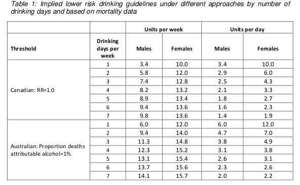
Assuming that drinking is spread out over a few days a week, these figures are roughly in the region of 14, so that is where the guideline figure comes from. The same figure is now being used for men and women.
Something you may have noticed about the table above is that it implies the safe drinking limits are lower for men than for women. You may think that’s a bit odd. I think that’s a bit odd too.
Nonetheless, the rationale is explained in the report. We are told (see paragraph 46 of the guidelines document) that the risks of immediate harm from alcohol consumption, usually associated with binge-drinking in a single session, “are greater for men than for women, in part because of men’s underlying risk taking behaviours”. That sounds reasonably plausible, although no supporting evidence is offered for the statement.
To be honest, I find this result surprising. According to table 6 on page 35 of the Sheffield modelling report, deaths from the chronic effects of alcohol (eg cancer) are about twice as common as deaths from the acute affects of alcohol (eg getting drunk and falling under a bus). We also know that women are more susceptible than men to the longer term effect of alcohol. And yet it appears that the acute effects dominate this analysis.
Unfortunately, although the Sheffield report is reasonably good at explaining the inputs to the mathematical model, specific details of how the model works are not presented. So it is impossible to know why the results come out in this surprising way and whether it is reasonable.
There are some other problems with the model.
I think the most important one is that the relationship between alcohol consumption and risk was often assumed to be linear. This strikes me as a really bad assumption, perhaps best illustrated with the following graph (figure 11 on page 45 of the Sheffield report).
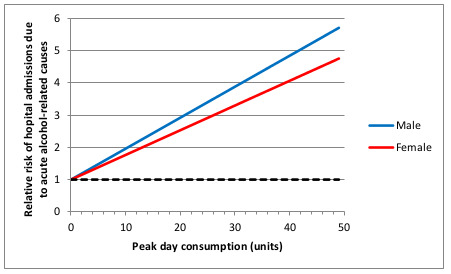
This shows how the risk of hospital admission for acute alcohol-related causes increases as a function of peak day consumption, ie the amount of alcohol drunk in a single day.
A few moments’ thought suggest that this is not remotely realistic.
The risk is expressed as a relative risk, in other words how many times more likely you are to be admitted to hospital for an alcohol-related cause than you are on a day when you drink no alcohol at all. Presumably they consider that there is a non-zero risk when you don’t drink at all, or a relative risk would make no sense. Perhaps that might be something like being injured in a road traffic crash where you were perfectly sober but the other driver was drunk.
But it’s probably safe to say that the risk of being hospitalised for an alcohol-related cause when you have not consumed any alcohol is low. The report does not make it clear what baseline risk they are using, but let’s assume conservatively that the daily risk is 1 in 100, or 1%. That means that you would expect to be admitted to hospital for an alcohol-related cause about 3 times a year if you don’t drink at all. I haven’t been admitted to hospital 3 times in the last year (or even once, in fact) for an alcohol related cause, and I’ve even drunk alcohol on most of those days. I doubt my experience of lack of hospitalisation is unusual. So I think it’s probably safe to assume that 1% is a substantial overestimate of the true baseline risk.
Now let’s look at the top right of the graph. That suggests that my relative risk of being admitted to hospital for an alcohol-related cause would be 6 times higher if I drink 50 units in a day. In other words, that my risk would be 6%. And remember that that is probably a massive overestimate.
Now, 50 units of alcohol is roughly equivalent to a bottle and a half of vodka. I don’t know about you, but I’m pretty sure that if I drank a bottle and a half of vodka in a single session then my chances of being hospitalised – if I survived that long – would be close to 100%.
So I don’t think that a linear function is realistic. I don’t have any data on the actual risk, but I would expect it to look something more like this:
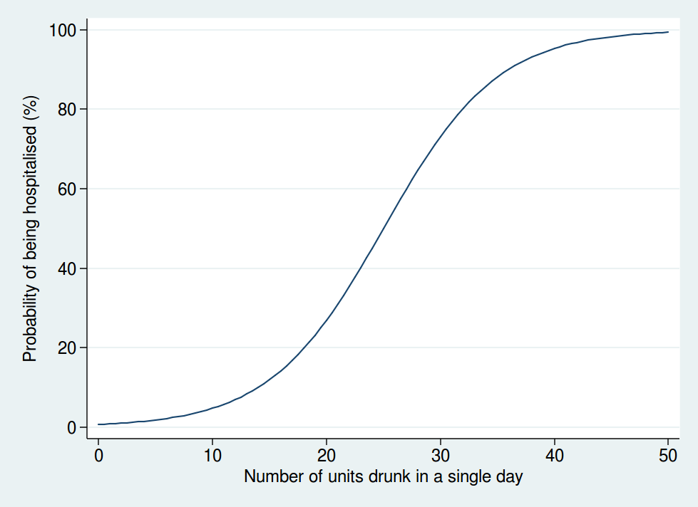
Here we see that the risk is negligible at low levels of alcohol consumption, then increases rapidly once you get into the range of serious binge drinking, and approaches 100% as you consume amounts of alcohol unlikely to be compatible with life. The precise form of that graph is something I have just guessed at, but I’m pretty sure it’s a more reasonable guess than a linear function.
A mathematical model is only as good as the data used as inputs to the model and the assumptions used in the modelling. Although the data used are reasonably clearly described and come mostly from systematic reviews of the literature, the way in which the data are modelled is not sufficiently clear, and also makes some highly questionable assumptions. Although some rudimentary sensitivity analyses were done, no sensitivity analyses were done using risk functions other than linear ones.
So I am not at all sure I consider the results of the mathematical modelling trustworthy. Especially when it comes up with the counter-intuitive result that women can safely drink more than men, which contradicts most of the empirical research in this area.
But perhaps more importantly, I am also puzzled why it was felt necessary to go through a complex modelling process in the first place.
It seems to me that the important question here is how does your risk of premature death depend on your alcohol consumption. That, at any rate, is what was modelled.
But there is no need to model it: we actually have empirical data. A systematic review of 34 prospective studies by Di Castelnuovo et al published in 2006 looked at the relationship between alcohol consumption and mortality. This is what it found (the lines on either side of the male and female lines are 99% confidence intervals).
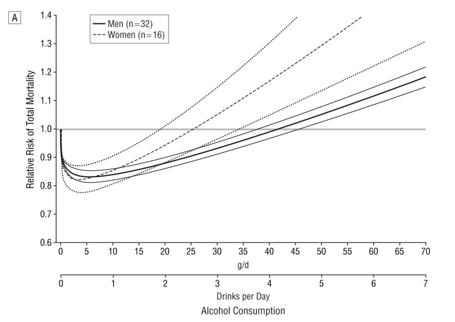
This shows that the level of alcohol consumption associated with no increased mortality risk compared with non-drinkers is about 25 g/day for women and 40 g/day for men. A standard UK unit is 8 g of alcohol, so that converts to about 22 units per week for women and 35 units per week for men: not entirely dissimilar to the previous guidelines.
Some attempt is made to explain why the data on all cause mortality have not been used, but I do not find them convincing (see page 7 of the summary of evidence).
One problem we are told is that “most of the physiological mechanisms that have been suggested to explain the protective effect of moderate drinking only apply for cohorts with overall low levels of consumption and patterns of regular drinking that do not vary”. That seems a bizarre criticism. The data show that there is a protective effect only at relatively low levels of consumption, and that once consumption increases, so does the risk. So of course the protective effect only applies at low levels of consumption. As for the “patterns of regular drinking”, the summary makes the point that binge drinking is harmful. Well, we know that. The guidelines already warn of the dangers of binge drinking. It seems odd therefore, to also reject the findings for people who split their weekly consumption evenly over the week and avoid binge drinking, as this is exactly what the guidelines say you should do.
I do not understand why studies which apply to people who follow safe drinking guidelines are deemed to be unsuitable for informing safe drinking guidelines. That makes no sense to me.
The summary also mentions the “sick quitter hypothesis” as a reason to mistrust the epidemiological data. The sick quitter hypothesis suggests that the benefits of moderate drinking compared with no drinking may have been overestimated in epidemiological studies, as non-drinkers may include recovering alcoholics and other people who have given up alcohol for health reasons, and therefore include an unusually unhealthy population.
The hypothesis seems reasonable, but it is not exactly a new revelation to epidemiologists, and has been thoroughly investigated. The systematic review by Di Castelnuovo reported a sensitivity analysis including only studies which excluded former drinkers from their no-consumption category. That found a lower beneficial effect on mortality than in the main analysis, but the protective effect was still unambiguously present. The point at which drinkers had the same risk as non-drinkers in that analysis was about 26 units per week (this is an overall figure: separate figures for men and women were not presented in the sensitivity analysis).
A systematic review specifically of cardiovascular mortality by Ronksley et al published in 2011 also ran a sensitivity analysis where only lifelong non-drinkers were used as the reference category, and found it made little difference to the results.
So although the “sick quitter hypothesis” sounds like a legitimate concern, in fact it has been investigated and is not a reason to distrust the results of the epidemiological analyses.
So all in all, I really do not follow the logic of embarking on a complex modelling exercise instead of using readily available empirical data. Granted, the systematic review by Di Castelnuovo et al is 10 years old now, but surely a more appropriate response to that would have been to commission an updated systematic review rather than ignore the systematic review evidence on mortality altogether and go down a different and problematic route.
Does any of this matter? After all, the guidelines are not compulsory. If my own reading of the evidence tells me I can quite safely drink 2 glasses of wine with my dinner most nights, I am completely free to do so.
Well, I think this does matter. If the government are going to publish guidelines on healthy behaviours, I think it is important that they be as accurate and evidence-based as possible. Otherwise the whole system of public health guidelines will fall into disrepute, and then it is far less likely that even sensible guidelines will be followed.
What is particularly concerning here is the confused messages the guidelines give about whether moderate drinking has benefits. From my reading of the literature, it certainly seems likely that there is a health benefit at low levels of consumption. That, at any rate, is the obvious conclusion from Di Castelnuovo et al’s systematic review.
And yet the guidelines are very unclear about this. While even the Sheffield model used to support the guidelines shows decreased risks at low levels of alcohol consumption (and those decreased risks would extend to substantially higher drinking levels if you base your judgement on the systematic review evidence), the guidelines themselves say that such decreased risks do not exist.
The guideline itself says “The risk of developing a range of diseases (including, for example, cancers of the mouth, throat, and breast) increases with any amount you drink on a regular basis”. That is true, but it ignore the fact that it is not true for other diseases. To mention only the harms of alcohol and ignore the benefits in the guidelines seems a dishonest way to present data. Surely the net effect is what is important.
Paragraph 30 of the guidelines document says “there is no level of drinking that can be recommended as completely safe long term”, which is also an odd thing to say when moderate levels of drinking have a lower risk than not drinking at all.
There is no doubt that the evidence on alcohol and health outcomes is complex. For obvious reasons, there have been no long-term randomised controlled trials, so we have to rely on epidemiological research with all its limitations. So I do not pretend for a moment that developing guidelines on what is a safe amount of alcohol to drink is easy.
But despite that, I think the developers of these guidelines could have done better.
Excellent analysis!
Solid analysis based on unbiased science
Glad I’m not the only one to wonder where the detail is – and as always with these sorts of analysis the devil is in the detail. The document also fails to mention reporting bias – self reported alcohol units are almost always underestimate intake which will affect the outcomes. One of the things that I would have liked to see in the report would be better labelling of alcohol units on bottles and on bar prices lists and wine lists. Would have been good to know how many units I got through with my beer yesterday evening without getting my drinkaware.co.uk calculator out! (It was 1)
There’s actually quite a detailed discussion of the problem with self reports of alcohol consumption systematically underestimating real consumption, but it’s not in the main document. It’s on pages 56 to 58 of the Sheffield report.
But the conclusion is that they don’t adjust for it, just recognise it as a limitation.
The percentage alcohol on the label is the number of units in a litre. A pint is just over half a litre. So if you don’t want to use a calculator, just divide by two and add on a bit. A pint of 4.5% beer would actually be 2.5 units because a UK pint is actually 0.56L. 33cL bottles of lager are obviously easier because you just divide by 3. A bottle of wine is 75cL therefore 12% wine contains 9 units per bottle, so stop when you get half way down. Hope that helps.
A truly excellent analysis. Di Castelnuovo et al. also did individual all-cause mortality graphs by geographical area. The J-curve was most favourable for Europeans (men especially), showing an intake of about 70g/day equals teetotal death rates. It’s all in my book ‘The Good News About Booze’ – a populist title to mask the fact that it’s a fairly academic tome.
Di Castelnuovo has emailed me about the new UK guidelines, calling them “misleading”. His message ? “Unless they are at high risk of alcohol-related cancers, healthy adults who are currently regular light to moderate alcohol consumers should not be discouraged from continuing.”
A very good reading and scrutiny of the guidelines and their background evidence.
It would seem to me, based on the decent amount of research (including a systematic review) showing the potential for moderate daily drinking to reduce risks, that the government has elected for the simple approach.
Bob – no they haven’t! The article shows that there are provable, repeatable and multiply sourced studies clearly demonstrating that, *all other factors taken into account*, people who drink (yes, within a range and obviously less than a fairly predictable point), *live longer than people who don’t drink*. The “guidelines” (rules, actually, because they use the word ‘limit’ rather than ‘guideline’) could conceivably raise death rates if everybody adhered to them.
Thanks for this SG. The more I look at this, the more angry I get. It’s beginning to look like deception rather than incompetence. I have a few comments. You say
“But perhaps more importantly, I am also puzzled why it was felt necessary to go through a complex modelling process in the first place.”
This reliance on models rather than empirical data is typical of the Public Health Industry and is common to many of its studies. Most famously, its claims that heart attack incidence decreases following smoking bans.
You then say
“It seems to me that the important question here is how does your risk of premature death depend on your alcohol consumption. That, at any rate, is what was modelled.”
Most would agree that’s the important question, “Is it killing me?”
I believe that what they modelled was the risk of premature death FROM ALCOHOL CONSUMPTION due to alcohol consumption. They needed this figure for the “Australian approach”. Firstly, this is of little interest as it excludes the possibility that higher alcohol consumption may substantially decrease the risk of death from other causes, resulting in a lower overall risk of premature death (as seems to be the case from actually looking at total mortality). Secondly, they can then excuse the use of a model because there will be little or no relevant data available.
The Australian approach itself seems similarly irrelevant.
“In Australia, an alternative approach was used which focused on the absolute mortality risk due to
drinking compared to the mortality risks from other causes. Thus the Australian guideline was set
such that if the population all drank at that level, 1% of annual deaths would be attributable to
alcohol.”
For example, if alcohol attributable deaths all occurred at the age of 90, then surely the more of them, the better, the better?
As you imply, “Why not just look at Di Castelnuova’s graph and Ronskley’s sensitivity analysis?” The obvious answer is that they need “evidence” to recommend lower guidelines; and that is not where to find it. The way to find it is to construct an opaque model, whose details are secret, with so many imprecise inputs, themselves the outputs, chosen by themselves, of not even first hand, but second hand (meta) statistical analyses, in total including hundreds of systematic biases, confounders, robustness questions and misclassification errors (see pages 25 and 26 of the Sheffield study).
Very good analysis
One additional point that might have been made is that assuming a linear relationship between consumption and harm has a paradoxical effect. Alcohol-related diseases are most likely to occur in those who drink a lot. This is a small group. But if there is a linear relationship, then even those at low consumption have some degree of risk, and this is a big group. The result is that more deaths by number occur in lower drink categories than in higher. More women who drink very little suffer alcohol-related breast cancer than women who drink a lot, simply because although their risk is lower there are many more women in the lower-drinking group. So diseases that are most likely to be caused by heavy drinking claim more lives in low-drinking groups. That’s why it’s possible to claim such a high risk even for modest drinkers.
A great post! Really interesting reading!
I always think how the knowledge of units consumed is researched. If the researcher is just asking the individuals, it would not be reliable. Who tells the truth, even to themselves, if they are heavy drinkers. The temptation to ‘minimise’ is hard to resist.
I got bored and got a drink…
The main fault of the guideline is, in my opinion, that they are giving suggestions about ALCOHOL consumption in general.
From this point of view, I find that it’s OK from the government point of view to play on the safe side. To use a worst case scenario.
The problem is that literature is used to confirm or to criticise these guidelines. In reality there is not a systematic and general study on the matter.
Maybe If I repeat the studies in more detailed way I will find different conclusions depending on the drink types.
Maybe drinking 21 units given in the form of red wines will save my life. Drinking 21 units in the form of vodka will do less so.
Beer, Wine, Ciders, etc are not just diluted alcohol. They come with lots of other compounds that may be very healthy.
Distillates may loose these compounds (or may recover some when aged in barrels, like whisky). Not sure.
There is such a variety of drinks and compounds involved in this subject that capping everything under the “ALCOHOL” problem is a bit generalist if not wrong.
Government guideline should reflect these differences. Proper studies should be performed to understand the matter. And guidelines should reflect these findings.
Governement could at least differentiate between feremented beverages and super-alcoholic/distillate beverage.
Maybe we can afford 14 units of alcohol if assumed in form of distillates, but afford 30 if assumed in form of red wines.
The matter is complex and deserve investigation before scaring people. Until things are clearly understood, I agree with the Government in playing on the safe side. After all, these are just guidelines and I am not forced to confess my ‘sins’ to my GP 🙂
It’s certainly an interesting question to ask whether the beneficial effects of drinking are a result of the alcohol or a result of other things that you find in wine.
As far as I can tell, there is no strong evidence that any one type of alcoholic drink is any better than any other, and it seems that the alcohol itself is the important thing, but it’s very hard to know for sure.
Here’s one (now rather old) paper that looked at this issue:
http://www.bmj.com/content/312/7033/731.long
Re alcohol types, it all depends on the particular health benefit. For example, risk of heart disease, diabetes and kidney cancer shows an inverse relation with all alcohol types, but wine seems to be most favourable for e.g. dementia, macular degeneration and lung cancer. Crucially, the all-cause mortality J-curve is dramatically different in wine drinkers, with the maximum health benefit at 2 to 4 units/day. Indeed some wine studies show the J-Curve morphs into a U-curve. You’ll see one of them in my book The Good News About Booze. Astonishingly, one study has shown a straight-line inverse association between mortality risk and wine intake. I didn’t include that one.
Great analysis and I hope you don’t mind that I added you piece (in further reading) to my post . The Sheffield group analysis seems to be blackbox with the desired outcome they had in mind. We hope that a government funded body has the desire to tell the truth, but the truth has been surely twisted here for motives of funding etc. Cheers and have a nice glass of Malbec (high in resveratrol) Richard.Norton EditorFermentedGrape.com
For those interested see:
Blood alcohol concentration and other factors plus a damning verdict on the latest CMO recommendations
http://www.fermentedgrape.com/wine-and-health/2016/1/10/uks-new-alcohol-guidelines-push-prohibition-agenda-but-with-bias-in-scientific-conclusions
For more info on resveratrol in wine etc.
http://www.fermentedgrape.com/wine-and-health/2013/9/28/is-drinking-wine-good-or-bad-for-you.html
One thing that bothers me is the conflation in the govt. advice between “death from alcohol-relatable illness” and “premature death from alcohol-relatable illness”. As far as I can see, it’s (strictly speaking) consistent with the figures in the mortality risk percentage chart that heavy drinkers live roughly the same length of time as non-drinkers (or even longer), but die of different causes. If I die of liver failure at the age of 102, am I an “alcohol-related fatality”? Or has the data been adjusted so it only takes account of deaths significant earlier than that person’s life expectancy? Conversely, I could produce a chart showing that not-drinking increases the risk of death from non-alcohol-related causes, using exactly the same data. After all, everyone dies of something – flat risk of death not really a good measure, as overall I’d say that risk is 100% for everyone!
I wonder if there’s an axe being ground in Sheffield? I seem to remember earlier reports supporting minimal unit pricing and others along the lines of this report that looked like the wilfully ignored earlier work that established the J curve.
Presumably the research commissioning process went through the usual govt. procurement processes, as required by EU.
Shame about the Australian input. I thought that they used to have a good approach, which specifically distinguished between acute risk from getting drunk vs longer term health impact.
Surely the whole basis upon which the Sheffield model rests is irretrievably flawed for the simple reason that nobody entering hospital for alcohol-related causes (or indeed any cause) carries with them a dosimeter showing how much alcohol they consumed and when.
Without this information, how can the model be anything other than an algorithm based on guesswork?
You had me rolling in the aisles! It was a great read this Monday morning (after wine with dinner last night). Keep up the good work debunking crap.
Prof Ian Gilmor has a history of prohibition related activity, he was a leading light in creating the smoking ban in the UK, this ban had the same problem with looking at Relative Risk of no significance as with these guidelines and perceiving it as harm when in fact the full body of evidence was discounted.
They used information from select universities with input from paid lobby groups to create a view that there is no safe level of SHS, even though the HSE could not produce epidemiological evidence that SHS is significantly harmful, see HSE OC255/15 article 9, the smoking ban was not brought in by the HSE but under the Health Act 2006, this so it did not have to be an evidence based ban, these people use and twist select studies to suit their end game, which is to make drinking the same as smoking, I have no links to either the drinks industry or tobacco industry but have studied since 2006 the corrupt manner that has been used.
ASH and similar paid lobby groups and institutions left a wake of closed pubs bingo halls and a social apartheid between smokers and non smokers.
Christopher Snowdon (author) has analysed all this in depth in his books one being Iron Glove Velvet Fist.
A beautifully written, incisive piece. I particularly liked this:
“If the government are going to publish guidelines on healthy behaviours, I think it is important that they be as accurate and evidence-based as possible. Otherwise the whole system of public health guidelines will fall into disrepute, and then it is far less likely that even sensible guidelines will be followed.”
May be too late here but…..isn’t the daily risk graph trying to capture the ‘war of attrition’ on the body from alcohol consumption over a lifetime rather than what happens on a particular day? Alcohol is like cigarettes, pizza, mars bars in that continuing consumption of things that are not good for you is not a good idea. The comments by your readers on the J Curve read a bit like special pleading by drinkers to me. The idea that alcoholic drinks can really be ‘good for you’ seems a bit grasping at straws really!
I want to continue drinking 25-30 units a week but am not sure this convinces me it is ok to do do!
No, if you’re talking about the graph with the straight lines that I refer to as the first graph in my piece above (figure 11 from the Sheffield report), then it’s specifically looking at the acute effects of alcohol, eg getting drunk and falling over and breaking bones).
I know this is an old blog post but its still very relevant. And here is an effective demolition of Public Health England’s 14 units recommendation by Christopher Snowdon. It was bad science!
https://velvetgloveironfist.blogspot.com/2019/04/add-link-new-drinking-guidelines-are.html